
Alternating Row Colors in SSRS Tablix: The Complete Guide
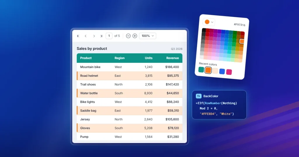
TL;DR :
Alternating row colors (zebra striping) improve readability in SSRS tablix reports by visually separating rows and groups. Use RowNumber(Nothing) for standard tables and RunningValue(Fields!GroupField.Value, CountDistinct, Nothing) for grouped tables and matrix reports.
Introduction
Most business reports don’t start out unreadable. A five-row summary table is easy to scan no matter how it’s formatted. The problem appears when scaling: as an SSRS tablix grows from a handful of rows to hundreds, the human eye starts losing track of which row it’s reading. Without a strong visual anchor, it’s easy to accidentally read a value one row up or down from where you intended.
In business reporting, report readability is directly tied to decision quality. A finance analyst misreading a row in a reconciliation report can produce real downstream errors. Reports are also frequently printed, exported to Excel or PDF, or projected on a screen during a meeting, all of which strip away the fine-grained cues (cursor position, cell selection highlighting) that make on-screen scanning easier in an interactive grid.
Alternating row colors, shading every other row a slightly different background color, commonly called zebra striping, solves this with almost no design overhead. It gives every row a clear visual boundary, so the eye tracks horizontally across a row instead of drifting vertically between rows. That’s why it remains one of the most widely used formatting techniques in SSRS tablix reports today: it’s cheap to implement, doesn’t compete with a report’s branding or color scheme, and measurably improves scanning accuracy on any table, grouped tablix, or matrix report.
This guide keeps the original step-by-step implementation walkthroughs for tables, grouped rows, and matrix reports in the Bold Reports Designer, and expands them into a complete reference on alternating row colors in SSRS. You’ll see how the underlying RowNumber(), RunningValue(), and CountDistinct() expressions actually work; when to use each; how to choose colors that hold up under accessibility, print, and export requirements; and how to troubleshoot the most common implementation problems.
SSRS tablix fundamentals: What a tablix is, and how formatting applies to it
Before diving into expressions, it helps to understand exactly what you’re formatting. In SSRS, table, matrix, and list report items are all built on the same underlying data region, called the tablix. A tablix organizes dataset results into cells arranged in rows and columns, and it’s the single most common report item across SSRS, Report Builder, and RDL-compatible tools like Bold Reports, which is why alternating row colors in a tablix really means alternating row colors in any table, grouped table, or matrix built on top of it. If you want a deeper primer on how the tablix data region itself is structured, see Basics of SSRS Tablix Data Region, and for a broader tour of what the tablix can do beyond row coloring, see 7 Unique Features of a Tablix. A few structural facts matter directly for alternating row colors:
-
- A table has row groups but a fixed column structure. Its detail rows repeat once per dataset record, which is why a simple RowNumber(Nothing)-based expression works cleanly.
- A grouped table introduces one or more row groups on top of detail rows (for example, grouping by product category, then subcategory). Formatting needs to alternate per group instance, not per physical row, which is why RowNumber() alone isn’t the right tool once grouping is involved, you need RunningValue() combined with CountDistinct Bold Reports’ documentation on adding grouping and totals in a tablix can help if you’re building the grouped structure itself before formatting it.
- A matrix adds column groups on top of row groups, so both axes can expand dynamically based on the data. Row-color expressions in a matrix are applied to the row group cell and behave the same way as a grouped table’s row-group formatting. See Bold Reports’ guide on how to design an SSRS matrix report if you’re setting up the matrix structure for the first time.
- Formatting (including background color) is applied per cell, and the scope of an expression, whether it’s evaluated against the whole dataset, a specific group, or the tablix as a whole, determines whether “every other row” means every other physical row or every other group instance. Getting this scope right is the single most important concept in this entire guide, and it’s covered in depth in the next two sections.
Tablixes are used so widely in reporting solutions precisely because this one flexible structure, table, matrix, or list, with or without grouping, covers the vast majority of business report layouts, and alternating row colors is one of the simplest, highest-impact formatting improvements you can apply to any of them.
Understanding alternating row colors in SSRS tablixes
Alternating row colors is a form of conditional formatting applied to an SSRS tablix. Every other row (or every other group instance) is shaded a different color, typically a light gray or tint against a white base.
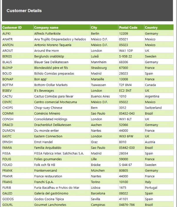
Why zebra striping works:
-
- Reduces horizontal tracking errors: The human eye uses subtle boundaries to stay on a single line while scanning left to right. A row color change acts as a lane marker, reducing the chance of reading a value from the row above or below.
- Improves usability without adding visual noise: Unlike bold borders or heavy dividing lines, a light color tint separates rows without cluttering the layout or competing with the data itself.
- Supports accessibility, when contrast is handled correctly: Zebra striping can help low-vision users track rows more easily, but only if the color difference between alternating rows and the text remains within accessible contrast ratios. This topic is covered fully in the best practices section later.
- Improves outcomes for exported and printed reports specifically: Interactive cues like cell selection or hover highlighting disappear once a report is exported to PDF or Word or printed on paper. Alternating row colors are one of the few readability aids that survives all of those output formats unchanged.
- Reduces reporting errors downstream: For reports used to drive decisions such as approvals, reconciliations, and order fulfillment, reducing row-tracking mistakes at the reading stage reduces the error rate in whatever process consumes the report.
The expressions behind alternating row colors
Every alternating-row-color expression in this guide is built from the same small set of SSRS functions. Understanding exactly how each one works, and critically, how scope changes its output, is what separates a working expression from one that alternates unpredictably.
RowNumber()
RowNumber(scope) returns a running total of rows as a paginated report renders, based on the scope you provide:
-
- RowNumber(Nothing): Counts every row in the entire dataset, ignoring any grouping. This is the correct scope for a flat table with no groups. Every detail row is a new number, so MOD 2 alternates cleanly between two colors.
- RowNumber(“GroupName”): Restarts the count at 1 every time a named group instance begins. This is useful when you want the count (and therefore the color alternation) to reset within each group rather than continuing across the whole report.
Common mistake: Using RowNumber(Nothing) on a grouped row cell. Because RowNumber(Nothing) counts every physical detail row, not every group instance, it produces an alternation pattern tied to row count within the group rather than to the group boundary itself, which is almost never the visual effect report authors actually want when formatting grouped rows. This is the single most common cause of “my alternating colors don’t line up with my groups” support requests.
When to use it: Use RowNumber(Nothing) for simple, ungrouped tables. Use a scoped RowNumber(“GroupName”) only when you specifically want the numbering (and coloring) to restart at each group boundary rather than alternate by group instance, which is a different visual effect than the group-level striping covered next.
RunningValue()
RunningValue(expression, function, scope) returns a running aggregate of a numeric expression, evaluated using the aggregate function you specify (Sum, Count, CountDistinct, Avg, and others), calculated within the scope you provide.
-
- For alternating row colors, it’s almost always paired with the CountDistinct aggregate function because you want a value that increments by exactly one every time a new distinct group value appears, not one that increments per physical row.
- RunningValue(Fields!GroupField.Value, CountDistinct, Nothing) tracks the running count of distinct values of GroupField across the entire dataset (or, when placed inside a group’s row, across the enclosing scope). Because it increments only when the group’s value changes, MOD 2 on this running count alternates the color once per group instance, not once per row. This produces the desired effect for grouped tables and matrix row groups.
Common mistake: Applying RunningValue(…, CountDistinct, Nothing) on the wrong cell, for example, on a detail row instead of the group header or group row cell. This causes the color to change on every row within the group rather than remaining consistent for the entire group and changing only at the next group boundary.
When to use it: Use RunningValue() with CountDistinct whenever you need the color to alternate per group, whether that group is a row group in a grouped table or a row group in a matrix report.
CountDistinct
CountDistinct is one of the aggregate functions available to RunningValue() (and to standalone aggregate expressions). It returns the total of all distinct non-null values specified by the expression, evaluated in the context of the specific scope:
-
- Paired with RunningValue(), it’s what makes the running count increment once per unique group value rather than once per row that shares that value, which is the entire mechanism that makes group-level zebra striping possible.
- Common mistake: Using a field in CountDistinct that isn’t actually the grouping field, or that has duplicate values that don’t align with group boundaries (for example, a description field that repeats identical text for unrelated records). This produces an alternation that doesn’t match the visual group boundaries, since the “distinct” count is now driven by something other than the group itself.
When to use it: Always pair CountDistinct with the exact field the row group (or the innermost group you want to alternate by) is grouped on. This guarantees the distinct-value transitions line up exactly with the group boundaries in the rendered report.
| Layout | Function to use | Why |
| Flat table, no groups | RowNumber(Nothing) | Every detail row is a new physical row; a simple row count alternates cleanly. |
| Grouped table (row groups) | RunningValue(Fields!GroupField.Value, CountDistinct, Nothing) | Alternation needs to track group instances, not physical rows. |
| Matrix (row groups + column groups) | RunningValue(Fields!GroupField.Value, CountDistinct, Nothing) on the row group cell. | Same principle as grouped tables; matrix row groups alternate per group instance. |
| Nested groups | RunningValue() scoped to each nesting level’s own group field. | Each nested level needs its own expression, scoped to its own group field, to alternate independently. |
How to apply alternating row colors in an SSRS tablix
Alternating row colors can be implemented differently depending on whether you’re working with a standard table, a grouped tablix, or a matrix report. The correct expression depends on how rows are rendered and whether grouping is involved. The following sections walk through the recommended implementation approach for each report layout.
How to apply alternating row colors in a table
Prerequisites: A table report item bound to a dataset, with at least one detail row containing your report’s data fields. If you don’t have a table set up yet, see the documentation on designing an SSRS/RDL report using a table before starting.
Expected outcome: Every other detail row in the table renders with a light background tint (#F4F4F4) while the rest remain white (#FFFFFF), with the pattern holding consistently as the dataset grows or shrinks.
Step 1: Open your table report item in the Report Designer. You can see how to create a new one in our documentation.
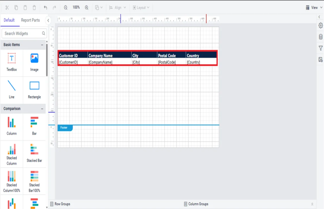
Step 2: On the designer page, select the entire row group by clicking on the row handle on the left side.
Step 3: Under the Appearance category, click the square icon at the right corner of the Background Color property and click the Expression menu to open the expression builder.
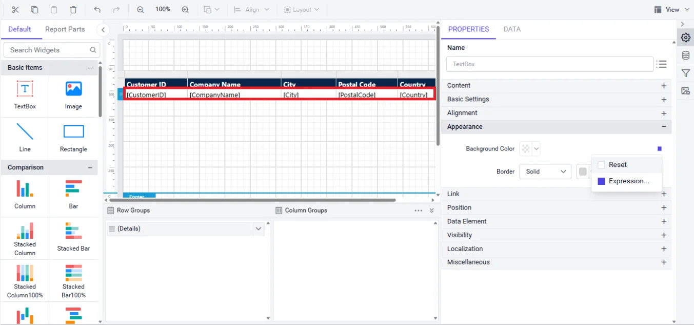
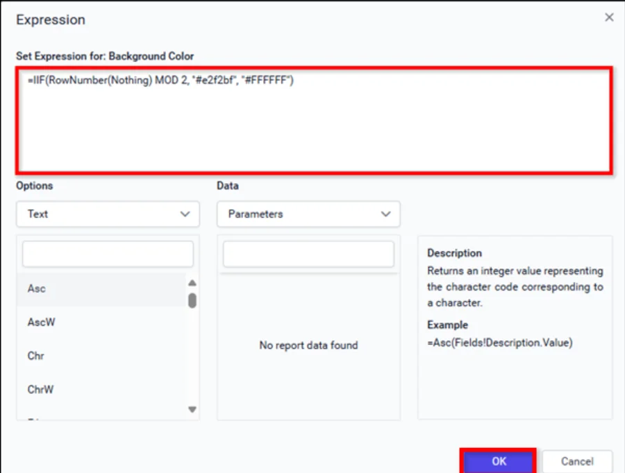
Step 4: Add the following expression in the expression builder and click OK.
| =IIF(RowNumber(Nothing) MOD 2, “#F4F4F4”, “#FFFFFF”) |
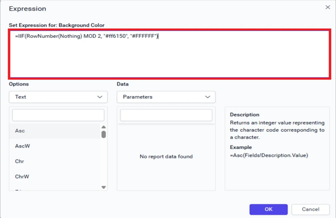
RowNumber: Gives you a running count of rows in a paginated report, based on the scope you choose.
Nothing: Means it counts the rows across the whole dataset, without any specific group or filter.
Step 5: Click Preview at the top-right corner to confirm the alternating row colors are applied to the table.
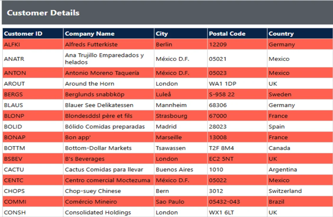
Validation checklist:
- Preview with a realistic row count (not just 3–4 sample rows) to confirm the alternation stays consistent throughout a full page and across page breaks in a paginated report.
- Confirm the expression is applied at the row level (not an individual cell), so every column in the row shares the same background color.
- Check that sort or filter changes (if the report supports interactive sorting) don’t visually break the alternation. Since RowNumber(Nothing) recalculates based on rendered row order, resorting will still alternate correctly, but it’s worth confirming for reports with user-controlled sorting.
Implementation recommendation: For a simple table, prefer RowNumber(Nothing) over RunningValue(). It’s simpler, cheaper to evaluate, and there’s no group boundary with which to align. Reach for RunningValue() only once you introduce row grouping, covered next. For a deeper reference on the exact expression syntax and additional SSRS report expressions, see the KB article on applying alternating row colors in a tablix.
How to apply alternating row colors to groupings of rows in a table
Prerequisites: A grouped table report. At minimum, one row group configured on the tablix. If you haven’t built the grouping structure yet, follow the documentation on adding grouping and totals in a tablix design before applying row-color formatting.
Expected outcome: Each group instance (for example, each distinct product category) renders with a consistent background color for every row that belongs to it, and the color flips to the alternate shade at the next group boundary rather than flipping on every physical row.
Best for: Reports grouped by category, customer, or region, where you want readers to visually separate one group from the next at a glance.
Step 1: Open the downloaded grouping report in the Bold Reports Report Designer. See how to create a table report in this documentation.
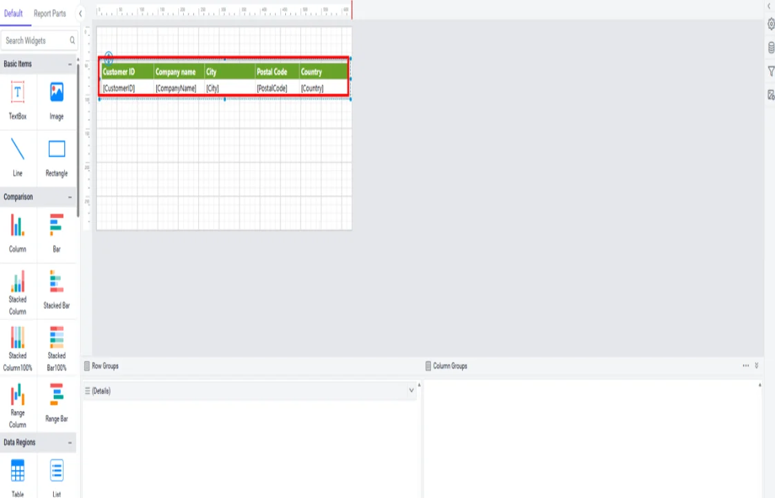
Step 2: Select the first row group cell (for example, Customer ID).
Step 3: In the Appearance category, click the small square icon next to Background Color, then choose Expression.
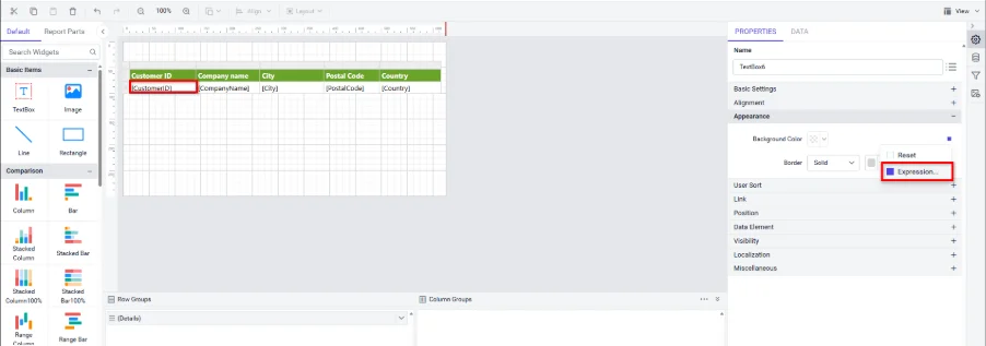
Step 4: Set the following expression in the expression builder and click OK.
| =IIF(RunningValue(Fields!ProdCat.Value, CountDistinct, Nothing) MOD 2, “#F4F4F4”, “#FFFFFF”) |
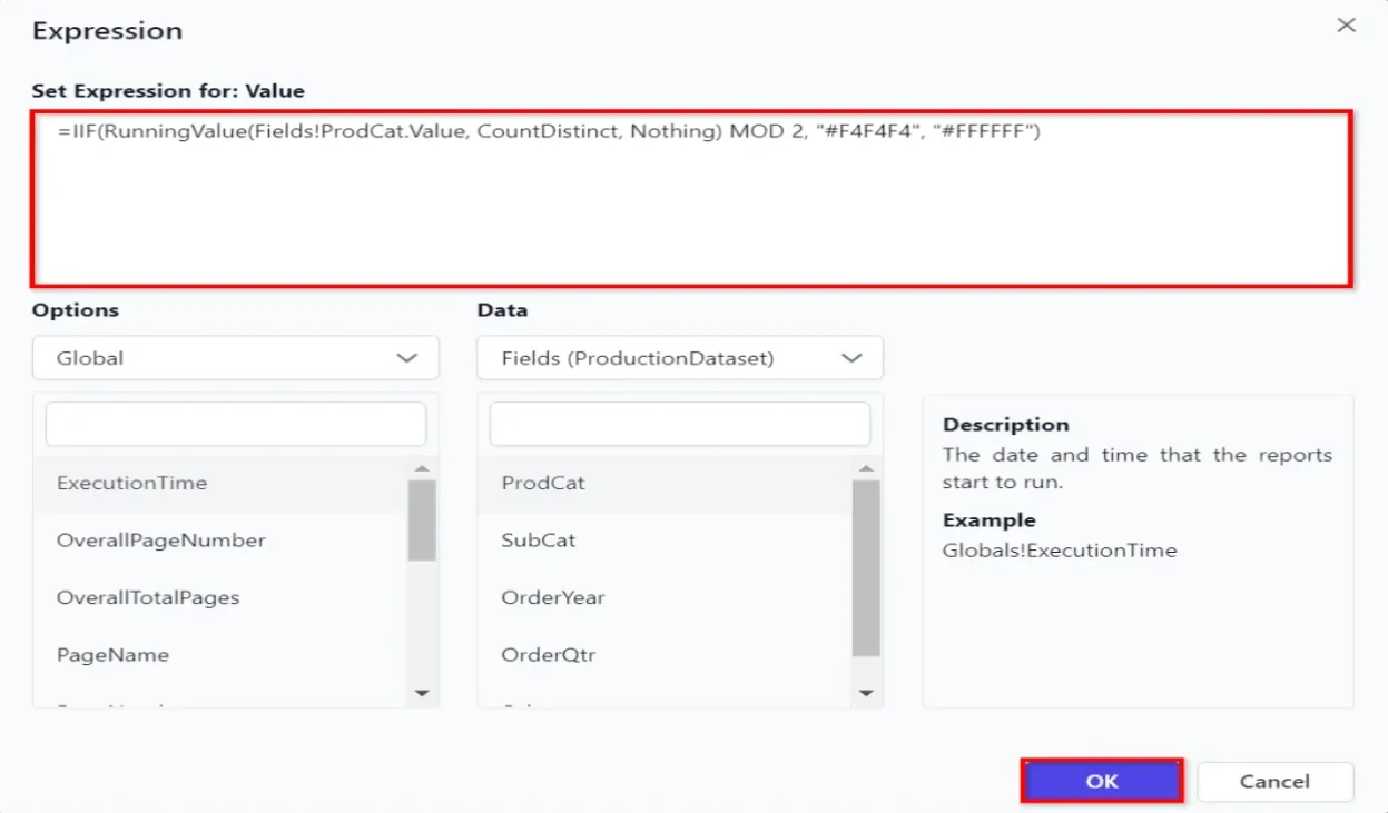
RunningValue: Returns a running total of all non-null numeric values from the expression, calculated within the specified scope.
CountDistinct: Returns the total of all distinct non-null values specified by the expression in a paginated report, evaluated in the context of the specific scope.
Step 5: Set the following expression in the expression builder and click OK. This repeats the same pattern for a nested group level (for example, subcategory nested inside category).
| =IIF(RunningValue(Fields!SubCat.Value, CountDistinct, Nothing) MOD 2, “#F4F4F4”, “#FFFFFF”) |
Step 6: Click Preview in the top-right corner to confirm that alternate row colors are applied to the groupings.
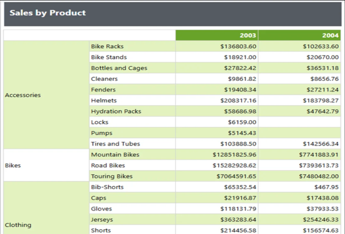
Validation checklist:
- Confirm the expression’s field reference (Fields!ProdCat.Value, Fields!SubCat.Value) exactly matches the field the row group is grouped on. A mismatch is the most common cause of alternation that doesn’t line up with group boundaries.
- Verify each nested group level has its own RunningValue() expression, scoped to its own group field, so an outer group and an inner (nested) group can alternate independently without interfering with each other.
- If every row inside a group renders the same color as intended, but the color doesn’t change at the next group boundary, double-check the expression is applied on the group’s row cell, not on a detail row inside it.
Implementation recommendation: When grouping is nested more than two levels deep, keep each level’s alternating colors visually distinct in intensity (for example, a subtle tint for the inner group, a slightly stronger tint for the outer group) so readers can tell which group boundary just changed without needing to re-read the label text.
How to apply alternating row colors in a matrix
Prerequisites: A matrix report item with at least one row group configured (and, typically, a column group as well, since that’s what distinguishes a matrix from a table). If you’re starting from scratch, see the documentation on how to design an SSRS matrix report.
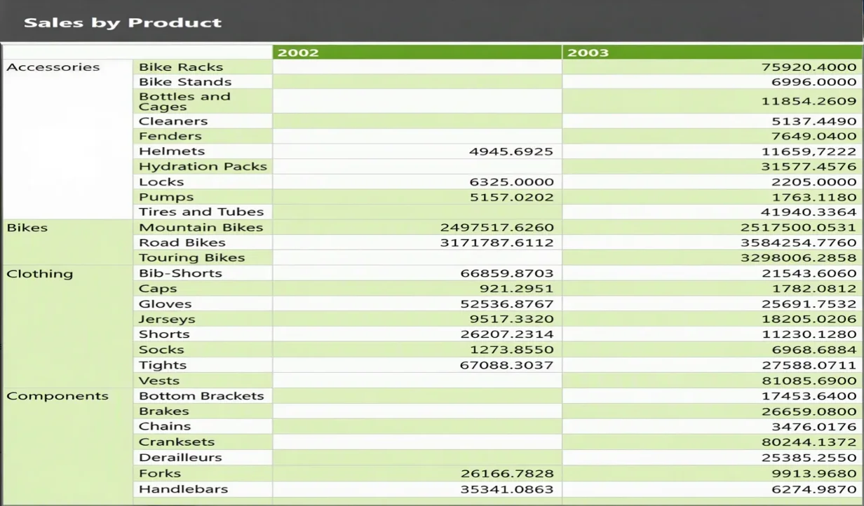
Expected outcome: Each row group instance across the matrix, regardless of how many dynamic columns the matrix renders based on the column group, shares a consistent background color, alternating at each row group boundary, exactly as it would in a grouped table.
Best for: Cross-tabulated summaries such as sales by category across years or any pivot-style report where a wide, dynamically expanding set of columns makes horizontal row tracking especially error-prone.
Step 1: Open the matrix report in the Report Designer. See how to create a new report in this documentation.
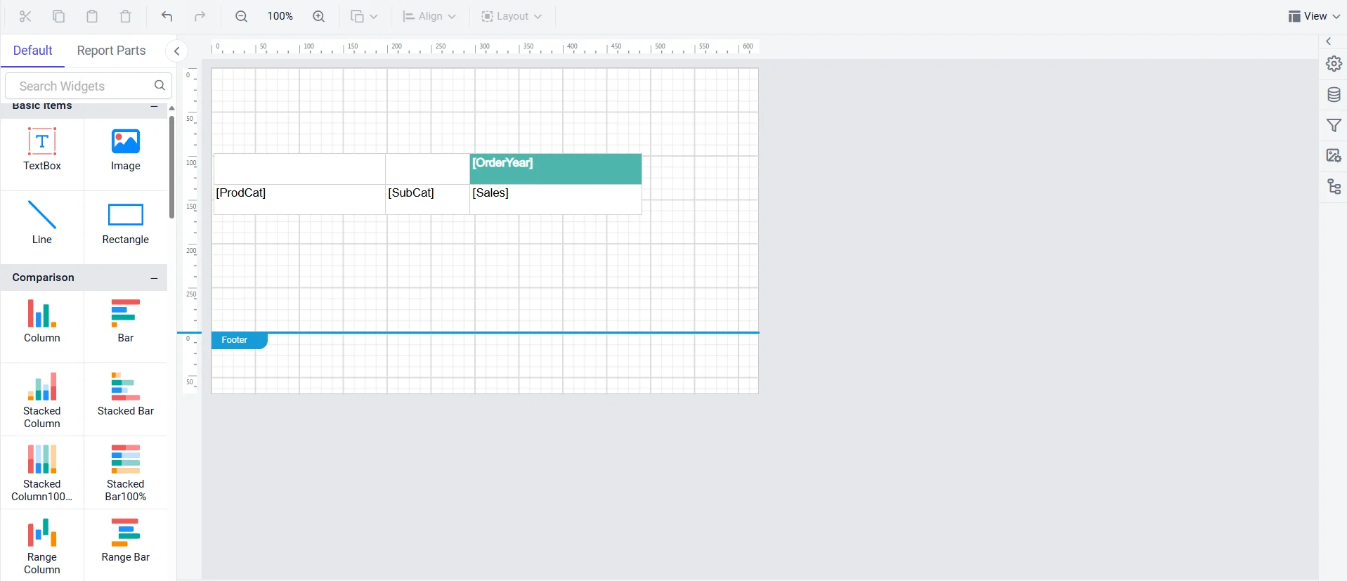
Step 2: Select the first-row group cell (e.g., ProdCat).
Step 3: Click the square icon at the right corner of the Background Color property under the Appearance category. Then select the Expression menu to open the expression builder.
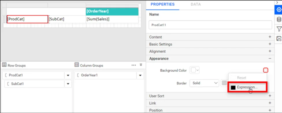
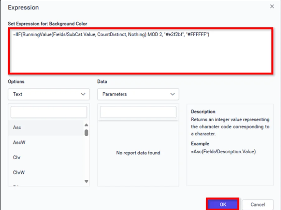
Step 4: Set the following expression in the expression builder and click OK.
| =IIF(RunningValue(Fields!SubCat.Value, CountDistinct, Nothing) MOD 2, “#F4F4F4”, “#FFFFFF”) |
Step 5: Preview the matrix report to confirm that the alternating row colors are applied.
Validation checklist:
- Preview with enough distinct column-group values (e.g., several years or regions) to confirm the row banding stays consistent across the full dynamic width of the matrix, not just the sample columns visible at design time.
- If the matrix has multiple nested row groups, confirm each nesting level has its own scoped RunningValue() expression, exactly as with a grouped table.
- Check that the corner cell and static header rows aren’t accidentally inheriting the same expression. Those should typically keep a fixed header style rather than participating in the alternation.
Implementation recommendation: Because a matrix’s column count grows dynamically with the data, apply the background color expression to the row group cell, not to individual data cells within the body. This guarantees the striping spans the full width of the rendered matrix automatically, even as new columns appear.
By following these steps, you can apply alternating colors to different report types, making your data easier to understand and more visually appealing.
Comparison table: Table vs. grouped tablix vs. matrix row-color implementation
| Aspect | Standard Table | Grouped Tablix (Table with Row Groups) | Matrix Report |
| Implementation complexity | Low, one expression, one cell. | Medium, one expression per group level. | Medium-high. Same as grouped tablix, plus dynamic column awareness. |
| Recommended expression | RowNumber(Nothing) | RunningValue(Fields!GroupField.Value, CountDistinct, Nothing) | RunningValue(Fields!GroupField.Value, CountDistinct, Nothing) on the row group cell. |
| Scope consideration | Whole dataset, no grouping to align with. | Must match the exact field the row group is grouped on. | Must match the row group field; column group axis doesn’t affect the expression. |
| Maintenance effort | Very low, rarely needs revisiting. | Moderate, revisit if group fields or nesting structure change. | Moderate-high, revisit if row group fields change or new nested levels are added. |
| Typical reporting scenarios | Transaction lists, order details, employee rosters. | Sales-by-category reports, invoices grouped by customer, audit logs by type. | Sales-by-region-by-year, budget vs. actual, any pivot-style cross-tab. |
| Risk of common mistakes | Low | Medium, field/group mismatch is the top failure mode. | Medium, same as grouped tablix, plus column-count assumptions. |
SSRS alternating row color expression reference
Use this section as a quick copy-reference for the most common alternating-row-color scenarios in SSRS and the Report Designer.
Detail rows (flat table, no grouping):
| =IIF(RowNumber(Nothing) MOD 2, “#F4F4F4”, “#FFFFFF”) |
Grouped rows (single row group):
| =IIF(RunningValue(Fields!ProdCat.Value, CountDistinct, Nothing) MOD 2, “#F4F4F4”, “#FFFFFF”) |
Nested groups (inner group, scoped independently from the outer group):
| =IIF(RunningValue(Fields!SubCat.Value, CountDistinct, Nothing) MOD 2, “#F4F4F4”, “#FFFFFF”) |
Matrix row group:
| =IIF(RunningValue(Fields!SubCat.Value, CountDistinct, Nothing) MOD 2, “#F4F4F4”, “#FFFFFF”) |
Custom color scheme (brand colors instead of gray/white):
| =IIF(RowNumber(Nothing) MOD 2, “#EAF1FB”, “#FFFFFF”) |
Swap #EAF1FB for any brand-approved light tint. See the best practices section for how to choose one that stays print- and export-safe.
Conditional formatting combined with alternating colors (e.g., highlight overdue rows regardless of stripe):
| =IIF(Fields!DaysOverdue.Value > 30, “#FFCDD2”, IIF(RowNumber(Nothing) MOD 2, “#F4F4F4”, “#FFFFFF”)) |
This layers a priority condition (overdue rows in red) on top of the base zebra-stripe pattern, so the alert color always wins over the alternating pattern.
Three-color rotation (uncommon, but useful for grouped totals rows):
| =IIF(RowNumber(Nothing) MOD 3 = 0, “#E8E8E8”, IIF(RowNumber(Nothing) MOD 3 = 1, “#F4F4F4”, “#FFFFFF”)) |
Best practices for choosing alternating row colors
Follow these best practices when applying alternating row colors:
-
- Keep contrast subtle between the two row colors: A light gray (#F4F4F4, #F0F0F0, #EEEEEE) against white is enough to create a visible boundary without the report looking like a spreadsheet grid. High-contrast alternating colors (e.g., dark gray next to white) tend to read as harsh rather than helpful.
- Maintain sufficient text-to-background contrast on both stripe colors: Whichever text color you use must meet accessibility contrast guidelines against both the light and the base row color, which is where accessibility checks are often missed. WCAG 2.1 recommends a minimum contrast ratio of 4.5:1 for normal text to improve readability and accessibility
- Design for print, not just screen: Very light tints can wash out or disappear entirely on some printers or when toner is low. Test a printed sample before finalizing a color, especially for reports regularly printed for offline review or meetings.
- Verify export compatibility across every target format: PDF, Excel, and Word exports can render background colors slightly differently than the interactive HTML preview. Microsoft notes that report pagination can be affected when exporting to different formats because rendering extensions process report layouts differently.
- Align colors with corporate branding where relevant: Alternating row colors don’t have to be gray. A light tint of a brand’s primary color can reinforce branding while still delivering the readability benefit, as long as contrast rules are respected.
- Avoid using alternating row colors as the only conditional-formatting signal: If a report already uses color to flag urgent or exceptional rows (e.g., red for overdue), make sure the alert color visually dominates the zebra stripe (see the “combined conditional formatting” expression) so critical rows aren’t accidentally camouflaged by the striping pattern.
- Keep the pattern consistent across a report suite: If your organization publishes multiple report types, standardizing the alternating color pair across all of them (via a shared report style or theme) improves consistency and makes the whole report suite feel cohesive rather than like a set of one-off designs. Bold Reports’ guides on formatting a report and on styling reports with the Report Designer cover how to apply and reuse formatting choices like this consistently.
Common alternating row color issues and troubleshooting
RowNumber-based alternation doesn’t line up with groups: This happens when RowNumber(Nothing) is used on a grouped row cell instead of RunningValue(…, CountDistinct, Nothing). RowNumber(Nothing) counts physical rows, not group instances, so the colors change on every detail row rather than at group boundaries.
Fix: Replace the expression with RunningValue() scoped to the exact group field, as shown in the previous grouped-rows walkthrough.
RunningValue-based alternation is inconsistent within a group: If some rows inside what should be a single group instance show different colors, the field used inside CountDistinct likely isn’t the actual grouping field, or it contains inconsistent or duplicate values that don’t align with true group boundaries. This is the scenario a commenter on another article ran into, where the inner row group had the same value repeated for every row and the expression didn’t produce a visible change.
Fix: Confirm the CountDistinct field matches the row group’s own grouping expression exactly, and if the group truly has no distinguishing field, consider alternating on the outer group’s field instead, or introduce a hidden row-index field in the dataset to group and count against.
Grouping errors causing an off-by-one alternation: If the very first group instance renders the wrong starting color relative to what’s expected, remember MOD 2 on a running count starting at 1 will show the alternate color first, not the base color.
Fix: Swap which color corresponds to True/False in the IIF(), or adjust to (RunningValue(…) – 1) MOD 2 if you need the first instance to always render the base color.
Matrix formatting challenges when row groups are nested: In a matrix, an expression applied at the wrong nesting level can alternate the outer group’s rows but leave the inner group flat, or vice versa.
Fix: Apply a separate, independently scoped RunningValue() expression at each nesting level’s own row group cell, exactly as with a nested grouped table.
Color rendering issues (colors look different than expected): Some renderers or older RDL viewers render hex colors slightly differently, or a named color (e.g., “LightGray”) may render inconsistently across platforms.
Fix: Always use explicit hex codes (“#F4F4F4”) rather than named colors for predictable, consistent rendering in the designer preview, exported files, and any embedded viewer.
Export discrepancies (colors missing or altered in PDF, Excel, or Word): Background color expressions occasionally don’t carry over identically to every export format, particularly with older renderer versions or heavily customized styles.
Fix: Test each target export format explicitly rather than relying on the interactive preview, and if a specific format drops the color, check for renderer-specific style overrides or update to the latest Report Designer or viewer version.
Alternating colors disappearing after adding conditional highlighting: If a separate conditional-formatting rule (e.g., highlighting overdue rows) was added after the base alternating expression, and both target the same background color property, only the last-applied expression takes effect. They don’t automatically combine.
Fix: Merge both conditions into a single, nested IIF() expression, as shown in the previous conditional formatting combined with alternating colors example. The priority condition and the base stripe pattern can then coexist correctly.
Performance concerns on very large datasets: RunningValue() recalculates its running aggregate as the report renders, which adds a small amount of overhead per row. On very large paginated reports, this is rarely noticeable, but if you’re layering many additional per-row expressions on top of it, consider presorting or pregrouping data at the query level to reduce redundant work at render time.
Report design best practices: Where alternating row colors fit into overall report usability
Alternating row colors are one tool in a larger report-readability toolkit, and they work best when paired with consistent, deliberate formatting elsewhere in the report:
-
- Visual hierarchy: Pair alternating body-row colors with a visually distinct header row (a stronger background color, bold text, or a border) so headers are never mistaken for a stripe in the pattern.
- Formatting consistency: Apply the same alternating-color pattern to every table, grouped tablix, and matrix in a report and ideally across an entire report suite, so readers build a consistent mental model of how to scan any report from your organization.
- Grouping visibility: In grouped and matrix reports, alternating colors work best when combined with clear group header text, and where useful, group-level subtotals. The color signals where a group changes, while the label and subtotal confirm what.
- Padding usage: Don’t let alternating colors substitute for adequate row height and cell padding. A cramped row with too little padding will still be hard to scan even with strong color banding.
- Readability optimization: Combine alternating colors with right-aligned numeric columns, consistent number formatting, and legible font sizing. Color banding solves horizontal tracking, but column alignment and typography solve vertical scanning within a column.
- Professional presentation: Restraint matters: one subtle, consistent alternating color pair reads as more professional than multiple competing color schemes across different sections of the same report. For a broader walkthrough of applying consistent styling across an entire report, see Professional Reports Made Easy with Report Designer: A Guide for Styling Reports.
Alternating row colors vs. other formatting techniques: When to use each
| Technique | Best for | Not ideal for |
| Alternating row colors (zebra striping) | Long detail tables, grouped reports, wide matrix reports, anything where row-tracking accuracy matters. | Very short tables (a handful of rows) where tracking is not a real problem. |
| Conditional highlighting (e.g., red for overdue, green for on-target) | Flagging specific exceptional values or thresholds that need immediate attention. | General readability across all rows. It is meant to draw the eye to specific rows, not organize all rows. |
| Color-based indicators (status dots, colored badges, icon-style cells) | Communicating categorical status (e.g., open/closed/pending) at a glance. | Row-tracking across many columns. Indicators highlight a single cell, not the whole row. |
| Grouping styles (bold group headers, indentation, group borders) | Establishing hierarchy and structure between groups and detail rows. | Improving readability within a single group’s detail rows, that is what alternating colors handle. |
| Borders (row or cell borders/gridlines) | Reports with sparse data or wide empty space where a clear boundary is needed without color. | Dense, colorful reports, too many borders combined with strong colors can feel visually noisy. |
| Emphasis formatting (bold, italics, larger font) | Drawing attention to specific values, totals, or labels. | Whole-row readability. Emphasis works at the text level, not the row level. |
Practical guidance: These techniques are complementary, not mutually exclusive. A well-designed report commonly combines alternating row colors (for baseline readability) with conditional highlighting (for exceptions), grouping styles (for hierarchy), and light borders (around totals or the whole tablix) rather than relying on any single technique alone.
Final thoughts
Using different colors for alternate rows in an SSRS tablix is a simple way to make your reports easier to read and more professional-looking. Whether you’re formatting a flat detail table with RowNumber(), a grouped report with RunningValue() and CountDistinct, or a wide matrix report, the same core principles apply: scope your expression correctly, keep contrast subtle but accessible, and validate the result for every format in which your report is actually delivered.
If you need assistance or would like a quick overview of Bold Reports, please book a free 30-minute demo with our experts. You’ll be able to see how Bold Reports can improve your data presentation and highlight patterns. Alternatively, you can sign up for a 30-day free trial to get started right away.
Frequently asked questions
- 1.
What are alternating row colors in SSRS?
Alternating row colors, also called zebra striping, is a conditional-formatting technique in an SSRS Tablix where every other row (or group instance) renders with a different background color, making large tables, grouped tablixes, and matrix reports easier to scan and compare.
- 2.
What expression is used for alternating row colors in an SSRS table?
For a flat, ungrouped table, the standard expression is =IIF(RowNumber(Nothing) MOD 2, “#F4F4F4”, “#FFFFFF”), applied to the detail row’s background color property. RowNumber(Nothing) counts every physical row in the dataset, and MOD 2 alternates the color based on whether that count is even or odd.
- 3.
Why doesn’t RowNumber work for alternating colors in a grouped report?
RowNumber(Nothing) counts physical rows, not group instances, so using it on a grouped row cell alternates the color on every detail row rather than at each group boundary. Use RunningValue(Fields!GroupField.Value, CountDistinct, Nothing) instead, since it increments only when the group’s value changes.
- 4.
How do I alternate row colors by group in SSRS?
Select the row group cell, open its background color expression, and use =IIF(RunningValue(Fields!GroupField.Value, CountDistinct, Nothing) MOD 2, “#F4F4F4”, “#FFFFFF”), replacing GroupField with the exact field the row group is grouped on. This alternates the color once per distinct group instance rather than once per row.
- 5.
What is the difference between RowNumber and RunningValue for row colors?
RowNumber(scope) returns a running count of physical rows within a given scope, making it suited to flat, ungrouped tables. RunningValue(expression, function, scope) returns a running aggregate (most commonly CountDistinct) of a field’s values, making it suited to grouped tables and matrix row groups where you need the count to increment per distinct group value, not per physical row.
- 6.
Can I apply alternating row colors to a matrix report in SSRS?
Yes. Apply the same RunningValue(Fields!GroupField.Value, CountDistinct, Nothing)-based expression to the matrix’s row group cell. Because the expression is scoped to the row group rather than an individual data cell, the striping automatically spans however many dynamic columns the matrix renders.
- 7.
Why are my alternating row colors not showing correctly after exporting to PDF or Excel?
Background color expressions occasionally render slightly differently across export formats compared to the interactive preview, particularly with named colors instead of hex codes, or with older renderer versions. Use explicit hex color codes and test each target export format directly rather than relying solely on the design-time preview.
- 8.
Can I use custom brand colors instead of gray and white for alternating rows?
Yes. Replace the hex codes in the expression (e.g., “#F4F4F4”) with any brand-approved light tint, as long as the resulting text-to-background contrast still meets accessibility guidelines on both the base and alternate colors, and the colors remain visible when printed.
- 9.
How do I combine alternating row colors with conditional formatting for exceptions (like overdue rows)?
Nest both conditions in a single expression on the same background color property, with the exception condition evaluated first so it takes priority: =IIF(Fields!DaysOverdue.Value > 30, “#FFCDD2”, IIF(RowNumber(Nothing) MOD 2, “#F4F4F4”, “#FFFFFF”)). This ensures flagged rows always display the alert color rather than being camouflaged by the base zebra stripe.







I am not getting the result because the in my case the inner row group has same values for each row. Can you please suggest any solution for that scenario.
Hi Rohit,
We were unable to understand the reported issue from our side with the given details. Could you please create a support ticket using your account in the link below and share the additional details of this issue, along with the issue snap and report with the expression details, and share it with us? It will be helpful for further validation.
https://support.boldreports.com/create