
Area Chart in Reports: Types, Benefits & How to Create It

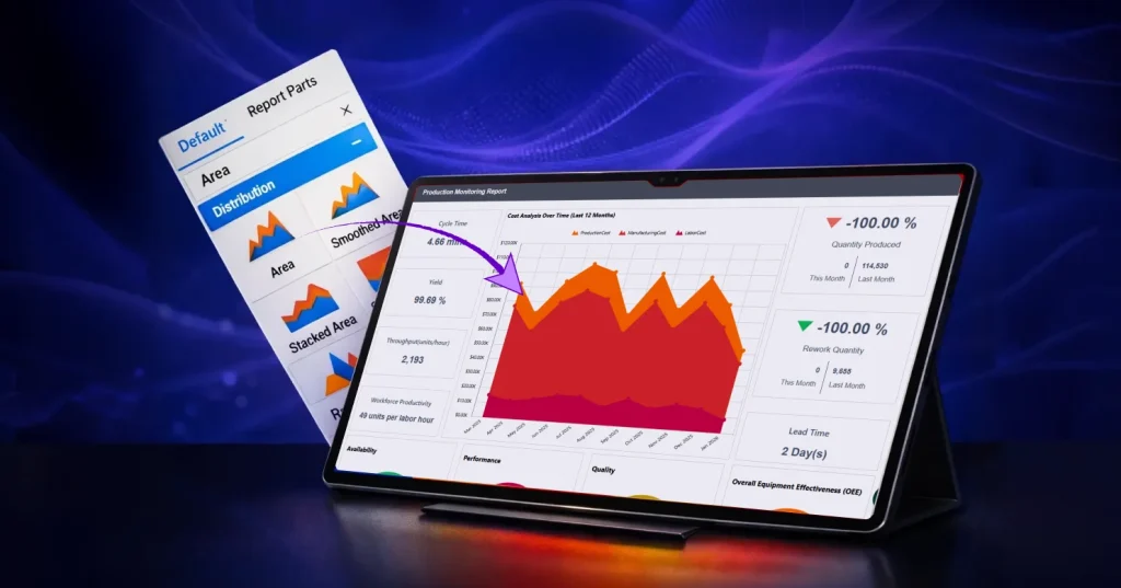
TL;DR: An area chart visualizes how values change over time by combining a line with a filled area to emphasize magnitude. It helps teams spot trends, understand cumulative movement, and when using stacked variations, to compare how categories contribute to a total.
Introduction
Many reports are packed with rows of numbers, making it difficult to recognize trends quickly, especially when tracking changes over time or comparing different categories. This challenge becomes even more pressing when stakeholders need fast insights and don’t have time to interpret spreadsheets.
An area chart in reports solves this by transforming raw data into a clear, time‑based visual story. Instead of scanning tables, readers can see the overall progression, spot peaks and dips, and with stacked charts, understand how each category contributes to the total.
In this blog, you’ll learn what an area chart is, the types of an area chart available in Bold Reports®, how to create and configure one, best practices for when to use and avoid them, real‑world reporting examples, and answers to frequently asked questions from report designers and BI teams.
What is an area chart?
An area chart is a line chart with the area under the line filled in to emphasize magnitude over time. It’s used to show trends, total progression, and (with stacked variations) category contribution across time intervals.
An area chart is especially useful when:
-
- You want readers to understand both direction (up/down) and size (how large values are).
- The “shape” of change matters more than exact point-by-point comparison.
- You need to communicate time-based movement clearly in a report.
Types of area charts in Bold Reports
Bold Reports offers multiple area chart variations, each suited for different analysis needs.
Here are the types of area charts available in Bold Reports:
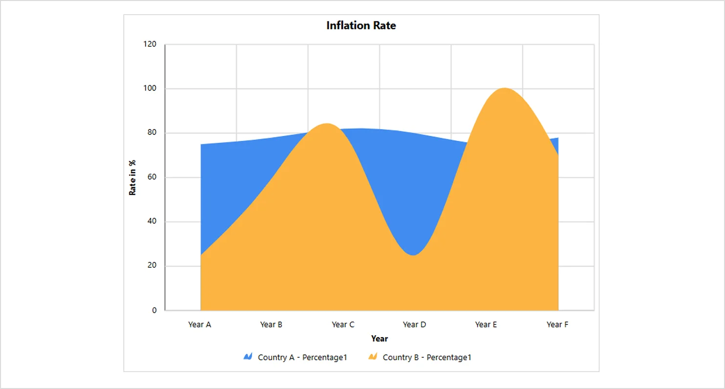
Smooth area chart
A smooth area chart is a refined version of the area chart with curved lines and softer transitions. It’s great for presenting trends with a polished, visually appealing flow.
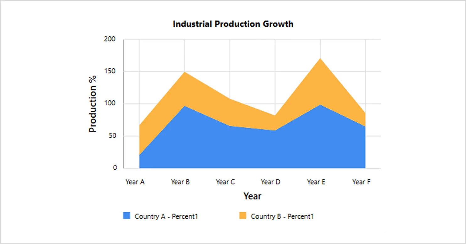
Stacked area chart
A stacked area chart is a type of area chart that compares multiple measures through vertically stacked, filled regions, making category contribution clear in trend analysis charts.
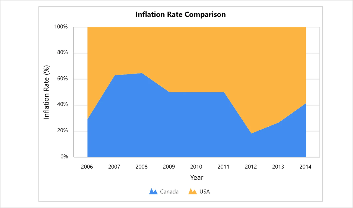
100% stacked area chart
A 100% stacked area chart shows each category as a percentage of the whole at every point in time. Instead of highlighting absolute values, it emphasizes how proportions shift over intervals.
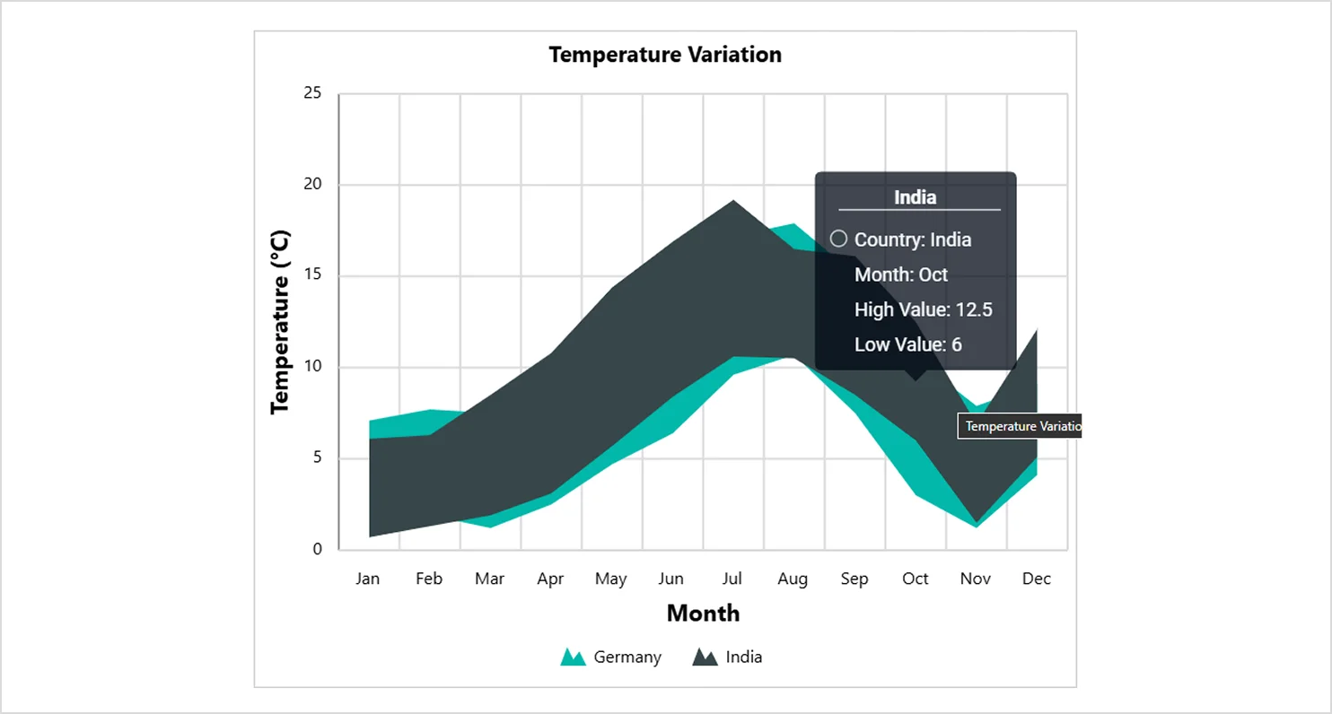
Range area chart
The range area chart visualizes the upper and lower bounds of values, such as confidence intervals, forecast ranges, or variability, using filled areas. It helps highlight uncertainty or spread in data.
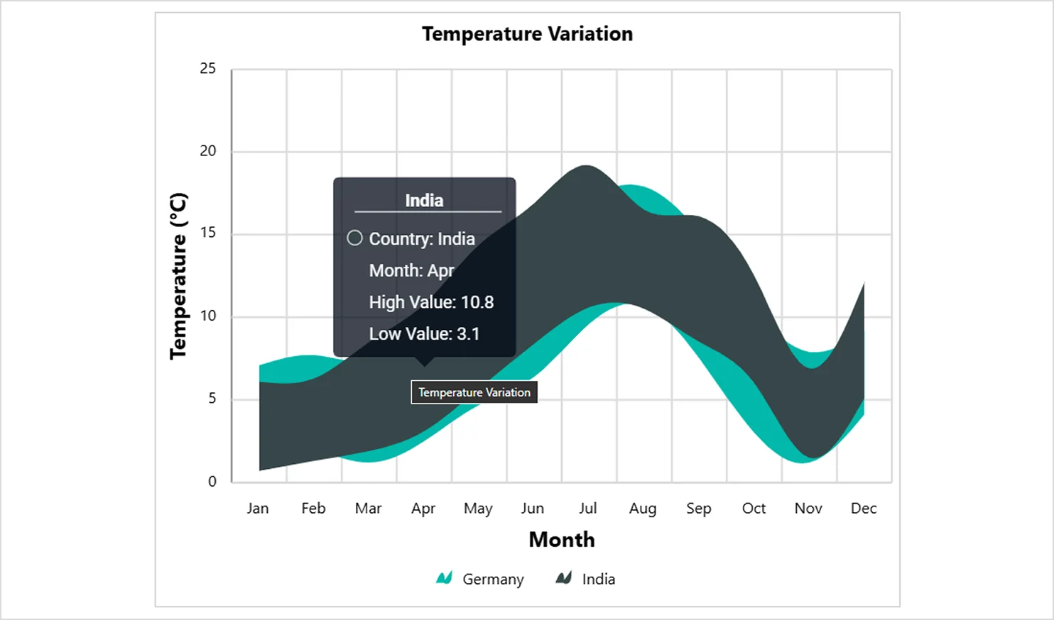
Smooth range area chart
The smooth range area chart is a variation of the range area chart where the upper and lower values are connected using smooth, curved lines. It visualizes a range of data by plotting two y‑values (high and low) for each data point and shading the area between them.
Features of an area chart in Bold Reports
An area chart in Bold Reports comes with a rich set of customization options that help you shape how your data is presented. The following are the features you can customize through the properties panel to fine‑tune the chart’s look, behavior, and output.
1. Chart basics (name, title, legend)
-
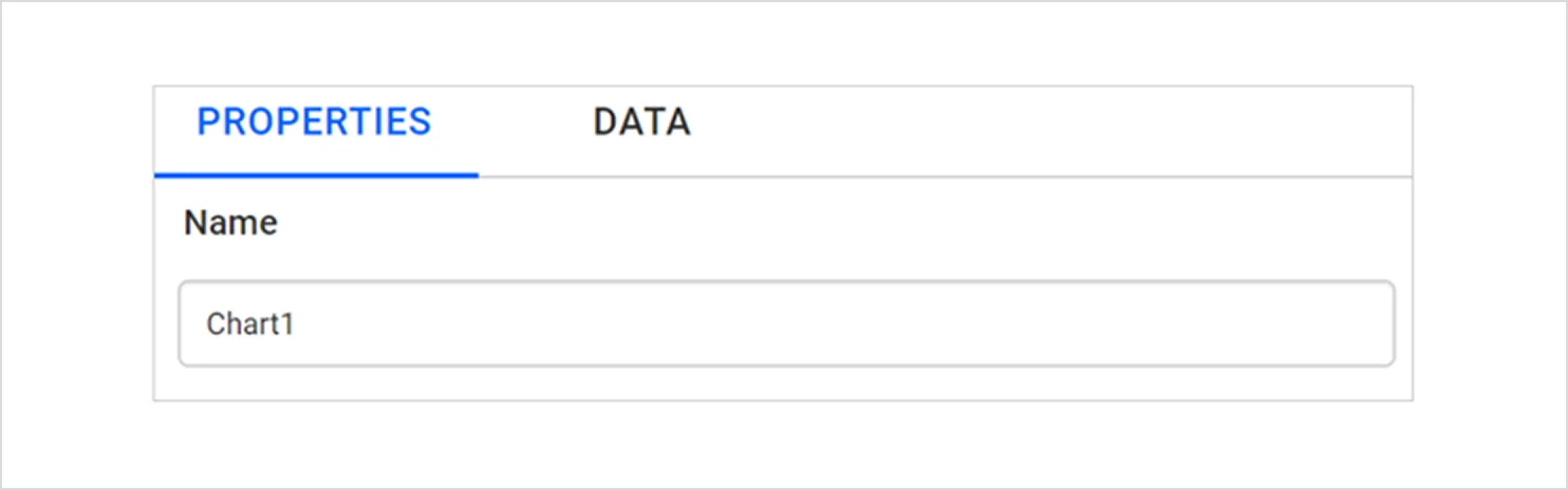
- Name: The name property assigns a unique name to the chart, making it easier to reference in complex reports.
-
- Title: The title section allows you to show or hide the chart title and customize the title text, font, color, and positioning.
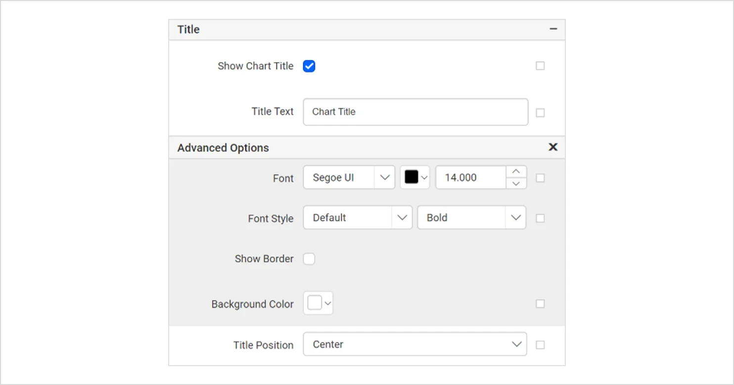
-
- Show legend: The show legend property enables you to display or hide the legend, which explains the data represented in the chart. It also allows customization of the legend’s text and appearance.
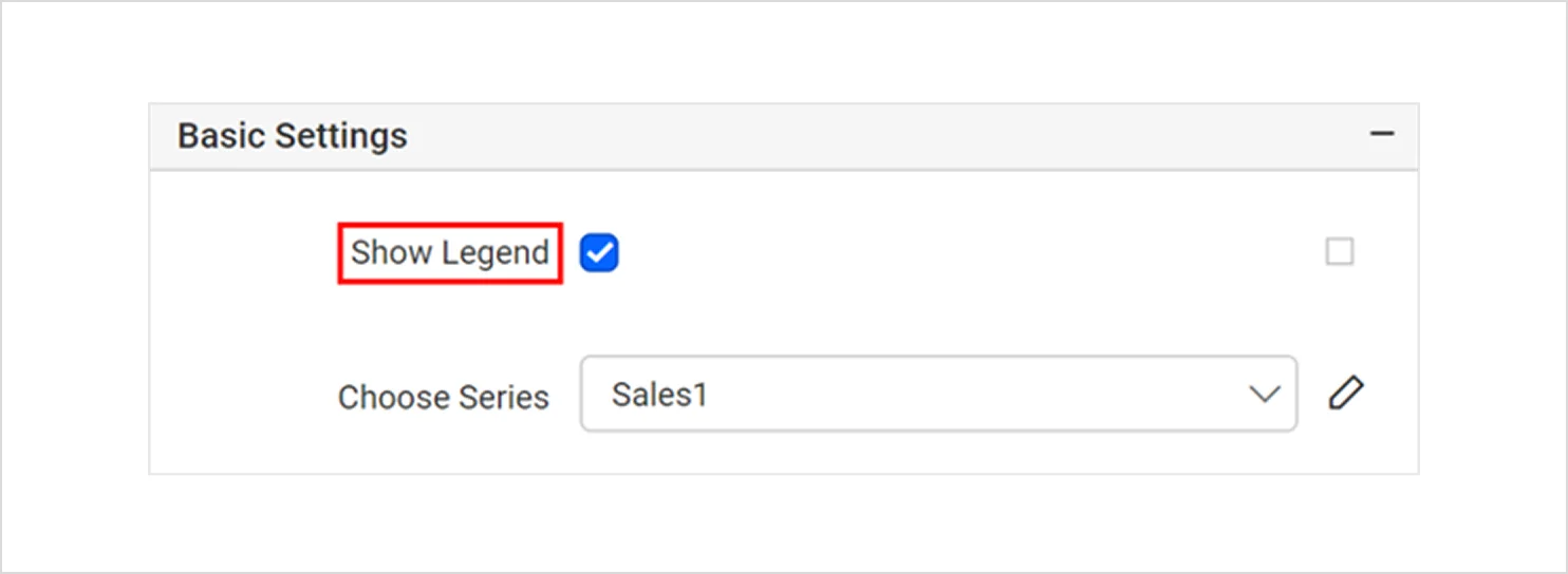
2. Data and series
-
- Choose series: The choose series feature allows you to add multiple data series and then select them to modify their visual style, formatting, or behavior.
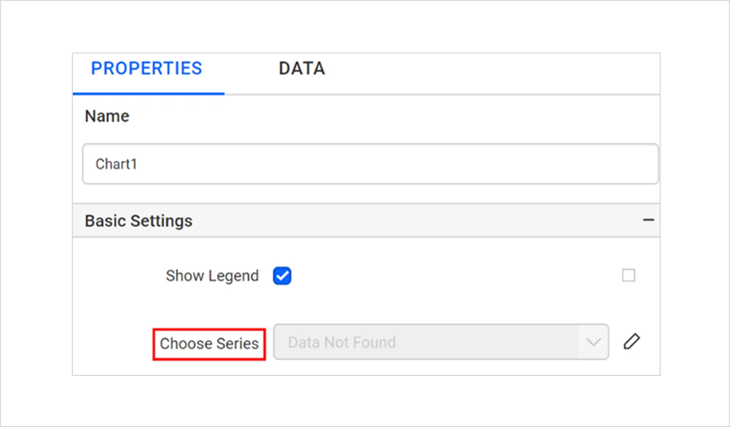
-
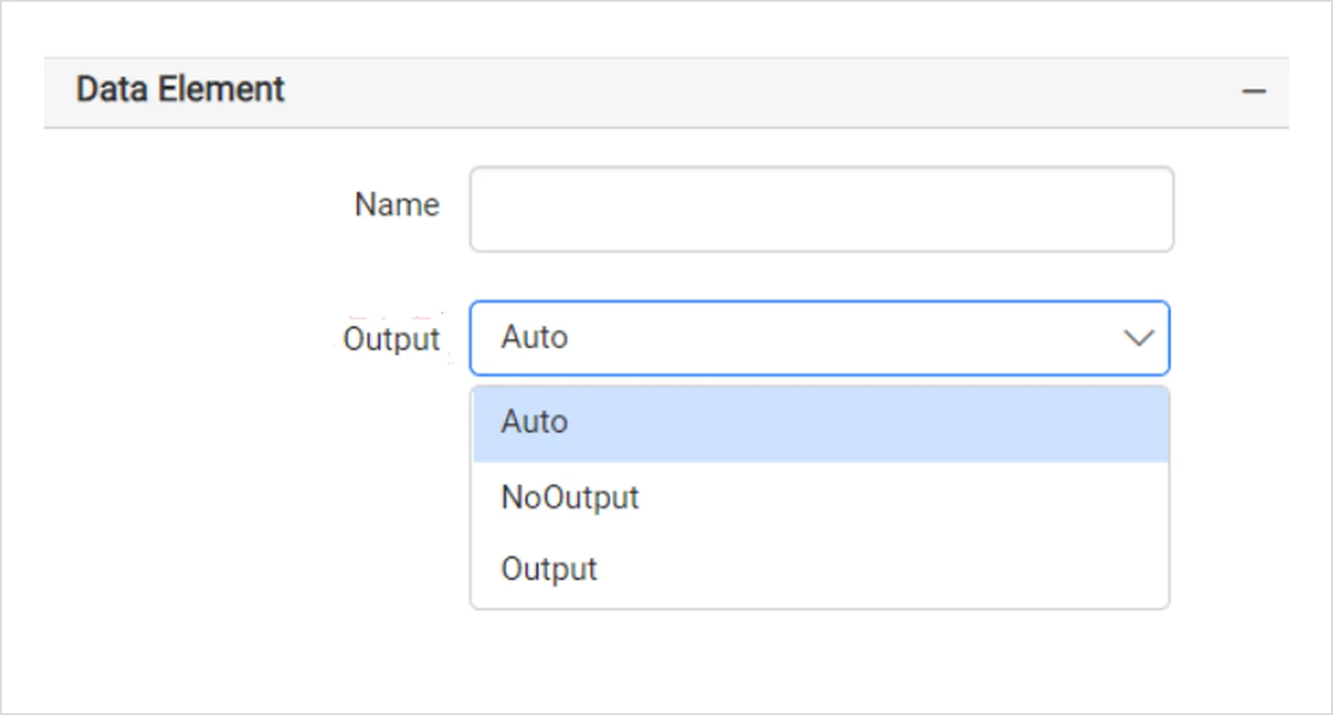
- Data element: Consists of two parts:
- Name: Defines how the chart is labeled in XML exports.
- Output: Output controls whether the chart is included in XML-based exports and other export outputs:
- Auto: Follows the default export behavior.
- Output: Forces the chart to be included.
- NoOutput: Excludes the chart from the export.
- Data element: Consists of two parts:
3. Styling (appearance, custom style)
-
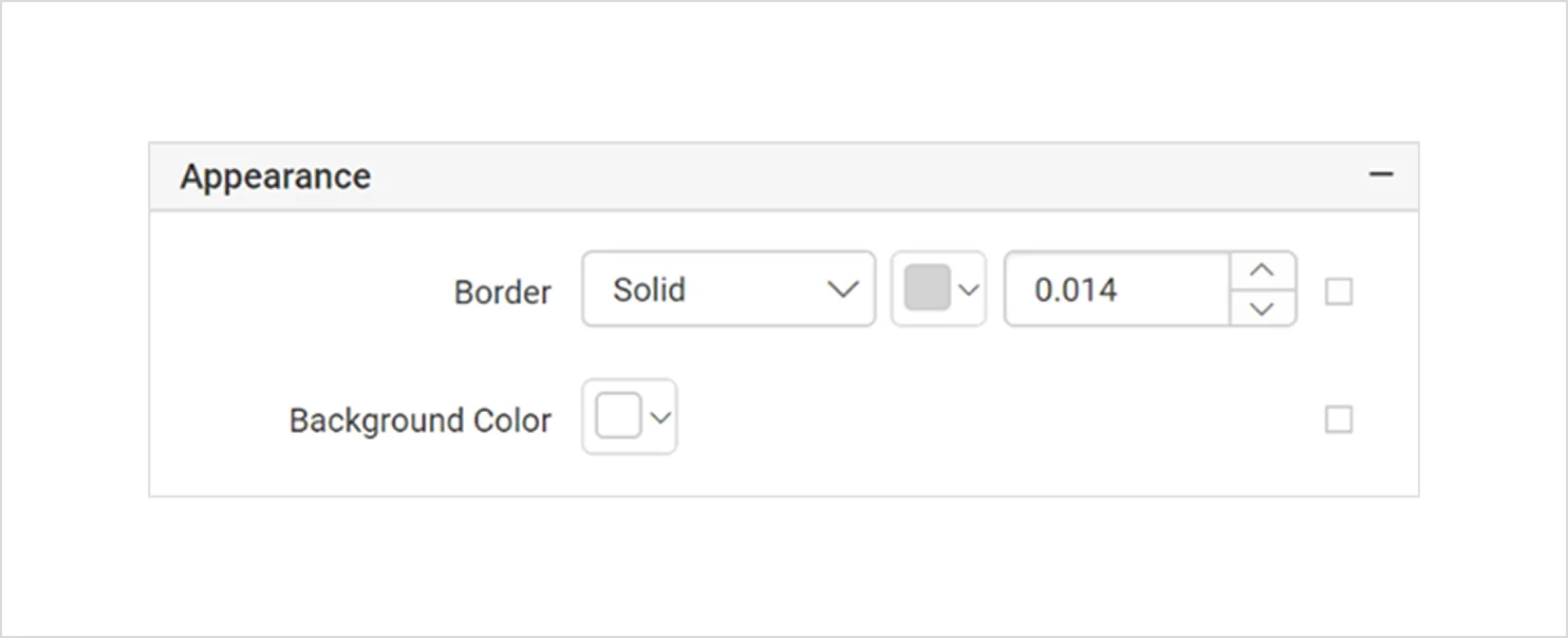
- Appearance: The appearance section provides styling options for the chart, including border properties, background color, and other visual elements.
-
- Custom style: This enables the use of external CSS to extend styling beyond default options to support specific branding or formatting requirements. To apply or modify external styles, refer to the custom style documentation.
4. Layout and export
-
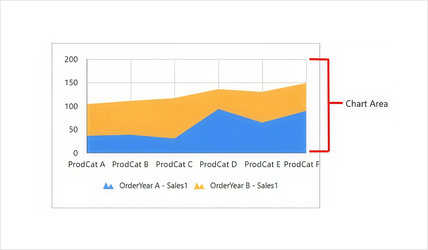
- Chart area: The chart area feature allows you to customize the main drawing area of the chart, including borders, shadows, offsets, and background settings.
-
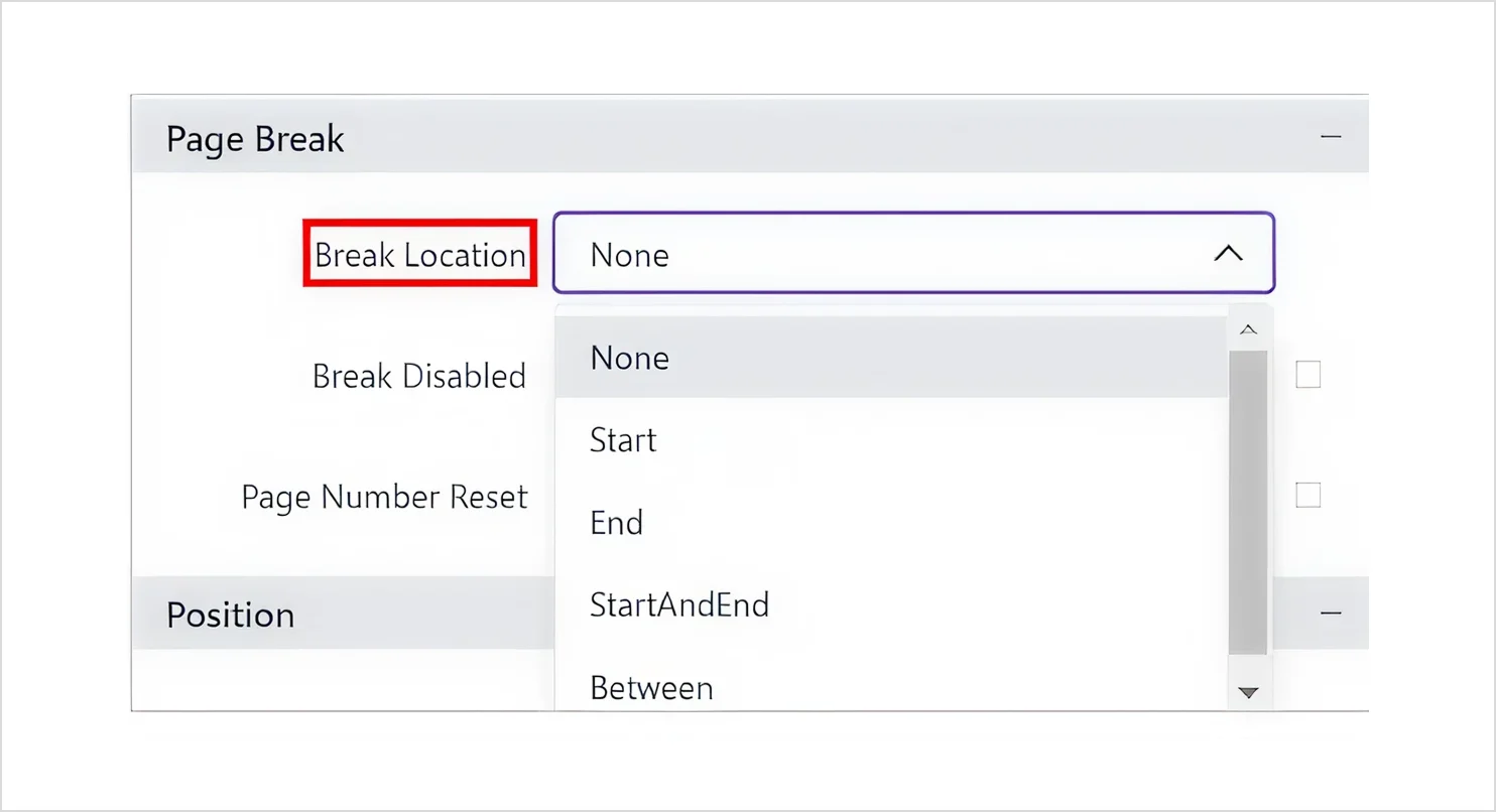
- Page break: The page break controls how the chart is divided across pages during printing or export, including break placement and page numbering behavior.
-
- Page name: This feature is used to define the worksheet or page name when the report is exported to Excel or Word. This helps organize multisheet or multipage exported documents for easier navigation. To set or modify this behavior, refer to the page name property.
5. Axes and grid line
-
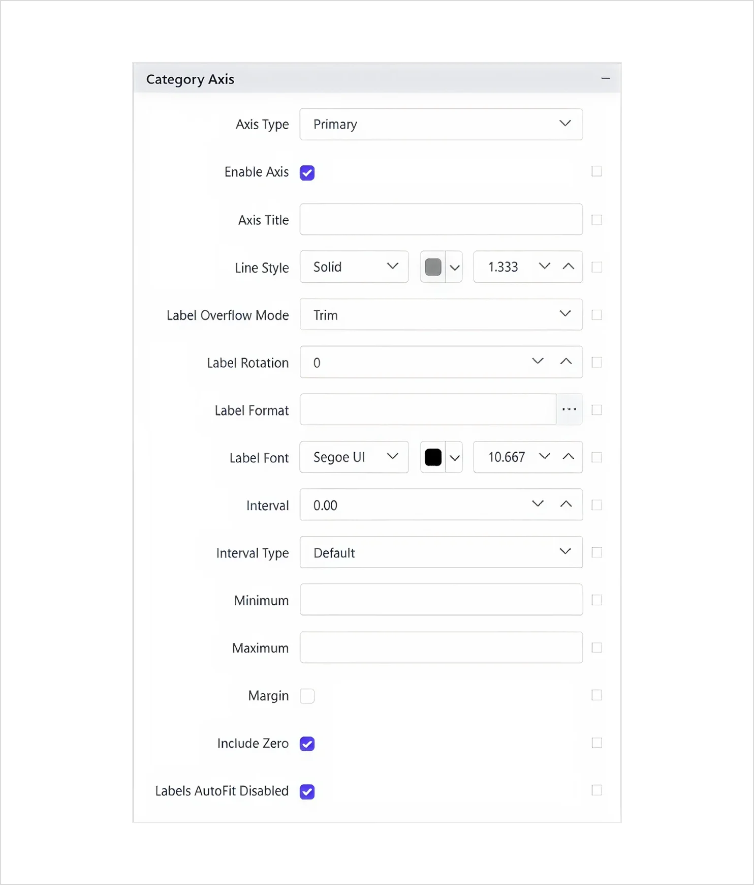
- Category axis: The category axis section enables a text-based axis, allowing labels such as dates, names, or grouping fields to be displayed instead of numeric values.
-
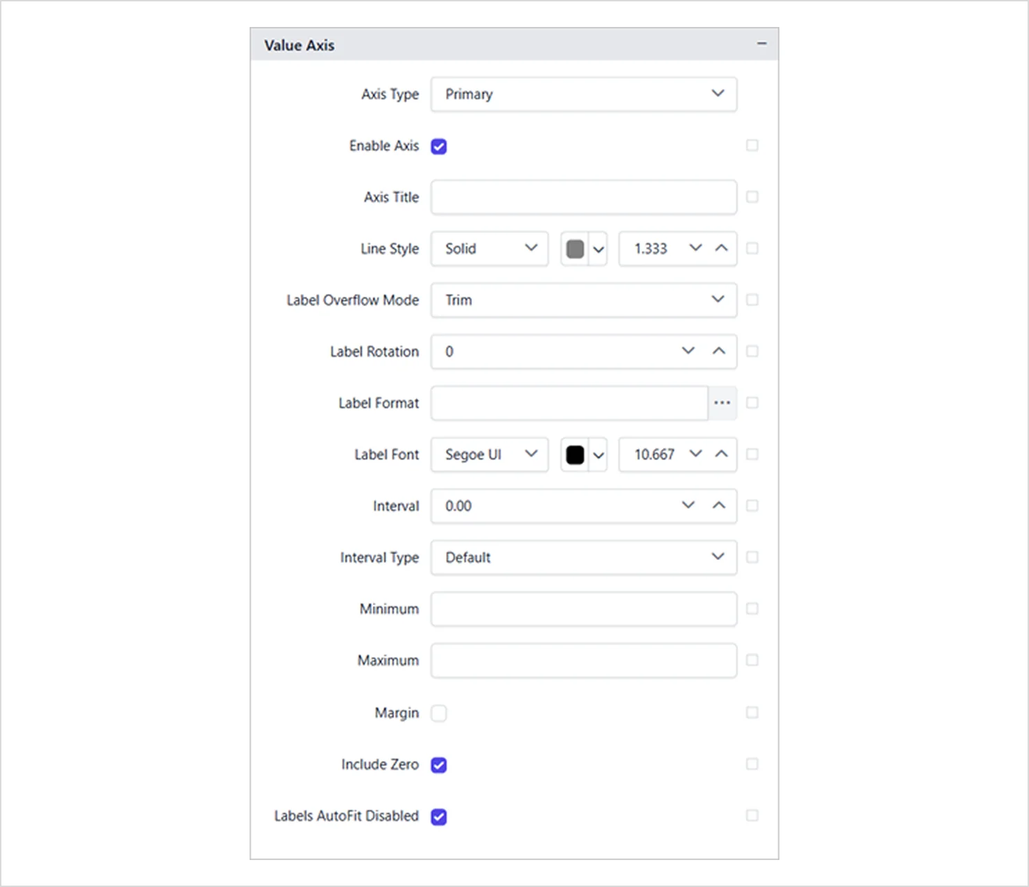
- Value axis: Enables the numeric axis and lets you configure its scale, number formatting, tick intervals, and label display for plotted values, including scaling options.
-
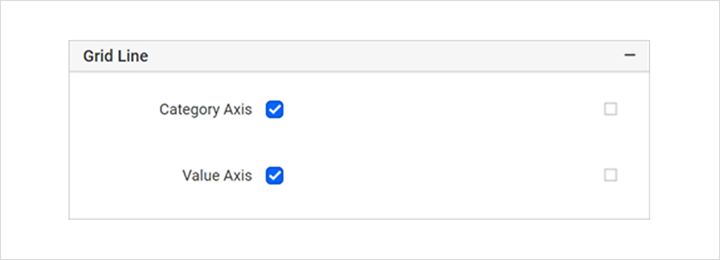
- Grid line: Allows you to turn on gridlines for the category axis and adjust the style of major and minor lines.
6. Interactivity and navigation
These properties control additional behaviors for navigation, labeling, interactivity, and styling. They include:
-
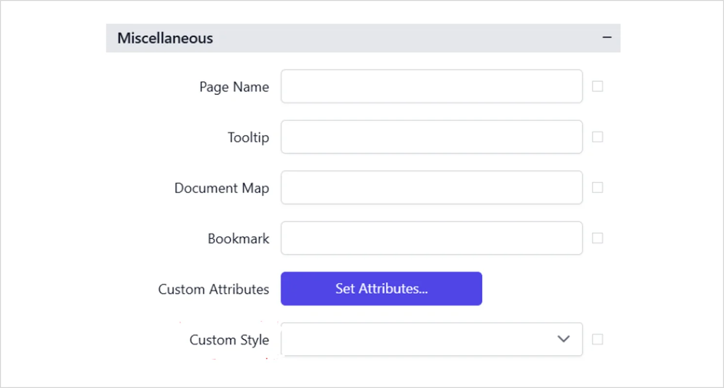
- Tooltip: A tooltip displays informative text or values when the user hovers over chart elements during report preview. To set or customize tooltip behavior, refer to the tooltip documentation.
- Document map: This feature adds the chart to the report’s navigation pane, allowing users to jump directly to it in long or structured reports. To configure its navigation behavior, refer to the document map documentation.
- Bookmark: This feature creates a navigation point inside the report, allowing users to move directly to the chart through links or document map entries.
- Custom attributes: These allow you to define additional key value properties for advanced customization or integration scenarios. Refer to the custom attributes documentation.
Refer to this documentation to learn more about the key features of an area chart in Bold Reports, explore other widget types, and understand how to use them effectively.
How to create an area chart in reports
To create an area chart in Bold Reports, follow these steps:
- Insert the area chart in the report by dragging it from the widget panel onto your report layout. Adjust the size and placement as needed.
- Prepare a dataset that includes at least one numeric field (Values) and one category field (Category), typically a date or month.
- Link your data to the chart by assigning:
- Values: the metric you want to measure.
- Category: the field that defines your timeline or grouping.
- Series (optional): a field to split the area into multiple groups or stacks.
- Refine the look and feel by customizing colors, transparency, markers, axes, and tooltip settings to improve clarity and presentation.
- Preview your report.
- Publish your report to complete your area chart reporting setup.
For a full step‑by‑step guide on configuring the area chart in reports, assigning data, and customizing its appearance, refer to this detailed area chart configuration documentation.
Benefits of using an area chart in reporting
An area chart helps teams interpret time-based data quickly, especially when magnitude and progression matter.
Key benefits
-
- Clear trend analysis: An area chart makes it easy to see how values rise or fall over time, helping teams quickly recognize growth patterns, declines, and seasonal shifts.
- Contribution comparison: A stacked area chart highlights how each category contributes to the overall total to give a clear view of distribution changes and category importance.
- Comparing multiple metrics: When multiple series are plotted together, an area chart reveals how different variables behave in relation to one another, enabling straightforward performance comparison.
- Tracking total progression: The filled‑area design naturally emphasizes cumulative movement, making it simpler to monitor overall increases or decreases across time.
- Communicating insights clearly: An area chart offers an intuitive visual format that helps stakeholders quickly grasp key information, improving communication and decision‑making across teams.
This makes area charts especially helpful for teams that need to understand patterns quickly.
When to use an area chart
Use an area chart when you want to:
-
- Track trends across a timeline (weekly signups, monthly revenue, daily usage).
- Show total progression where magnitude matters.
- Compare category contributions over time (stacked area).
- Highlight distribution changes (100% stacked area).
- Communicate patterns quickly to stakeholders.
When not to use an area chart
Do not use an area chart when you intend to:
-
- Compare precise values across categories or time points (use a bar chart or table).
- Show many series at once.
- Emphasize exact point-to-point differences (line charts are often clearer).
- Plot negative values without careful baseline handling, as filled areas may visually exaggerate or distort interpretation.
Real-world use cases of an area chart in reports
An area chart is used in different industries to visualize trends, totals, and distribution shifts over time. Here are the real‑world use cases of an area chart across various industries.
Marketing industry: Online marketing analysis report
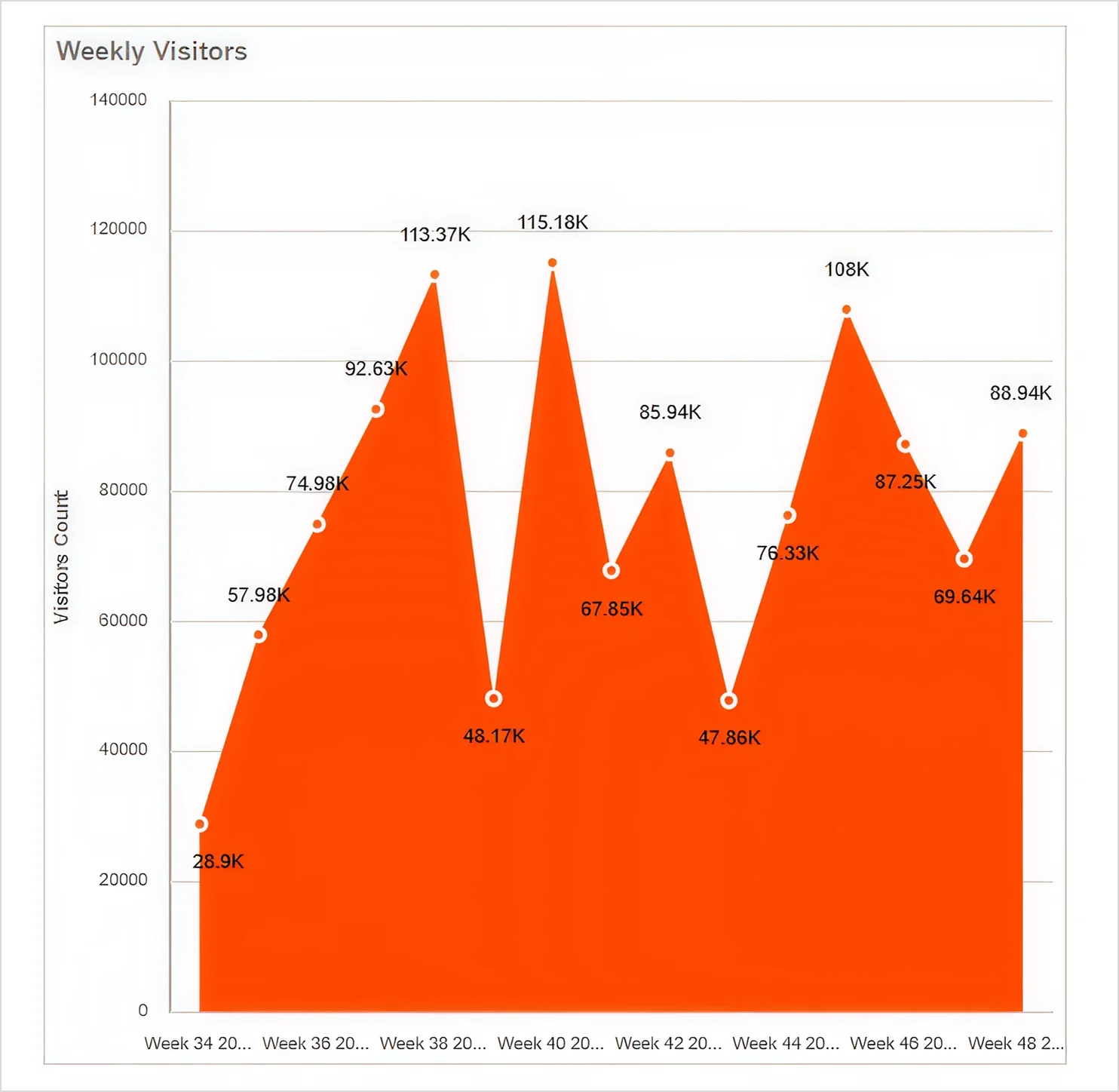
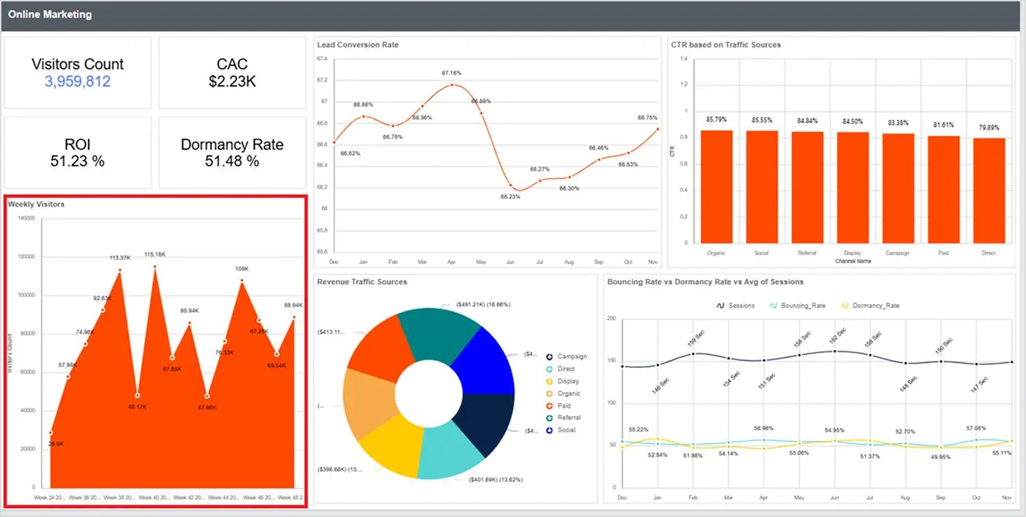
Marketing teams need to see weekly traffic changes fast. An area chart in an online marketing analysis report helps highlight total weekly visitors, making spikes, drops, and patterns easy to spot and campaign impact easier to evaluate.
Manufacturing: Production monitoring report
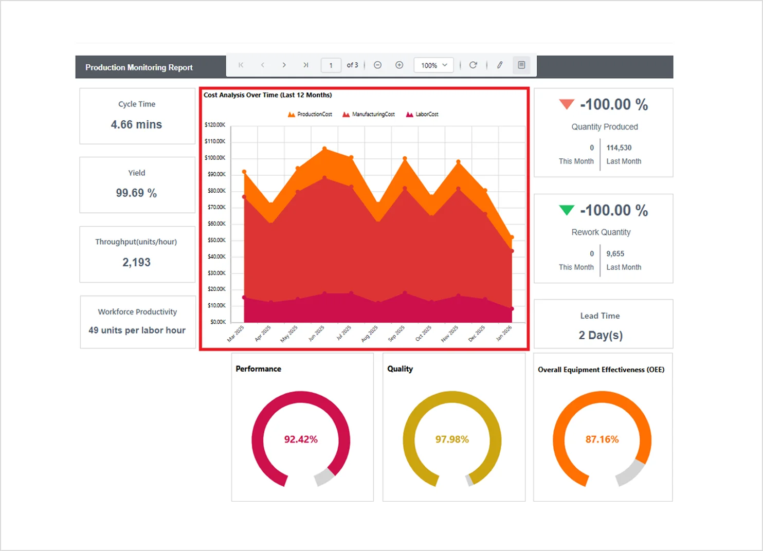
Production costs can change due to labor, materials, and demand. A stacked area chart in a production monitoring report shows each cost component over time, so teams can identify cost spikes and see which component is driving the total up.
Telecommunications: Network utilization analysis
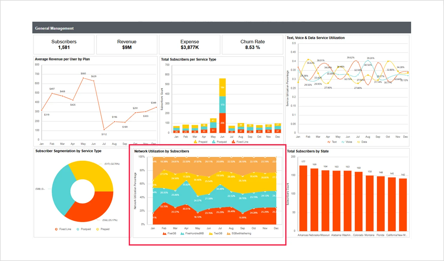
Service plan usage changes with promotions and seasonal demand. The 100% stacked area chart in the general management report shows how each plan’s share of total usage changes over time, supporting capacity planning and distribution analysis.
Transportation industry: Motor vehicle crashes analysis report
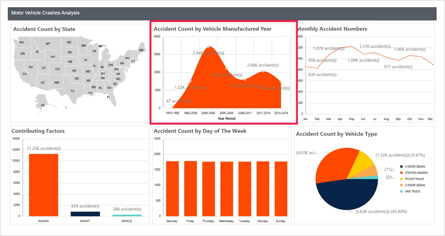
Safety teams may need to understand how crash frequency changes across years. An area chart in a motor vehicle crashes analysis report shows the number of crashes by the year of vehicle manufacture to reveal patterns, such as higher-risk older vehicles or improvements in newer ones.
Tips for visualizing data in an area chart
To keep an area chart easy to read in reports:
-
- Use an area chart to show magnitude over time: Choose an area chart when the goal is to highlight overall volume/total change across a timeline (not precise point-by-point comparisons).
- Reduce cognitive load: Avoid unnecessary visual effects (heavy gradients, 3D, thick borders). Simple fills and clean labels improve scalability.
- Limit the number of series: Too many stacked layers or overlapping areas make it difficult to track categories. If you have many categories, consider grouping, filtering, or switching to a different visualization.
- Use color intentionally: Choose colors with clear separation between series and keep opacity consistent. In stacked charts, add subtle boundaries between areas, so layers don’t blend.
- Make axes and units unambiguous: Label axes clearly, format numbers consistently, and use sensible tick intervals so the chart can be understood without hovering.
- Prioritize legibility: Use readable font sizes, avoid rotated labels when possible, and keep gridlines light, so they support reading without dominating the chart.
- Highlight what matters: If the chart is meant to communicate one key insight, annotate peaks and dips or add a short takeaway sentence, so the reader doesn’t have to infer the point.
Key takeaways
An area chart enhances data visualization by showing both trend direction and magnitude. With Bold Reports®, you can choose from a stacked area chart, a 100% stacked area chart, or a range area chart to suit different reporting needs, customize them for clarity, and turn complex datasets into clear, compelling stories.
Ready to turn your time‑series data into actionable visuals? Start a free 30-day trial to begin building an insightful area chart or book a personalized demo to see how Bold Reports can streamline your reporting workflow.
Frequently asked questions
- 1.
When should I use a stacked area chart?
Use a stacked area chart when you want to show how multiple categories contribute to a total across a timeline.
- 2.
How does an area chart differ from a line chart?
An area chart highlights both trend direction and magnitude through shading, while a line chart shows only the trend line.
- 3.
Can I use an area chart for real‑time data?
Yes, but keep the design simple to help maintain responsiveness and avoid visual clutter.





I appreciate the breakdown of the benefits of area charts, especially how they offer more context around data trends. It’s a great choice for reports that need to balance clarity with detailed insights.