Maximizing Data Insights with Polar Charts: A Comprehensive Guide

In today’s data-driven world, extracting meaningful insights from complex datasets lets organizations stay ahead of the competition. A polar chart is one useful tool for showing metrics. In this guide, we will explore how polar charts can help organizations interpret data and how to create them in Bold Reports®.
Understanding Polar Charts
Polar charts are graphical tools that display data using the polar coordinate system. Each data point is plotted as a point radiating from the center, making it easier to compare multiple variables simultaneously. This type of chart is particularly useful for visualizing data that spans multiple dimensions, such as performance metrics across departments or customer satisfaction across various service attributes.
Advantages of Polar Charts
Performance Benchmarking: Polar charts are particularly useful for benchmarking performance across different variables, facilitating quick identification of strengths and weaknesses.
Versatile Application: Suitable for a variety of applications, including market research, customer feedback analysis, and operational performance reviews.
Intuitive and Visual Appeal: Their circular design is not only visually engaging but also intuitive, enabling stakeholders to grasp complex data quickly.
Multidimensional Data Display: Polar charts excel at displaying multiple variables on a single chart, making them ideal for comparative analysis.
How to Create a Polar Chart with Bold Reports
Step 1: Configure the Data for the Polar Chart
A polar chart requires at least one value element and one column element to display data. You can use the Query Builder to create a dataset or bind the data directly using JSON inline data.
{
points: [
{ Month: 'Jan', Celsius: -7.1 }, { Month: 'Feb', Celsius: -3.7 },
{ Month: 'Mar', Celsius: 0.8 }, { Month: 'Apr', Celsius: 6.3 },
{ Month: 'May', Celsius: 13.3 }, { Month: 'Jun', Celsius: 18.0 },
{ Month: 'Jul', Celsius: 19.8 }, { Month: 'Aug', Celsius: 18.1 },
{ Month: 'Sep', Celsius: 13.1 }, { Month: 'Oct', Celsius: 4.1 },
{ Month: 'Nov', Celsius: -3.8 }, { Month: 'Dec', Celsius: -6.8 }],
Country: 'Warmest'
}
{
points: [
{ Month: 'Jan', Celsius: -17.4 }, { Month: 'Feb', Celsius: -15.6 },
{ Month: 'Mar', Celsius: -12.3 }, { Month: 'Apr', Celsius: -5.3 },
{ Month: 'May', Celsius: 1.0 }, { Month: 'Jun', Celsius: 6.9 },
{ Month: 'Jul', Celsius: 9.4 }, { Month: 'Aug', Celsius: 7.6 },
{ Month: 'Sep', Celsius: 2.6 }, { Month: 'Oct', Celsius: -4.9 },
{ Month: 'Nov', Celsius: -13.4 }, { Month: 'Dec', Celsius: -16.4 }],
Country: 'Coldest'
}
]
Note: Refer to the Create Data documentation for more information. Here, we are going to create a dataset using JSON inline data to design the report.
Step 2: Add a Polar Chart to the Report
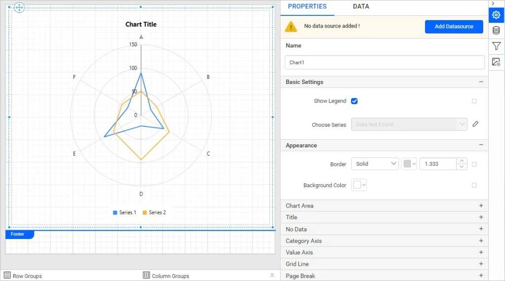
Add a polar chart to your report. Simply drag the polar chart item from the item panel and drop it into the design area. Once you do this, the chart will appear in the design space, and you can view and adjust its properties in the Properties panel.
Step 3: Assign Data to the Polar Chart
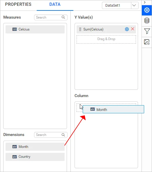
To assign data to the polar chart, click the Data tab on the Properties panel. The fields in the dataset will be displayed. The numeric columns and expressions are listed in the Measures section, while the remaining types of expressions and dimensions are listed in the Dimensions section.
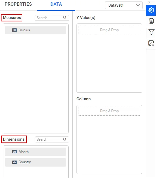
Drag the fields from these sections to assign values. When assigning data in each field, the chart is refreshed in the design area.
Step 4: Format the Polar Chart
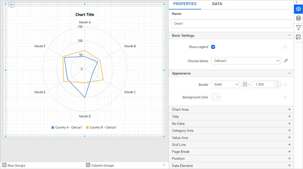
Format the polar chart to ensure it’s both visually appealing and informative. To format our polar chart, we go back to the Properties panel. Make sure your chart title and data labels are informative, choose contrasting colors, and add a legend. Adjust other properties until the metric is displayed clearly and appealingly.
Step 5: Preview and Export the Report
To preview the report, we switch from Design to Preview in the top panel.
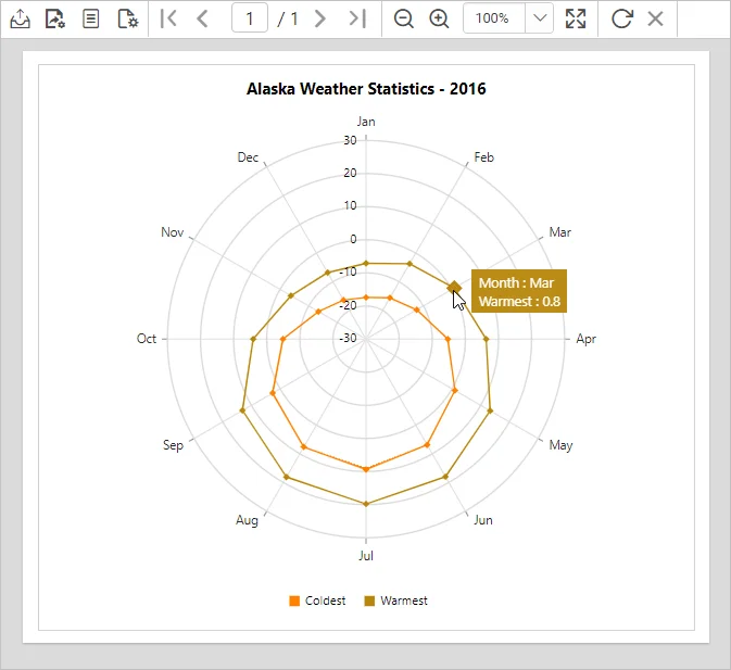
You can download a sample report of a polar chart from GitHub.
Conclusion
Polar charts are a powerful tool for organizations looking to maximize their data insights. By effectively utilizing this versatile visualization method in reports, businesses can understand their data better. As with any analytical tool, the key to success lies in thoughtful implementation and adherence to best practices.
Bold Reports® offers a 30-day free trial with no credit card required. We welcome you to start one and experience the full potential of Bold Reports.