Smooth Line Charts in Reports: When and How to Use

TL;DR: Smooth line charts help present trends more clearly by reducing visual noise and making data patterns easier to interpret. They are especially useful when analyzing time-series or fluctuating datasets where readability matters. In reports, smooth line charts improve clarity, storytelling, and decision-making without altering the underlying data.
Introduction
Line charts are among the most widely used visualizations in reporting, especially for tracking trends over time. But when datasets contain frequent fluctuations or dense data points, a standard line chart can quickly become cluttered and difficult to interpret. This is where smooth line charts become especially valuable. By visually softening transitions between data points, smooth line charts highlight overall trends more clearly while still preserving data accuracy. They are particularly useful in analytical and business reports where clarity, readability, and high‑level insight matter more than moment-to-moment variation.
In this guide, we explore what smooth line charts are, when to use them, how to configure them, and how different industries apply them in real reporting scenarios. Let’s get started.
Understanding a smooth line chart in reports
A smooth line chart is a type of line chart used to visualize trends in continuous data over a period of time. Unlike a standard line chart that connects data points with straight segments, a smooth line chart uses curved, flowing lines to connect the points. This creates a more polished visual representation and highlights gradual changes or patterns in the data.
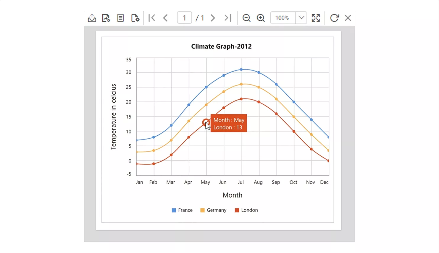
Understanding what a smooth line chart is lays the foundation for why it is so effective. Before diving deeper, let’s explore why it is important for data visualization.
Benefits of visualizing data through a smooth line chart
Adding smooth line charts to your reports offers several advantages:
- Shows trends clearly: Smooth line charts make it easy to see the overall trend by connecting data points with clean, flowing curves.
- Makes reports look cleaner and more polished: The smooth curves improve visual appeal, making reports easier to read and more professional‑looking.
- Helps simplify complex data: When data fluctuates a lot, smooth line charts reduce visual noise and make the information easier to understand.
- Communicates insights more effectively: By presenting data in a smooth, readable format, insights become clearer and more impactful in reports.
Now that we’ve looked at the advantages, let’s turn to the practical side and walk through how to configure a smooth line chart in reports.
How to configure a smooth line chart in reports
To configure a smooth line chart in Bold Reports, follow these steps:
- Drag and drop the smooth line chart from the Distribution category in the item panel into the design area. Resize it as needed.
- Open the Properties panel and switch to the DATA tab to assign your dataset.
- Add a numeric field from Measures to the Y Value(s) section, then drop a category field such as Month from Dimensions into the Columns.
- If you want to compare multiple lines (like different countries), add a series field to the Row(s).
For more details on preparing data or customizing formatting, refer to the documentation.
Once the basic setup is complete, the next step is exploring the features that give smooth line charts their flexibility and visual impact.
Features of the smooth line chart
Smooth line charts offer a wide range of formatting and customization options that help you present trend data more clearly and professionally in Bold Reports. Key features include:
-
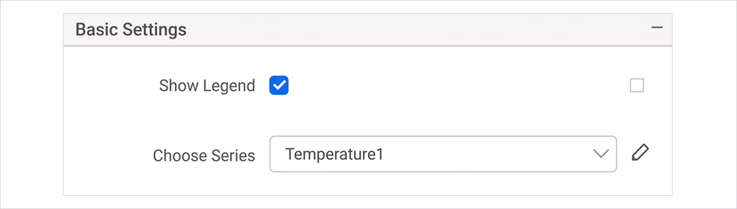
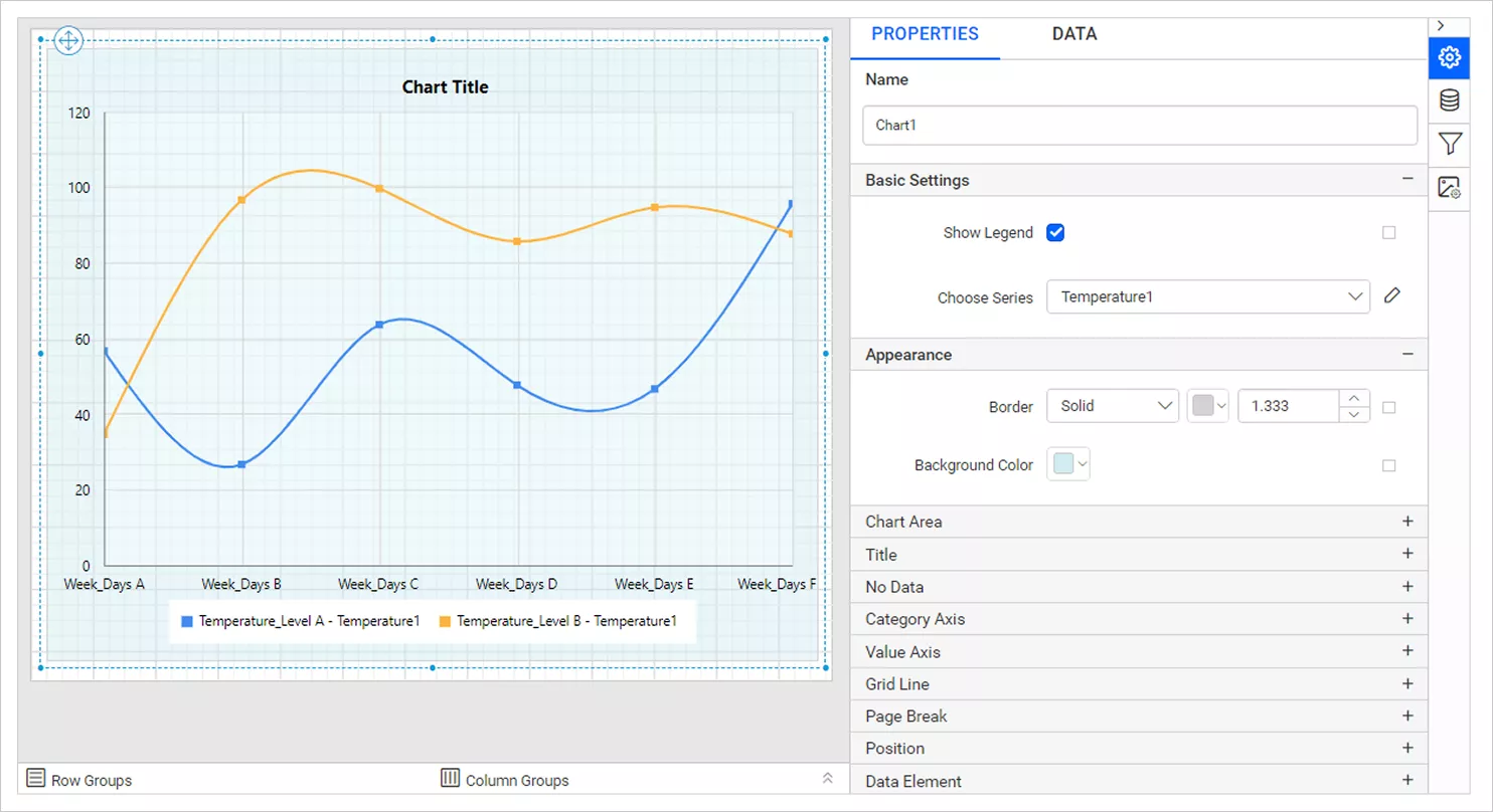
- Basic settings: You can set up essential chart properties like choosing the chart type and connecting your data before moving into detailed styling. These form the foundation for how the chart will behave.
-
- Appearance: You can adjust visual elements such as borders, backgrounds, and colors. These controls help you match the chart’s look to your overall report design or organizational branding.
-
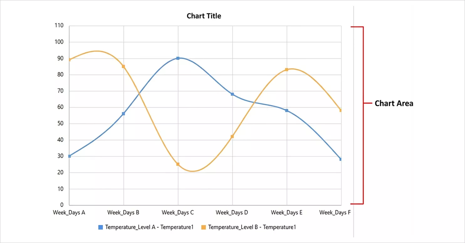
- Chart area: The chart area settings let you modify the space where the chart is drawn. You can change background styles, borders, shadows, and palette options to create a cleaner, more refined presentation.
-
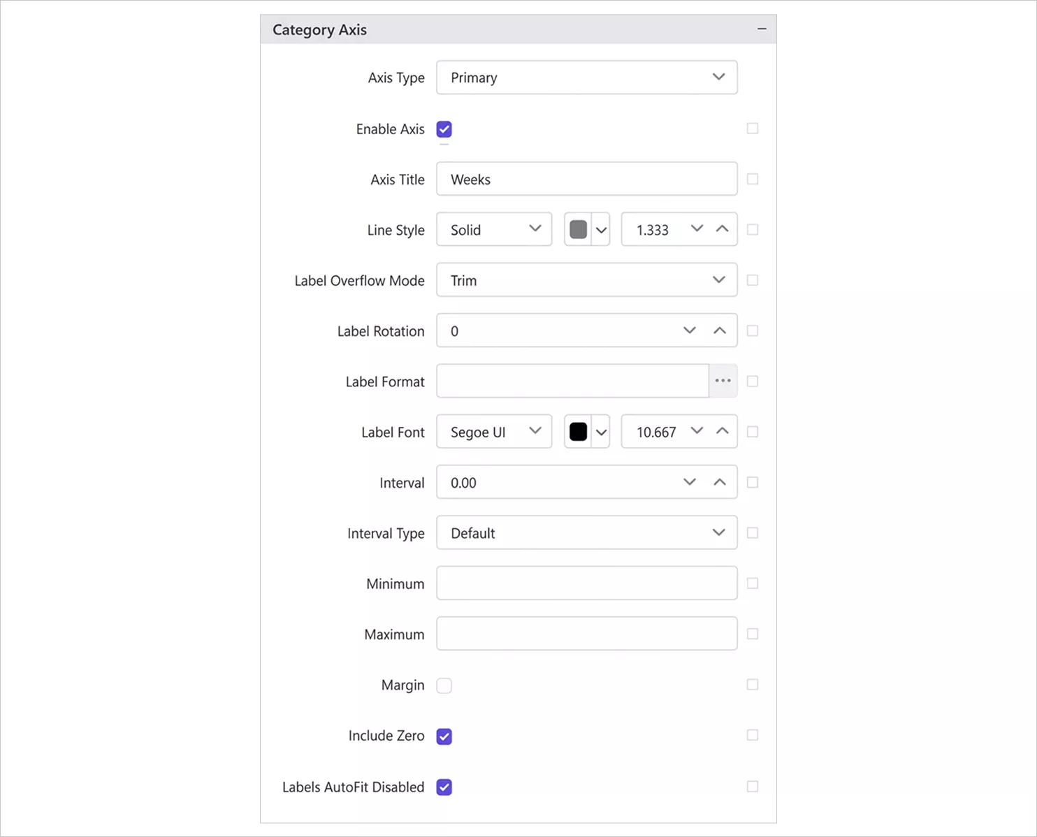
- Category and value axes: These settings let you customize how your axes look and function through labels, intervals, number formatting, scaling, and tick marks. This helps the viewer understand timelines, numeric values, and categories without confusion.
-
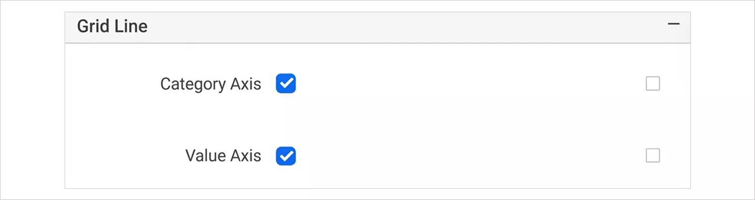
- Grid lines: You can turn major and minor grid lines on or off and adjust their style. Grid lines make it easier to compare values across the chart and follow trends more accurately.
-
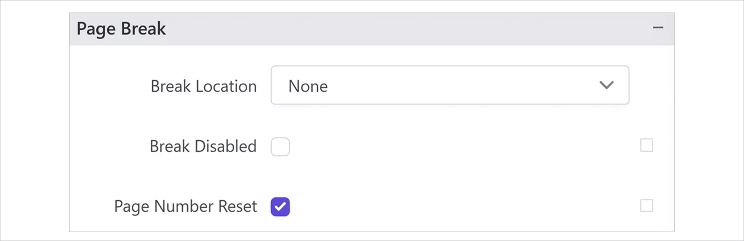
- Page breaks: Control how the chart behaves when printed or exported. You can determine whether the chart stays together on one page or breaks across pages more neatly.
-
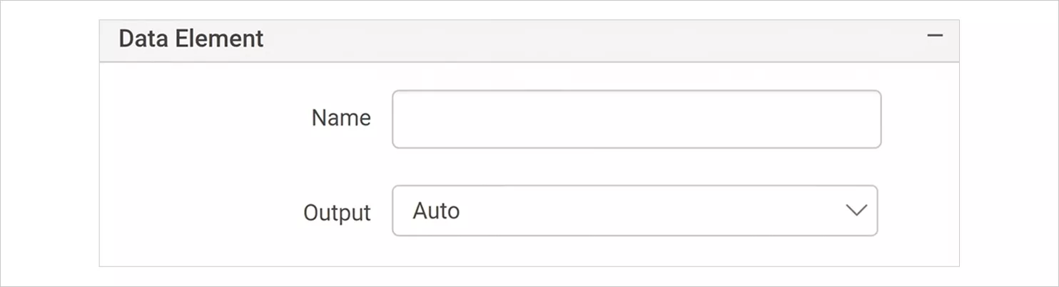
- Data elements: These settings define how the chart’s data is exposed when exporting to formats like XML or CSV. This is useful when the chart needs to be integrated with automated workflows or external systems.
-
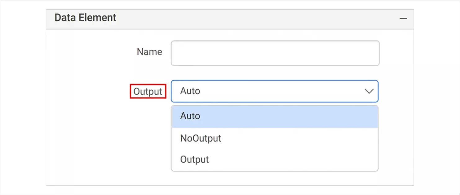
- Output: This feature lets you decide whether the chart should appear in specific export formats. For example, you may include the chart in a PDF but exclude it from Excel if needed.
-
- Page name: Assign a custom sheet or page name that appears when exporting to Excel or Word. This makes navigation easier in multi‑sheet or multi‑page files.

-
- Document map: Adding the chart to the document map creates a clickable entry that helps readers jump directly to the chart, especially in PDF exports.
- Bookmarks: Bookmarks act like internal reference points. They allow users to navigate to the chart using links or document map entries, making large reports easier to move through.
- Custom attributes: You can attach additional metadata to the chart through key value attributes. This supports advanced scenarios like automation, integration, or custom processing.
With a clear view of the available customization options, it becomes easier to identify when smooth line charts offer the most value.
For a deeper dive into these capabilities, check out the smooth line chart help guide to explore how each feature works in practice.
When is a smooth line chart effective?
A smooth line chart works well in scenarios such as:
-
- Showing trends over time or continuous ranges, especially when the relationship between points is gradual rather than abrupt.
- Highlighting minimums, maximums, and subtle fluctuations, where the curvature helps emphasize peaks and dips.
- Displaying smoother transitions between data points, making the visualization more visually appealing and easier to follow.
- Representing data that requires interpolation, allowing viewers to understand estimated values between recorded points.
- Visualizing seasonal or cyclical patterns, where smooth curves help reveal recurring behavior.
- Comparing multiple series with subtle differences, since the smooth lines help distinguish gentle changes.
- Emphasizing the rate of change, making acceleration or deceleration between points more visually apparent.
When not to use a smooth line chart
Avoid using smooth line chart in these situations:
-
- For categorical or nominal data, where values are not continuous.
- When precise data points are critical, since smoothing may introduce misleading interpolations.
- If the dataset contains significant outliers, which can distort the curve and misrepresent trends.
- When the relationship is known to be strictly linear, where a straight line would be more appropriate and accurate.
- When data is discontinuous or contains sharp, abrupt changes, as smoothing can hide important details.
- When values are categorical rather than numerical or based on time, making a smooth curve inappropriate.
Understanding when to avoid smooth line charts is just as important. With that context, let’s look at how different industries apply them effectively.
How different industries use smooth line charts in reports
Below are real-time smooth line chart use cases drawn from practical reporting scenarios.
Marketing: Website visitor analysis
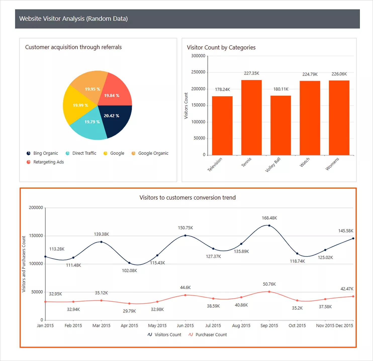
In marketing, tracking campaign performance is difficult because website traffic and engagement often fluctuate sharply from day to day. These unpredictable spikes make it hard to see genuine momentum or behavioral trends. Using a smooth line chart in the website visitor analysis report reduces this noise, making session and conversion patterns easier to follow and interpret.
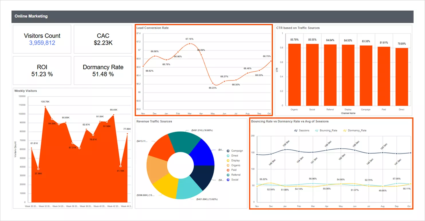
Online marketing report
Online marketing data like clicks, impressions, and conversions tends to spike or drop unpredictably due to ad auctions, competitor activity, or budget adjustments. This irregularity makes it hard for marketers to see whether performance is genuinely improving or just reacting to short-term fluctuations. Smooth line charts help by revealing the underlying trend, allowing teams to evaluate campaign effectiveness more accurately and optimize their strategies with confidence.
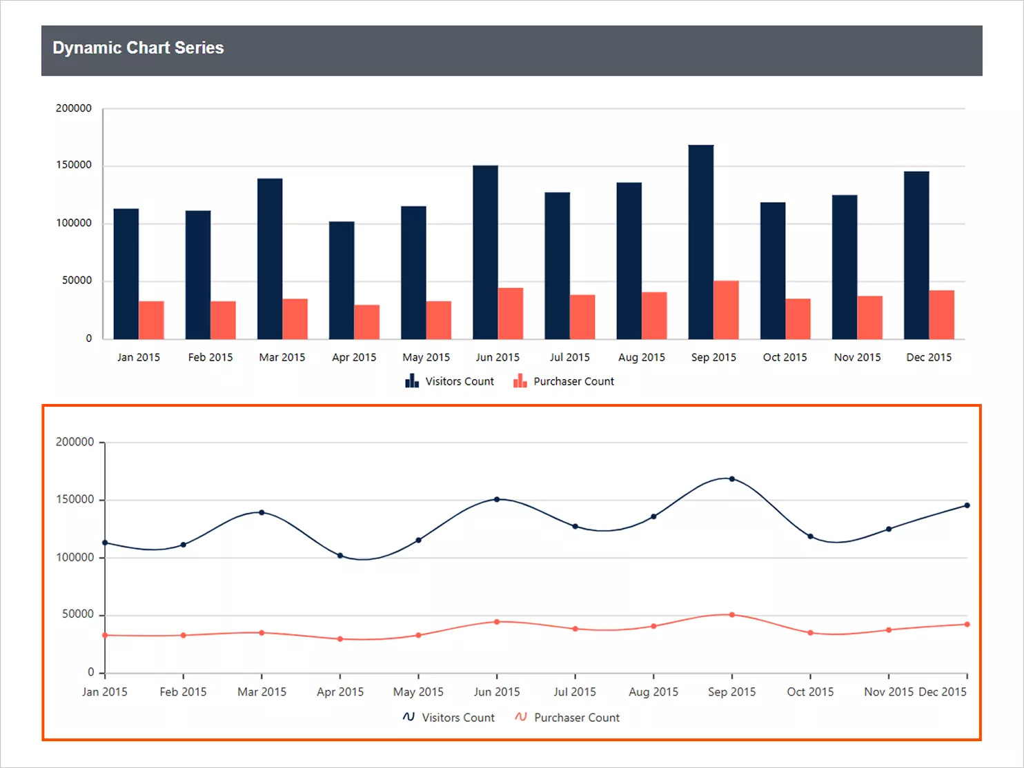
E‑commerce: Dynamic chart series
Website visitor metrics often show erratic movement caused by external events, promotions, or automated traffic, making it difficult to identify stable engagement patterns. This inconsistency can lead to misinterpretation of user behavior and poor content or SEO decisions. Smooth line charts clarify long-term visitor trends by softening sharp variations, helping teams quickly identify real growth opportunities or issues affecting user engagement.
Seeing how various teams use smooth line charts highlights their versatility. To make the most of them, let’s walk through some proven best practices.
Best practices for smooth line charts
The following are the best practices for using smooth line charts in reports effectively:
-
- Use continuous or time‑based data: Smooth line charts work best with data that progresses naturally over time or in a continuous numeric sequence.
- Keep the number of lines reasonable: Too many series can make the chart hard to read. Only include the essential lines needed for comparison.
- Show markers sparingly: Use markers only when necessary. Too many markers clutter the chart and reduce readability.
- Tune axis intervals and start the Y‑axis at zero: Choose appropriate axis spacing and, when possible, begin the Y‑axis at zero to maintain accurate visual representation.
- Mind outliers: Outliers can distort the smoothed curve. Review unusual values so the shape of the line remains meaningful.
- Add a clear and concise chart title: A good title quickly communicates what the chart is about without the viewer needing to decode it.
- Use light gridlines to guide the reader: Subtle gridlines help viewers follow values across the chart while keeping the visual clean.
- Include a visible, well‑placed legend: When displaying multiple lines, a legend ensures each data series is easy to identify and interpret.
By following these guidelines, you can ensure your smooth line charts remain accurate, readable, and visually effective across any reporting scenario.
Conclusion
Smooth line charts offer a powerful way to transform noisy trend data into clear, readable insights. Whether you’re spotting seasonal patterns, comparing multiple groups, or preparing stakeholder‑ready presentations, smooth line charts enhance clarity and storytelling.
Bold Reports® makes this even easier with strong customization, flexible data binding, reliable exports, and consistent rendering across formats. If you’re aiming to deliver cleaner, more insightful visualizations, smooth line charts are an essential tool.
Get started with Bold Reports today. Sign up for a free trial or request a personalized demo to see how effortlessly you can build export-ready smooth line charts and deliver clear, modern visualizations across all chart types.
Frequently asked questions
- When should I use a smooth line chart instead of a regular line chart?
Use a smooth line chart when you need clearer trends, reduced noise, and improved seasonal visibility. - Can Bold Reports support multiple smooth lines on one chart?
Yes, add a grouping dimension to the rows section to create multiple smooth lines. - Will smooth line charts export cleanly to PDF or Word?
Yes. They maintain clarity, markers, and styling across all export formats. - Do smooth line charts help reduce clutter in dashboards?
Absolutely. Their curved design makes multi-series trends easier to interpret.