Bar Chart in Reports: What It Is, Types, and Use Cases

TL;DR: When teams look at reports filled with rows of numbers, it becomes difficult to understand which category is performing well or falling behind. A bar chart presents this information visually and makes comparisons clear, which helps readers reach conclusions faster. This guide explains what a bar chart is, the types available in Bold Reports®, how to build one, and real cases where it improves decision-making.
Introduction
Many teams rely on reports to compare categories and track performance, yet it can still be difficult to interpret what the differences truly mean. Bar charts in reports help by turning those variations into clear visual comparisons that make notable values easy to notice. This removes guesswork and reduces the time spent interpreting dense tables or complex visuals. Bold Reports enhances this clarity by providing purpose‑built bar chart options designed for straightforward comparisons and quick understanding. With the right type of bar chart in place, teams can easily spot trends, outliers, and areas that require attention. Before exploring what bar charts mean in reports, here’s who will benefit most from this guide.
Who this guide is for
This guide is for teams responsible for building clear, effective reporting experiences, including:
-
- Business leaders and analysts who work with recurring performance summaries.
- BI developers who prepare datasets and publish reports for broad audiences.
- Report designers who focus on layout, readability, and effective chart communication.
If you need clarity when comparing categories or summarizing performance, a bar chart will help. Let’s start by understanding what a bar chart is and what it is designed to show.
Understanding bar charts in reports
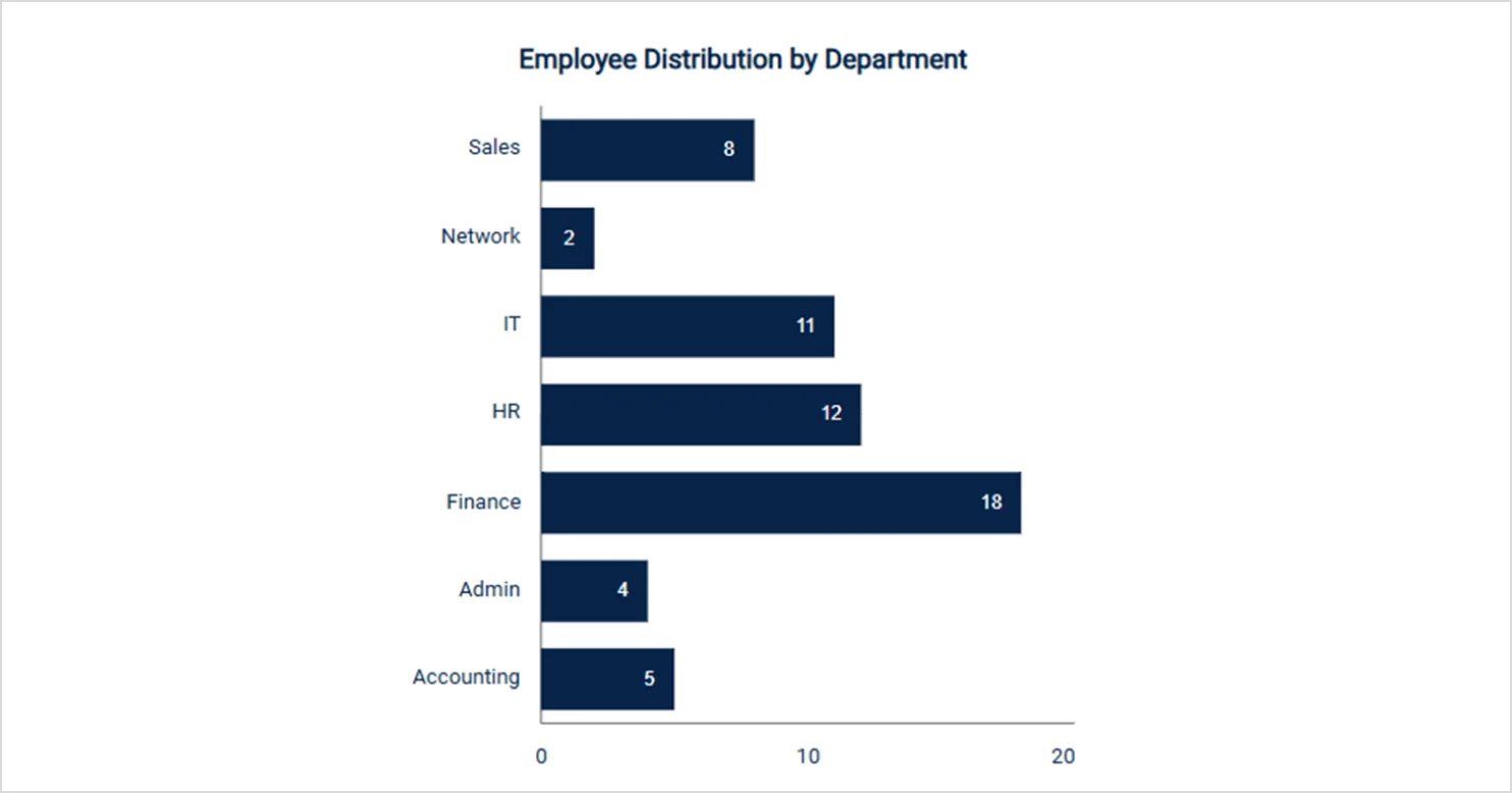
A bar chart is a type of chart that represents and compares data using rectangular bars whose lengths correspond to the values they represent. Each bar stands for a category, making it easy to compare differences between groups at a glance. Bar charts are commonly used to highlight trends, rankings, and categorical comparisons in a clear, readable format.
Now that you know what a bar chart communicates, the next step is selecting the best type for your data and reporting goal.
Types of bar charts in Bold Reports
Bold Reports offers multiple bar chart variations, each suited to different comparison needs, so choose the type that best aligns with your data. They include:
-
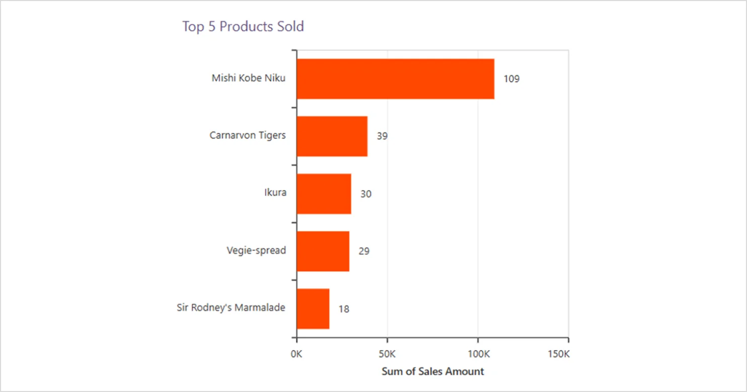
- Simple bar chart: This is the standard type that displays categories along a vertical axis with horizontal bars. It is ideal when you need simple, direct comparisons.
-
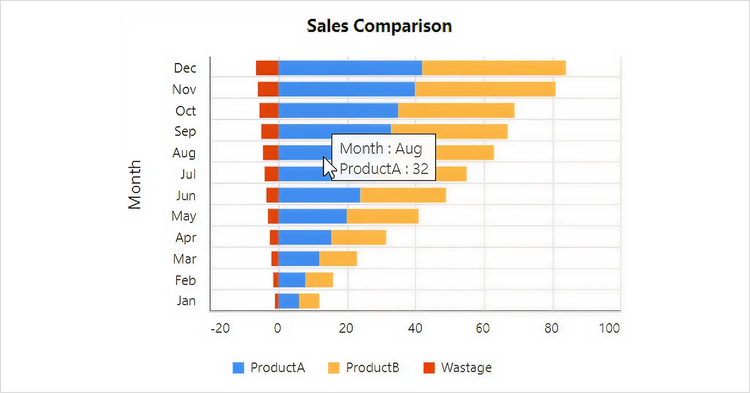
- Stacked bar chart: This type displays multiple values within each bar. It is useful when you want to show individual contributions to a total.
-
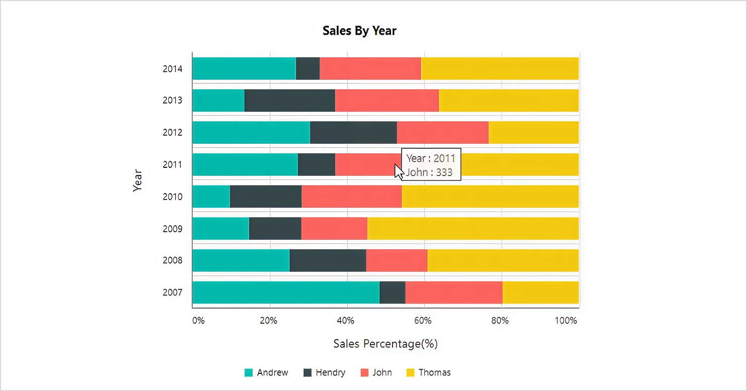
- Stacked bar 100% chart: Represents each bar as 100% and divides it proportionally based on each measure’s contribution.
-
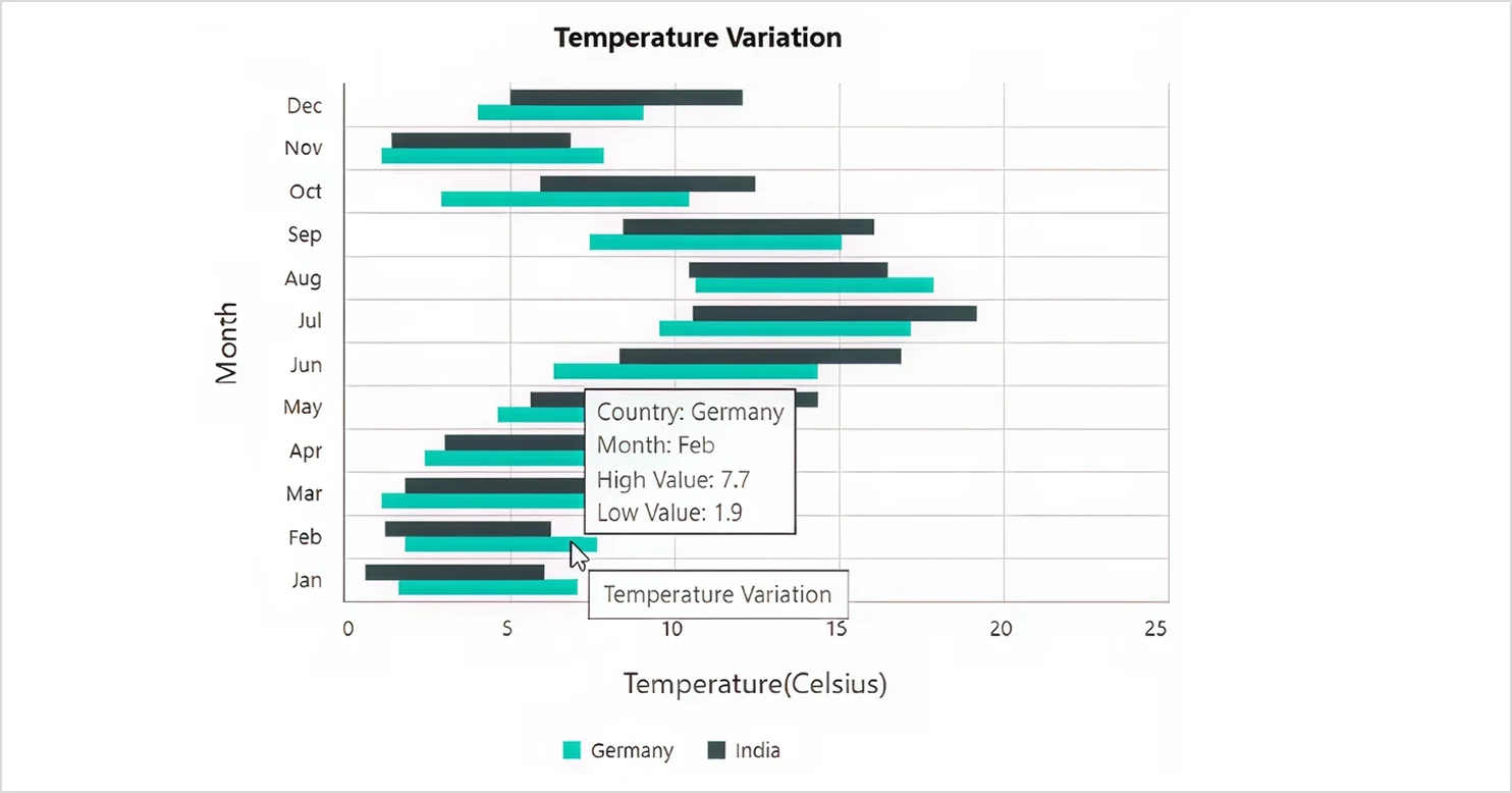
- Range bar chart: Shows a start and end value for each category using a horizontal range.
Refer to our supported chart types guide to learn more about charts in Bold Reports.
Each bar chart type answers a slightly different question. Before deciding when to use them, it helps to understand what you gain from using bar charts in reporting workflows.
Benefits of using a bar chart in reporting workflows
Bar charts offer several practical advantages that enhance clarity, comparison, and insight within reporting workflows.
-
- Clear visual representation: Bar charts in Bold Reports present data in a straightforward, visually engaging format, making information easy to understand at a glance.
- Quick comparison: They allow you to compare multiple data sets side by side, helping you spot trends and performance differences efficiently.
- Breaking down complex data: Bar charts simplify large or complicated data by organizing it into clear, manageable segments that improve readability.
- Easy to build and customize: Bold Reports provides intuitive design tools that make creating and customizing bar charts fast and flexible, so you can achieve the exact style you need.
- Monitoring performance: These charts help track progress over time, making it easier to measure outcomes against targets or key metrics.
- Spotting unusual patterns: Bar charts also help surface outliers or unexpected values, highlighting areas that may need deeper analysis or attention.
Each benefit plays a different role depending on the data you are working with, so the next step is to know when a bar chart is the right choice for your report.
When to use a bar chart in reports
Choosing the right moment to use a bar chart ensures your message is both clear and compelling. Bar charts are most effective:
-
- When category labels are long and easier to read horizontally.
- When you need the category axis to display several grouped values.
- When you have more than a few categories but still want clear comparisons.
- When you want to show the top categories from a larger dataset.
If these conditions match your scenario, a bar chart is likely your best choice.
When not to use a bar chart in reports
Although bar charts are flexible, they are not the right choice in every situation. Bar charts are least effective:
-
- When the data is continuous.
- When the dataset contains too many categories.
- When you need to show proportions or percentages.
- When comparing multiple variables in one visual.
- When precise numerical comparisons are required.
Once you have confirmed that a bar chart fits your data and reporting goal, you can build it quickly in the Bold Reports Report Designer. Next, let’s see how you can create a bar chart in Bold Reports.
How to create a bar chart in Bold Reports
Ready to build one? Follow these steps in the Bold Reports Designer.
- Drag and drop the Bar item from the widget panel into the design area. You can resize the chart as needed on the canvas.
- Create a dataset and assign data by including a minimum of one value element and one column element.
- Format the bar chart by adjusting colors, labels, borders, and axes.
- Preview the report and publish it.
For a detailed walkthrough on how to design a bar chart in Bold Reports, refer to this documentation. With your bar chart configured, let’s look at the features of bar charts that bring clarity to your data.
Features of bar charts in Bold Reports
Bar charts in Bold Reports include several groups of settings that help you control data behavior, chart appearance, interactivity, layout, and export settings. They are available after you select the bar chart.
1. Data and series
These settings control how your data is assigned, aggregated, and displayed within the chart. These include:
-
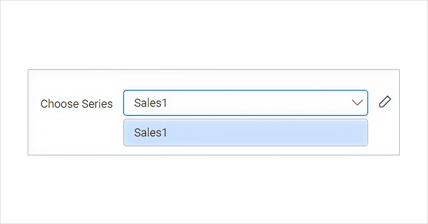
- Series configuration: You can add one or more data series to the bar chart. Each series can be configured individually through the Choose Series dropdown, where you can set:
-
-
- Aggregation type (sum, average, count, etc.).
- Series color, markers, and data labels.
- Additional series options, such as visibility and formatting.
-
-
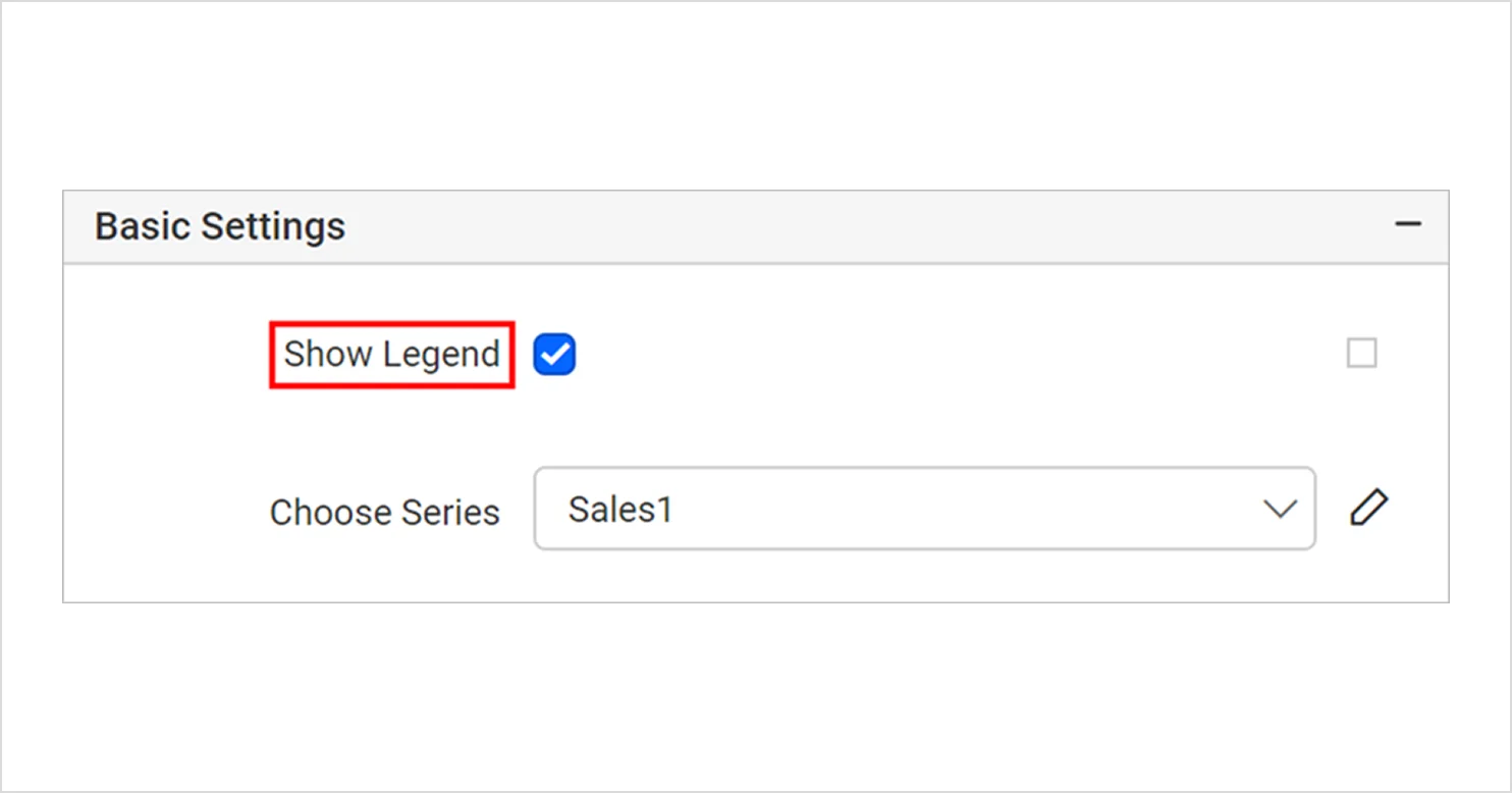
- Legend: A Legend identifies the data represented in the chart and can be shown or hidden as needed. For details on enabling and modifying the legend, see the legend documentation.
-
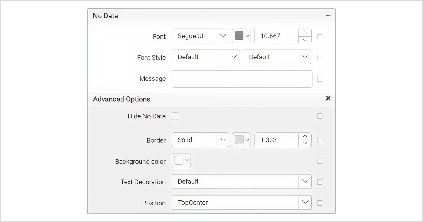
- No-data message: The No Data settings let you display a custom message when the chart’s dataset returns no records at runtime.
2. Appearance and styling
This group controls how the chart looks.
-
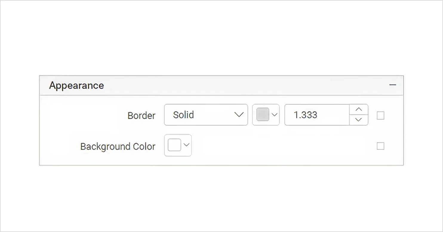
- Appearance settings: You can style the chart by configuring:
-
-
- Border color, width, and style.
- Background color.
- Default color palettes.
-
-
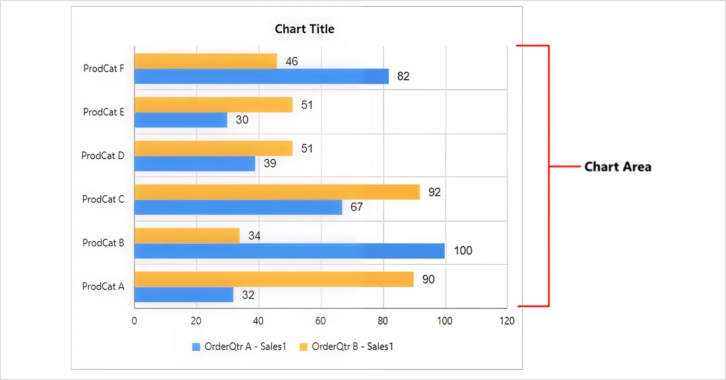
- Chart area: The Chart Area settings let you adjust elements like border width, colors, shadows, and background to refine the overall look of the chart.
-
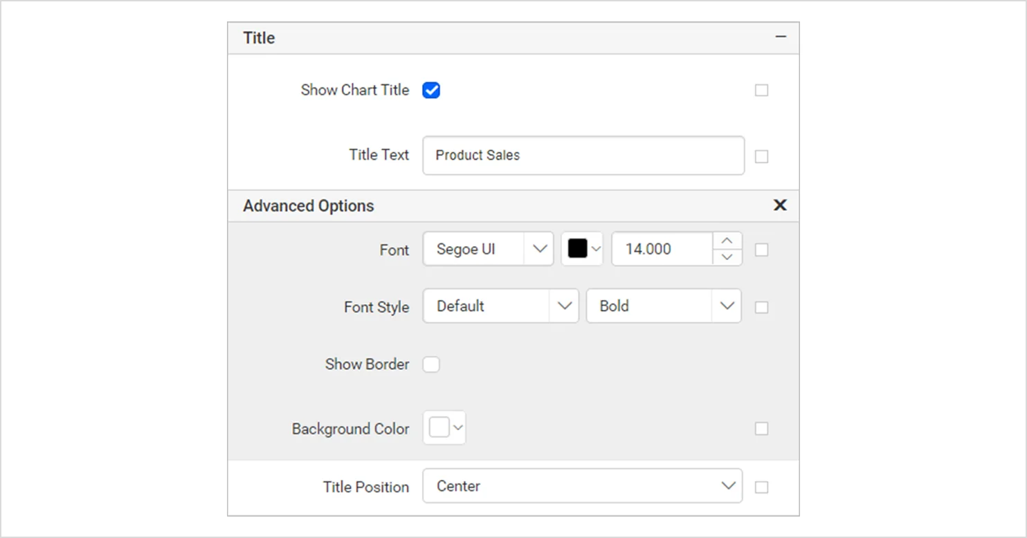
- Chart title: You can show or hide the chart title by toggling the Show Chart Title option. The title itself can be edited through the Title Text setting.
-
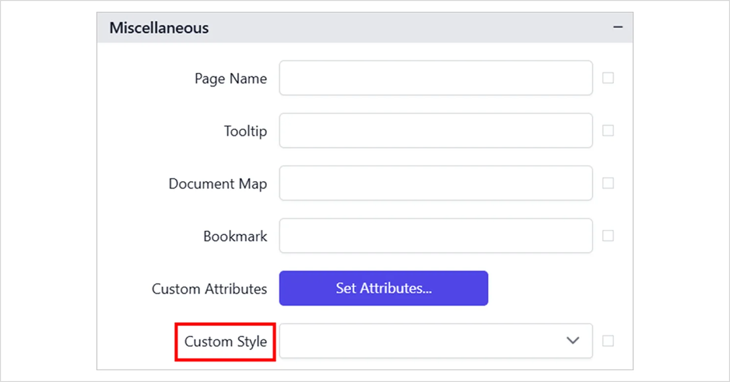
- Custom style: The Custom Style property lets you apply external CSS to report items, giving you more styling flexibility than the default options and helping you maintain a consistent design across the report.
3. Axes and gridlines
These properties help improve readability via labeling. These include:
-
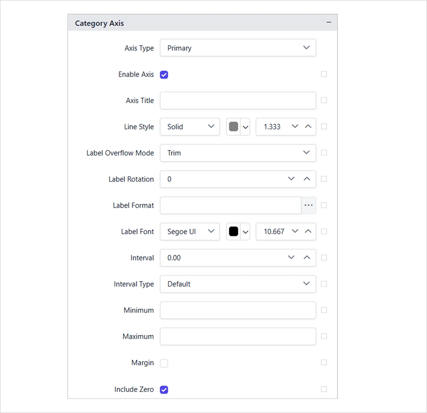
- Category axis: The Category Axis displays text labels rather than numeric values. You can enable it by selecting Enable Axis under the Category Axis settings in the chart properties.
-
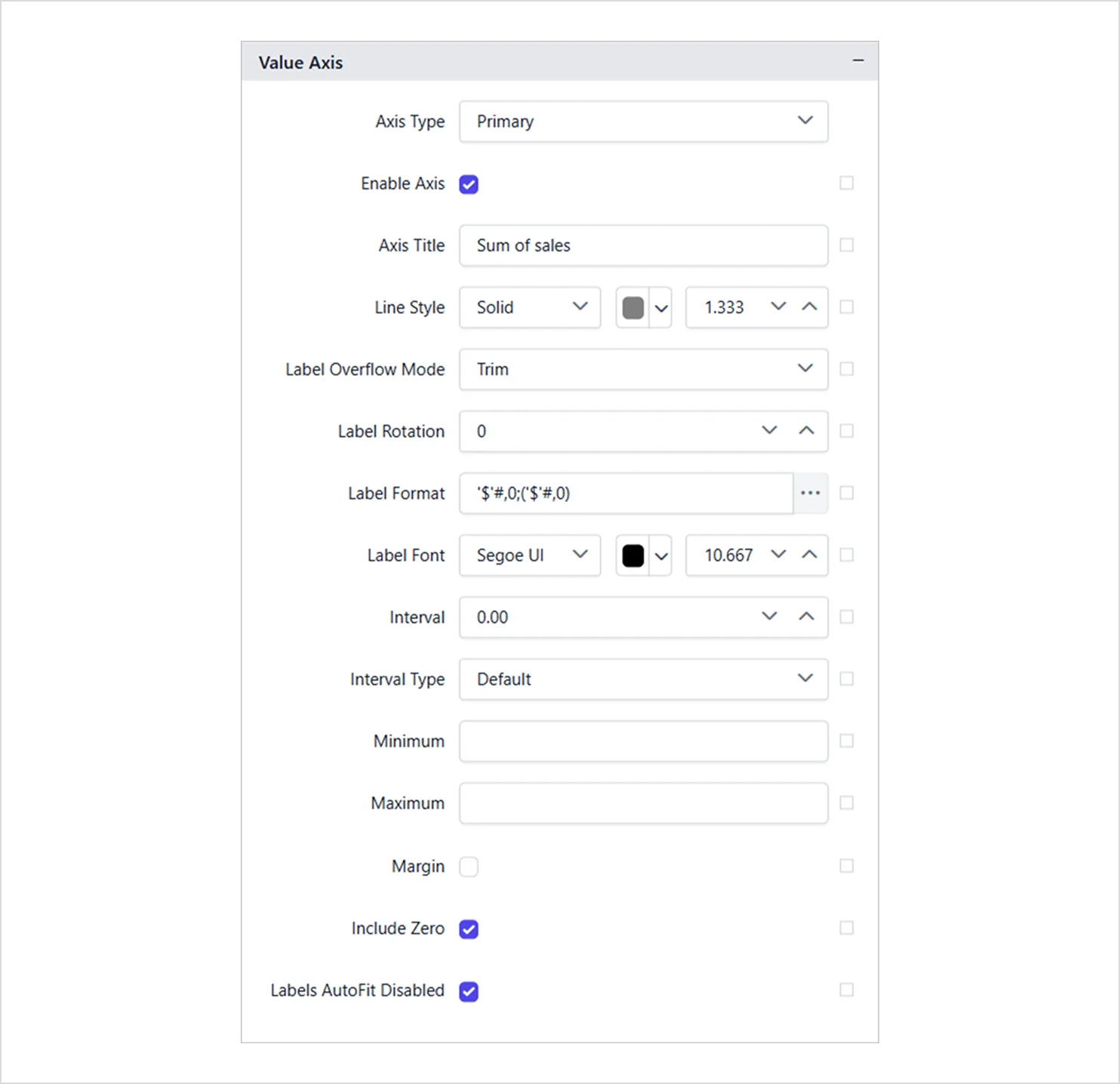
- Value axis: The Value Axis presents numeric values on a scale. You can enable it by selecting Enable Axis under the Value Axis section in the chart properties.
-
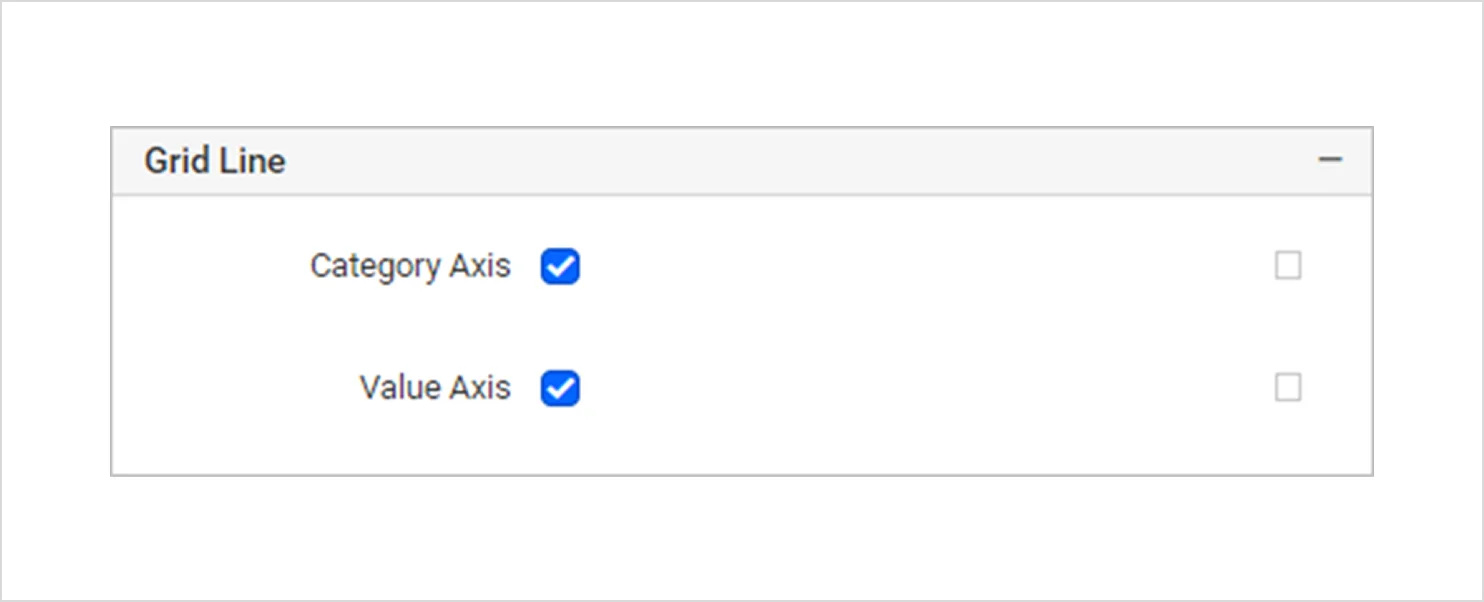
- Grid lines: Grid Line settings can be applied to both the category and value axes to control how reference lines appear in the chart.
4. Interactivity and navigation
These features enhance the user experience within the Report Viewer. They include:
-
- Tooltips: The Tooltip setting lets you show helpful text or values when the user hovers over the chart in the report preview. You can configure the tooltip behavior in the Tooltip section of the Properties panel.
- Bookmarks: You can assign bookmarks to chart elements so that users can jump to other sections of the report.
- Document map: A document map is a side panel with a structured list of report sections, allowing quick navigation to different parts of the report. You can configure one in the Document Map property under the Miscellaneous settings.
5. Export and output behavior
These properties control how the chart behaves when exported. They include:
-
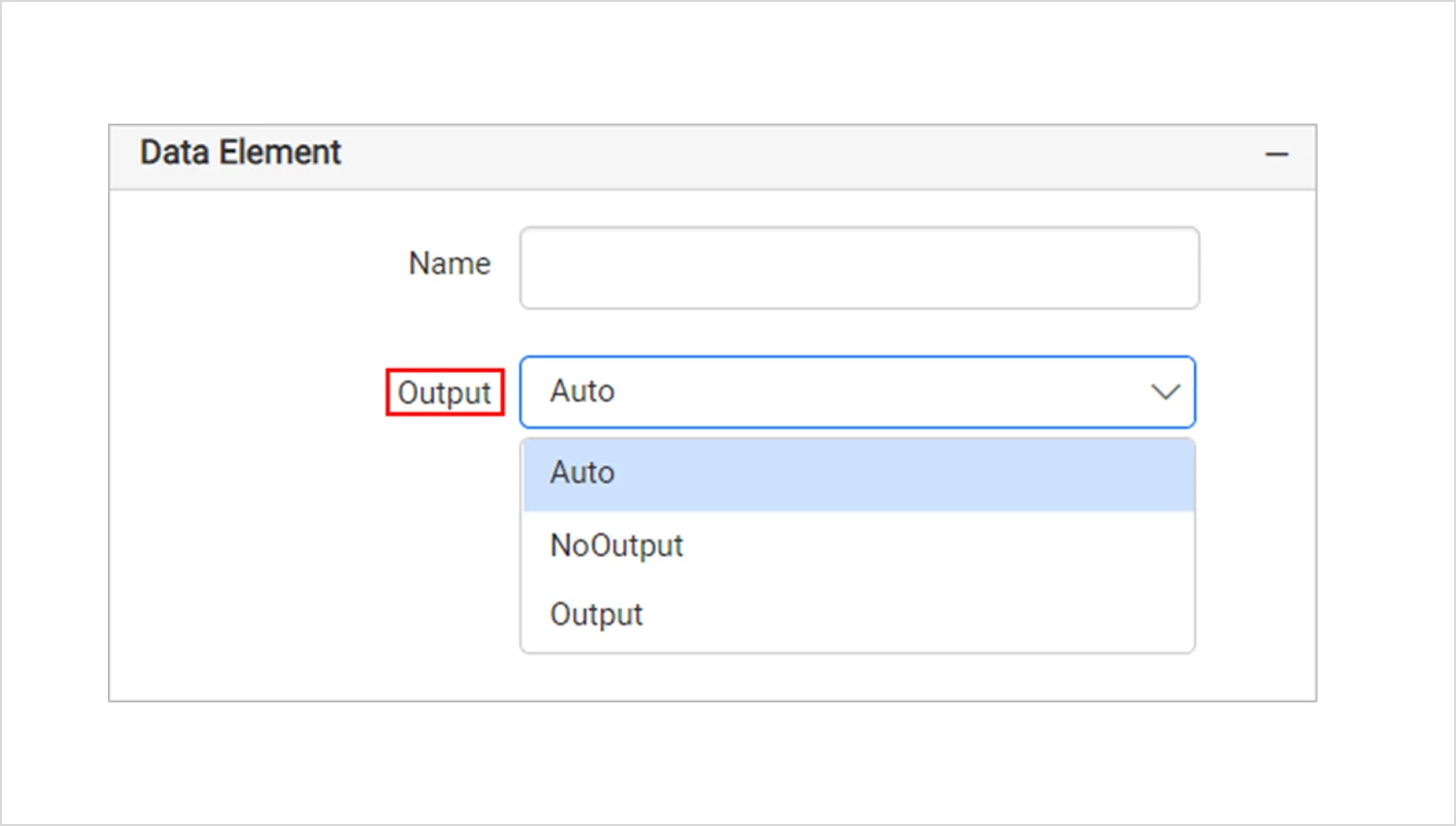
- Output: The output setting controls whether the chart is included when the report is exported. It includes:
-
-
- Auto and Output: Includes the chart when exporting.
- NoOutput: Excludes the chart from exporting.
-
-
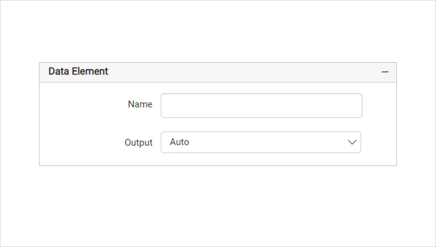
- Data element: The Data Element settings let you control whether a chart item is included when the report is exported to XML. These options are available under the Data Element section in the Properties panel.
-
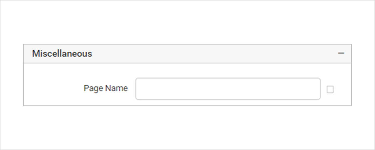
- Page name: The Page Name setting allows you to specify the name of the first worksheet when the report is exported to Excel.
6. Pagination and layout
These options are useful for multipage reports and layout control. They are:
-
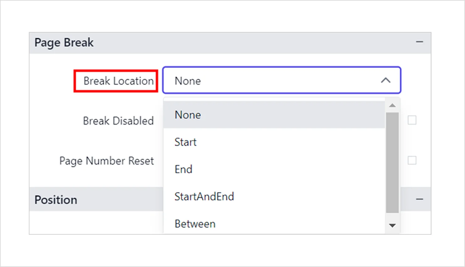
- Page break: The Page Break options let you control how much chart content appears on each page when the report is previewed. Use these settings to manage pagination for the chart item.
-
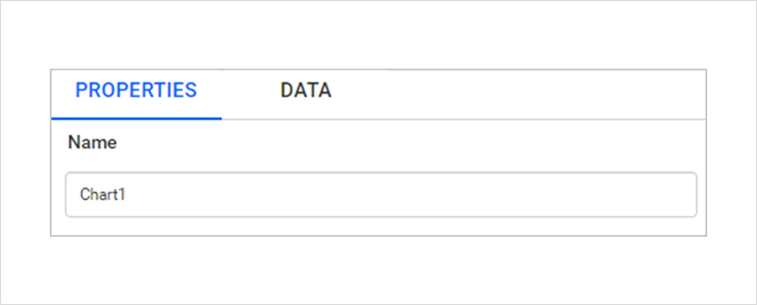
- Name: The Name setting allows you to assign a distinct identifier to the chart within the report, making it easier to reference and manage during design.
Now that you have seen what you can control through chart properties, let’s look at how bar charts support common reporting scenarios in real teams.
Real-world applications of bar charts
To understand the impact of bar charts in practical settings, here are three real‑world examples where they simplify analysis and support faster decisions.
Information Technology: Customer support analysis
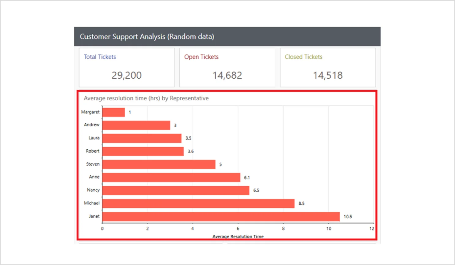
Support teams deal with large volumes of cases, and it can be difficult to pinpoint which issue categories or agents are creating bottlenecks. A bar chart breaks down support metrics, such as ticket counts, resolution times, and issue types, into easy‑to‑compare segments. This makes it simpler to identify problem areas and improve service efficiency.
Entertainment and event management: Ticket sales analysis
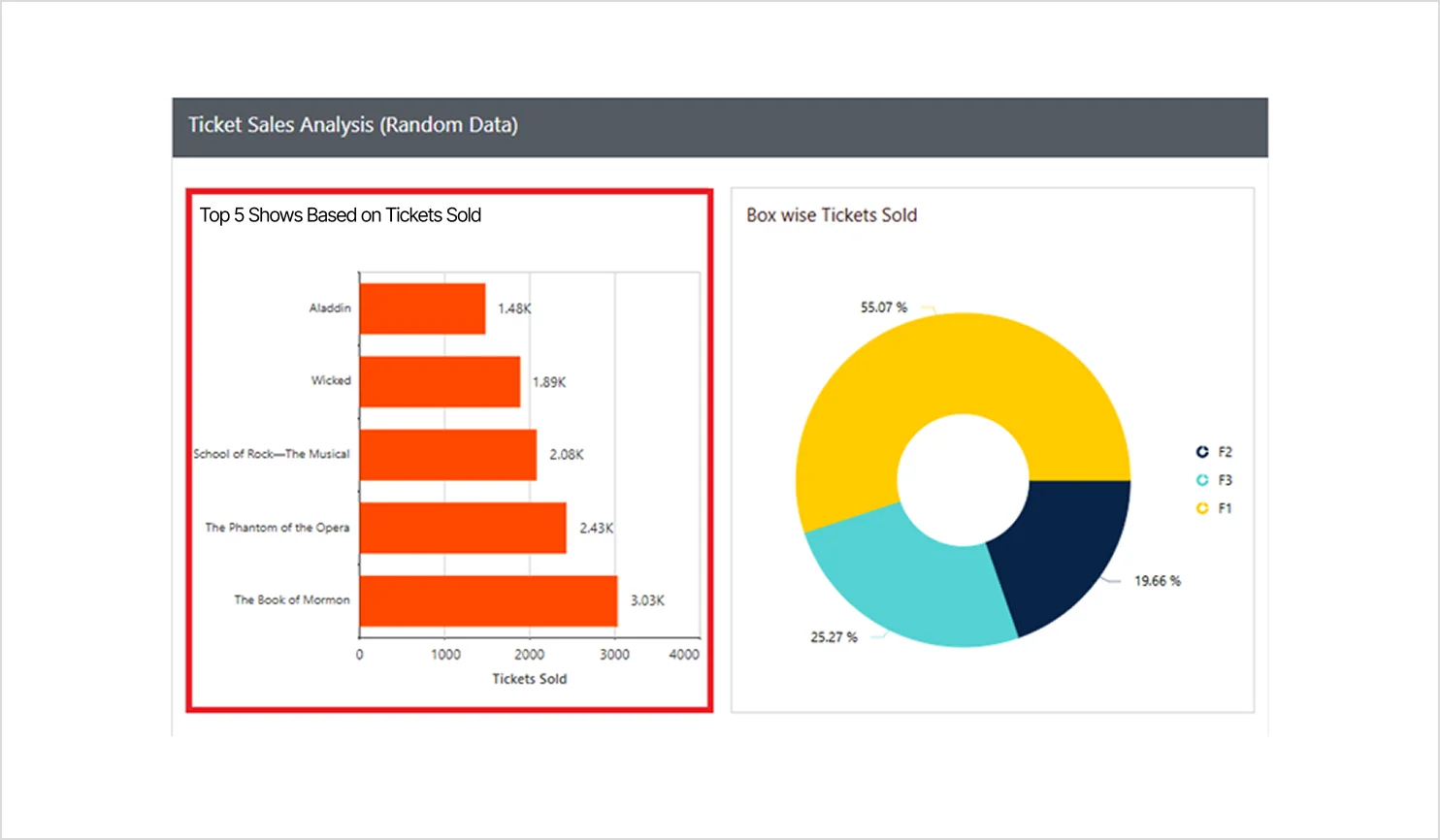
Event managers often struggle to quickly identify which shows are driving revenue when ticket sales reports are long and detailed. A bar chart highlights the top‑selling shows instantly, offering a clear comparison of performance. This allows teams to optimize marketing spend, adjust schedules, and prioritize high‑demand events.
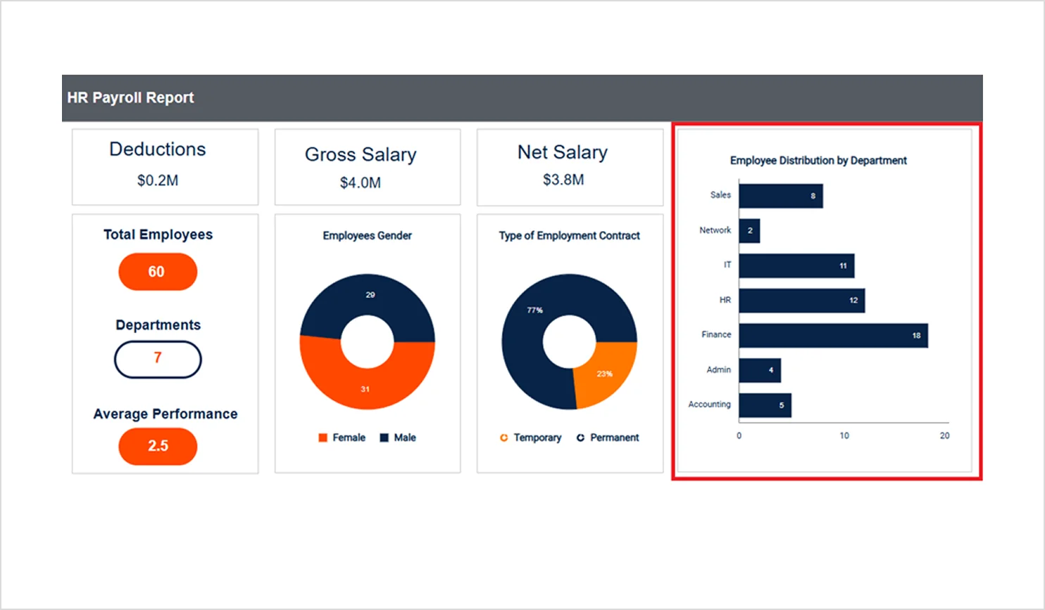
Human resources and administration: Employee distribution by department
Understanding how employees are spread across departments can be challenging when headcount data is buried in tables. Bar charts simplify this by displaying each department’s workforce side by side, making staffing imbalances immediately clear. This supports better workforce planning, resource allocation, and recruitment goals.
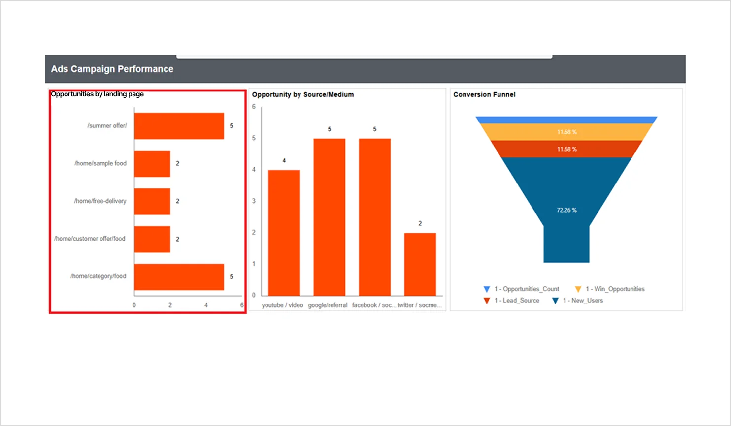
Marketing: Opportunities by landing page
Marketing teams often struggle to identify which landing pages actually generate meaningful opportunities because raw conversion data is scattered across campaigns and hard to compare. A bar chart clearly ranks landing pages by opportunity volume, helping teams see which pages drive the highest-quality leads. This enables marketers to prioritize high-performing pages, fix underperforming ones, and focus resources where they have the most impact.
These real-world examples show how bar charts simplify complex data and make insights actionable across different business scenarios, from improving operational efficiency to capitalizing on the most lucrative revenue streams. Now that you’ve seen why bar charts matter, how to build them, and where they deliver impact, let’s wrap up this article with the key takeaways.
Key takeaways
Bar charts make category comparisons easier to scan, interpret, and act on, especially in reports where readers need answers quickly. In Bold Reports®, you can choose the right bar chart type, configure series and axes for clarity, and add useful elements like tooltips and document navigation so stakeholders can explore insights without confusion.
Ready to turn category comparisons into clear, decision-ready visuals? Start a free 30-day trial and build your first reports. You can also schedule a personalized demo to see how Bold Reports fits your reporting workflow, including report design, publishing, sharing, and embedding.
Frequently asked questions
- 1.
What is a bar chart used for?
A bar chart is used to compare values across categories, so report viewers can see differences clearly.
- 2.
What types of bar charts does Bold Reports support?
Bold Reports supports standard, stacked, 100% stacked, and range bar charts.
- 3.
How do I choose the right bar chart type?
Select the type based on what you want to highlight, such as totals, proportions, or start and end values.
- 4.
Which industries benefit from bar chart reporting?
Bar charts are useful across many industries, including retail, finance, healthcare, education, manufacturing, and event management.
- 5.
How do I keep a bar chart clear and easy to read?
Limit categories, use simple labels, choose meaningful colors, and avoid elements that crowd the chart.