Radar Chart in Reports: When to Use It & How to Create It

TL;DR: A radar chart is used to compare multiple variables across categories in a single visualization. Use it when you need to identify strengths, weaknesses, or patterns across multiple dimensions. When creating one, limit categories, use consistent scales, highlight key comparisons, and pair with other chart types for deeper insights.
Introduction
Comparing performance across departments shouldn’t require bringing together scattered reports. Many decision-makers struggle with data spread across multiple systems, losing insights when switching between charts and trying to interpret complex datasets. A radar chart solves this by visualizing multiple variables at once, making comparisons simpler and more intuitive.
You’ll learn what a radar chart is, when to use it, its benefits, real-world use cases, and how to create it in Bold Reports® for simplified multidimensional data analysis.
When your reports already display performance data, but comparing multiple metrics still feels unclear and spotting category‑level strengths or weaknesses takes too long, this guide is for you.
Understanding a radar chart in reports
A radar chart is a two-dimensional visualization that displays multiple variables on axes radiating from a central point, forming a polygon shape. It’s mainly used to compare strengths, weaknesses, and patterns across categories at a glance, making it ideal for multivariate comparisons.
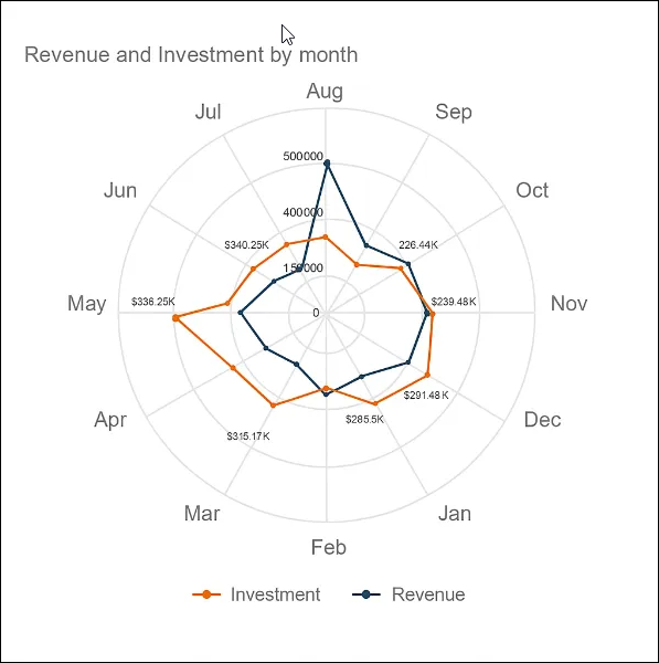
With this definition in mind, let us go a step further and understand the key elements.
Elements of a radar chart
The main elements of a radar chart include:
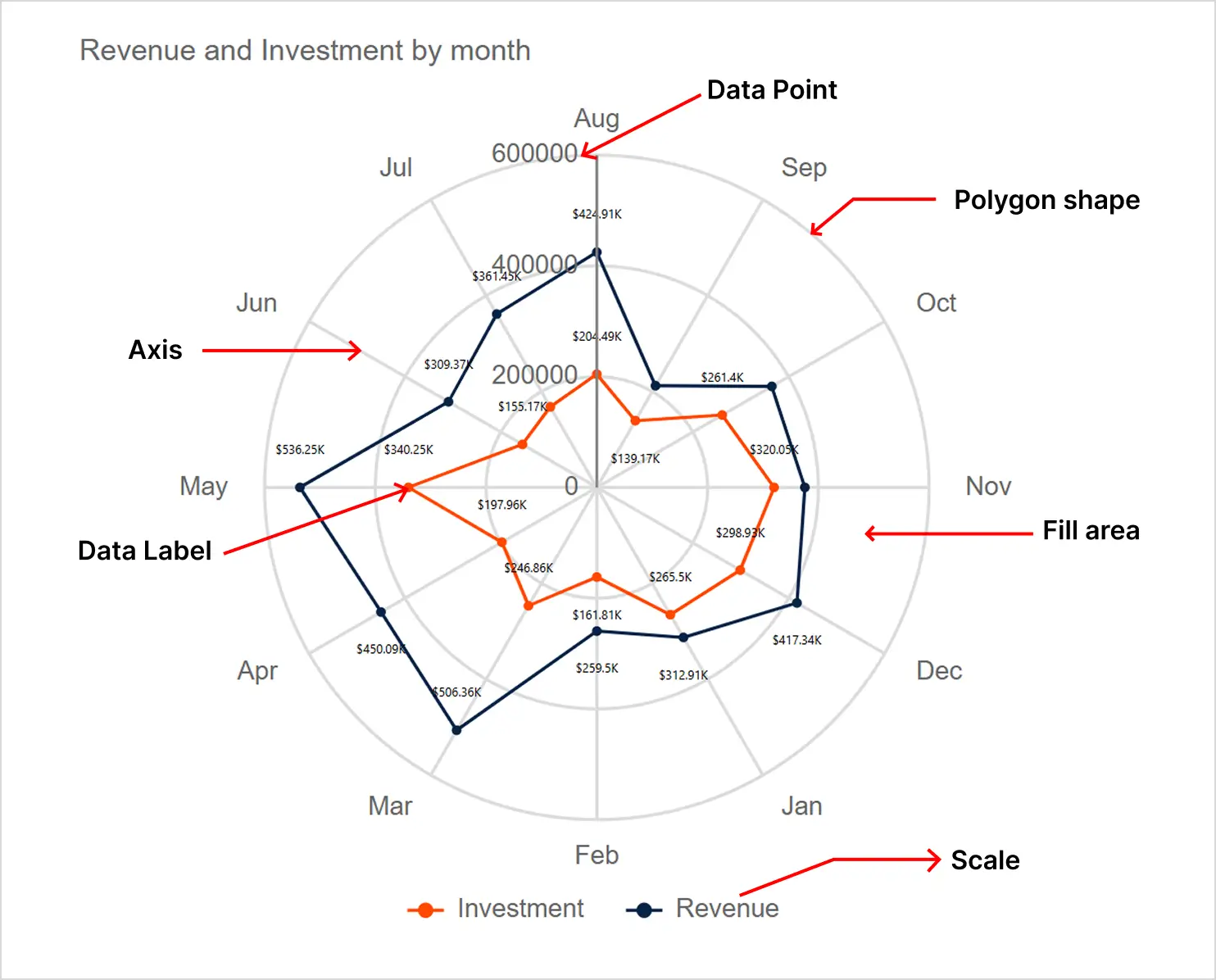
- Axis: Axis in a radar chart represents different variables or categories. All axes start from a common center point and extend outward.
- Data points: Data points show the values placed along each axis. These points represent the magnitude of each variable.
- Polygon shape: These are lines connecting the data points to form a polygon. The shape displays the overall pattern and distribution of the data.
- Scale: Each axis includes numeric levels that indicate increasing values. These levels help you judge the size of each value.
- Fill area: The fill area highlights the space inside the polygon. This makes each series easier to distinguish.
- Data labels: Data labels show the value at each point, making the chart easier to interpret.
6 benefits of a radar chart in reports
A radar chart offers more than just a visual appeal; it provides practical advantages for analyzing complex data. They are a powerful choice for multivariate comparisons.
- Multivariate data visualization: A radar chart shows several variables in one view, making complex data easier to compare quickly.
- Relative comparison: A radar chart clearly highlights strengths and weaknesses across categories, helping analysts compare entities side-by-side.
- Profile illustration: A radar chart creates a visual “shape” that easily shows patterns like skill sets or product features.
- Highlighting outliers: Unusual high or low values stand out immediately, making it easy to spot areas needing attention.
- Data simplification: A radar chart condenses multiple data points into a single chart, helping audiences interpret information faster.
- Visual appeal: The distinctive, engaging design draws attention and makes reports more visually compelling.
When to use a radar chart in reports
A radar chart is best used when:
- Comparing multiple variables at once, especially when each metric contributes to an overall profile or performance view.
- Highlighting strengths, weaknesses, and gaps across categories, where the shape of the chart makes differences easy to spot.
- Visualizing balanced vs. unbalanced patterns, such as skill sets, product features, or departmental performance.
- Displaying data that shares the same scale, allowing fair, side‑by‑side comparison across several dimensions.
- Revealing outliers or unusual values, where points that stretch far outward or pull inward stand out immediately.
- Presenting a holistic overview, making it easier for audiences to understand overall performance at a glance.
When not to use a radar chart in reports
Avoid using a radar chart in these situations:
- When your data is not on the same scale, as mismatched ranges can distort the shape and lead to incorrect comparisons.
- For large datasets or too many variables, overlapping lines and polygons can become cluttered and hard to read.
- When exact values matter more than overall patterns, a radar chart emphasizes shape over precise numbers.
- For categorical or unrelated variables, where the circular layout forces comparisons that may not be meaningful.
- When you need to show trends over time, a radar chart is not designed for chronological sequences.
- When comparing many items side-by-side, as too many overlapping shapes can overwhelm the viewer.
- If your audience needs highly precise insights, a radar chart is better for visual summaries rather than detailed analysis.
How to create a radar chart in Bold Reports
Bold Reports makes it simple to design a radar chart within its Report Designer. To create a radar chart in reports:
- Select the tables and columns you want to plot from the Data Sources.
- In the Widget panel, choose the Radar chart under the Comparison category, then drag and drop it into the dashboard designer. Resize it to your preferred dimensions.
- Open the Properties panel, go to the Assign Data, then drag a Dimension to the Columns and add two or more Measures to the Values field.
- Adjust the properties, such as Colors, Styles, and Formatting.
- Ensure categories and series are clearly identified with Labels and Legends for easy interpretation.
- Click the Preview button to review how the chart looks with your data, then save your dashboard.
Refer to the documentation for more information on creating a radar chart.
Real-world use cases of a radar chart in Bold Reports
A radar chart can be used to visualize multiple data points across different industries, helping users compare several variables at once. Following are some of the real-world use cases where a radar chart supports effective data analysis in Bold Reports.
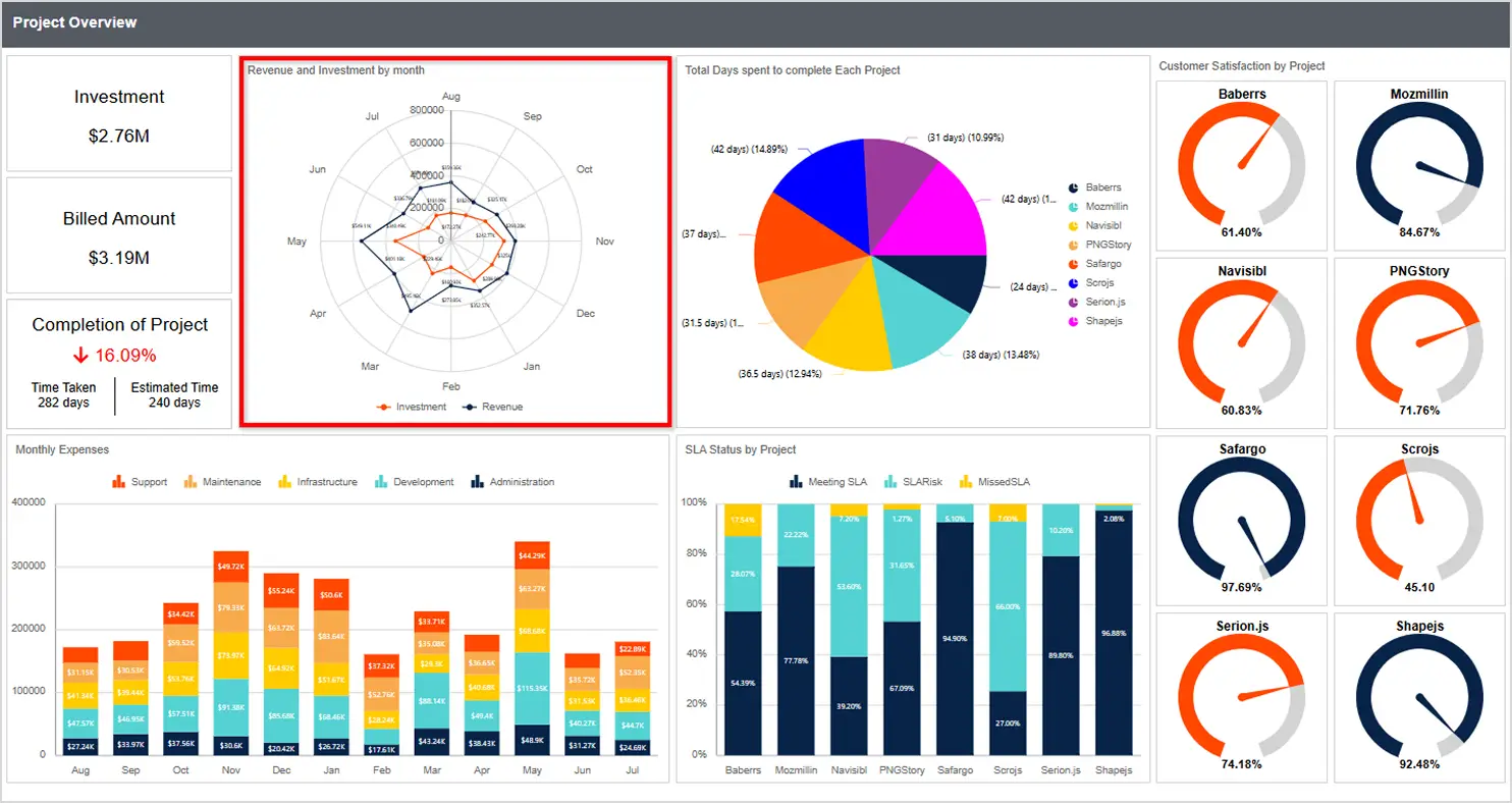
Information technology: Project overview report
In project management, tracking task progress can be difficult because workloads and deadlines often shift unexpectedly. These changes make it hard to see whether a project is truly moving forward or just reacting to short-term fluctuations. Using a radar chart in reports in the Project Overview Report highlights strengths, gaps, and overall balance across key project metrics.
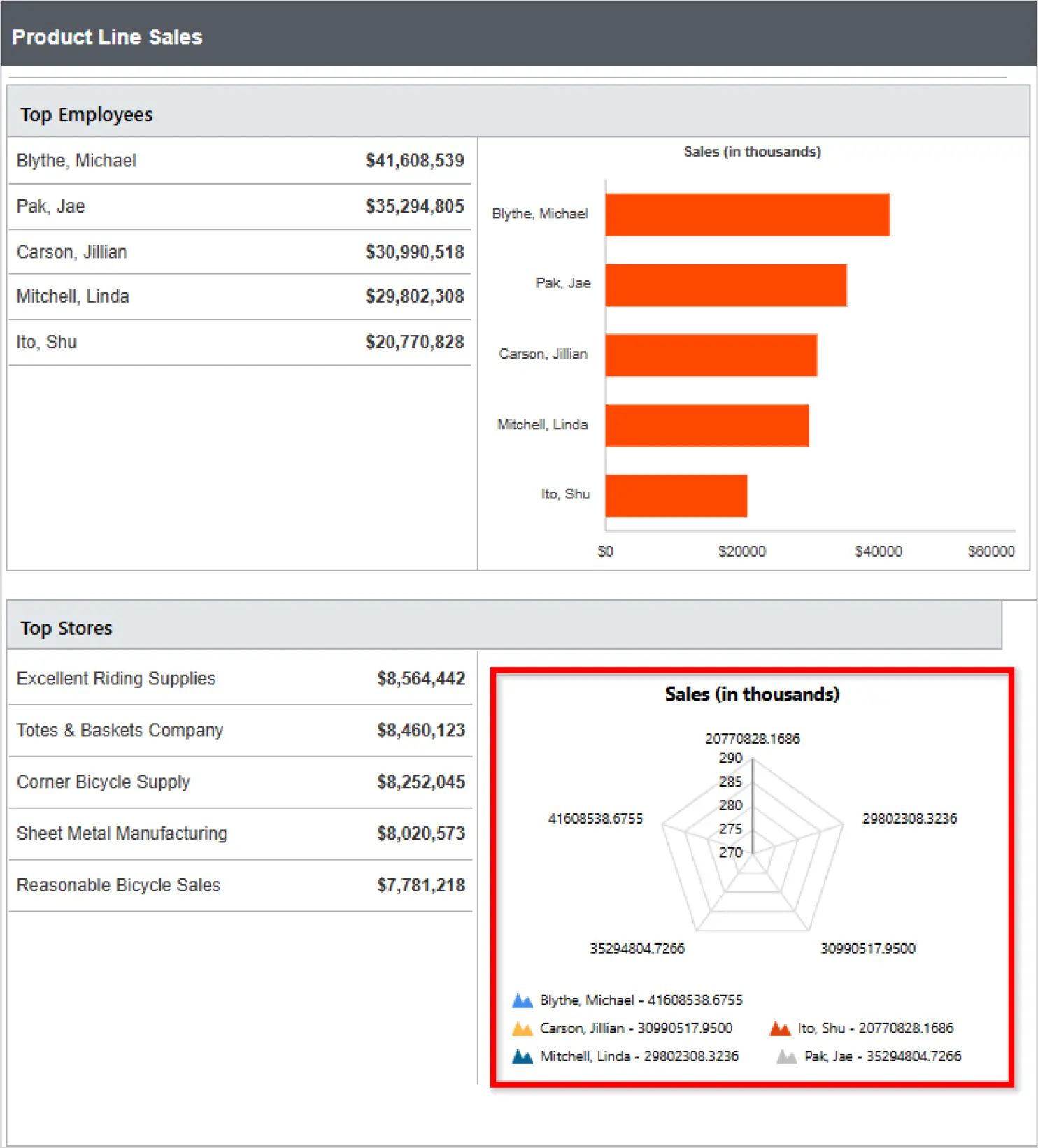
Sales analysis: Product line sales report
In sales performance reporting, comparing individual contributors can be challenging when reviewing multiple employees at once. Using a radar chart in a Product Line Sales report simplifies the process by providing a visual comparison of relative sales performance for all employees at once. This makes it easier to see how employees stack up against one another in overall sales.
Best practices for a radar chart in reports
Designing a radar chart for data analysis requires careful attention to key elements.
- Limit the number of variables: Make sure to keep to 5–7 dimensions to avoid clutter and maintain readability.
- Use consistent scales: Apply the same range across all axes to ensure fair and accurate comparisons.
- Normalize data: Scale values to a common range, so no single variable dominates due to larger magnitudes.
- Limit data series: Restrict comparisons to 2–3 entities to prevent overcrowding and indistinguishable shapes.
- Apply transparency for overlaps: Use semi-transparent fills or distinct colors to make overlapping areas easier to interpret.
- Keep axis order logical: Group related categories together, so the chart tells a meaningful and coherent story.
- Provide context: Always explain the significance of patterns or trends, so audiences understand the chart’s data.
Key takeaways
A radar chart provides a dynamic way to compare multiple project metrics at once, revealing strengths, gaps, and balance across key performance areas. Whether you’re evaluating team performance, assessing project health, or presenting multidimensional data to stakeholders, a radar chart makes complex comparisons more easily understandable.
Bold Reports® enhances this experience with customizable styling, flexible data connections, and consistent rendering that ensure your visual stays clear across all export formats. If you’re aiming to communicate more balanced project metrics at a glance, a radar chart is an essential addition to your reporting toolkit.
Ready to elevate your reporting? Try Bold Reports through a 30-day-free trial or book a 30-minute personalized demo to see how it can transform your reporting experience.
Frequently asked questions
- 1.
What is a radar chart used for?
A radar chart is used to compare multiple variables across categories in a single visualization.
- 2.
When should you use a radar chart?
A radar chart is used to compare multiple dimensions on the same scale and quickly spot patterns, strengths, and gaps.
- 3.
What are the different types of a radar charts?
Common types include filled radar chart (shaded polygons) and line radar chart (outlined polygons).
- 4.
What are the best practices for creating a radar chart?
Limit categories, use consistent scales, highlight key comparisons, and pair with other chart types for deeper insights.