Pyramid Charts in Reports: When to Use and How to Create One

TL;DR: Pyramid chart displays categories as proportional layers from largest at the base to smallest at the top. It helps visualize hierarchy, distribution, and ranking. With Bold Reports®, you can easily create and customize pyramid charts for clear, structured data analysis.
Introduction
Understanding how categories contribute to a whole doesn’t require scanning long tables or manually comparing rows of numbers. Many report designers struggle to interpret hierarchical or ranked data when proportions are buried in datasets.
A pyramid chart solves this by organizing categories into proportional layers, making distribution and ranking easy to understand at a glance. In this guide, you’ll learn what a pyramid chart is, when to use it, its benefits, real-world use cases, and how to create one in Bold Reports.
Understanding a pyramid chart in reports
A pyramid chart is a triangular visualization that displays values as proportional segments arranged from largest at the base to smallest at the top. Each segment represents a category, making it easy to see relative size and hierarchy at a glance.
Pyramid charts are commonly used for displaying demographic breakdowns, market segmentation, and organizational structures; any scenario where layered, top‑down, or bottom‑up comparison is useful.
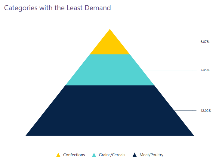
6 benefits of visualizing data using a pyramid chart
A pyramid chart offers more than just a distinctive visual style; it provides practical advantages for presenting proportional and hierarchical data. It is an effective choice for showing distribution, ranking, and comparative relationships in reports.
- Clear proportional comparison: A pyramid chart displays category proportions visually, making relative differences easy to compare at a glance.
- Hierarchical representation: The layered structure naturally supports ranked or ordered data, helping viewers understand levels and progression clearly.
- Easy data interpretation: By simplifying complex values into a single visual form, pyramid charts make information easier to understand for a wide audience.
- Efficient category comparison: Multiple categories can be compared within one chart without clutter or visual confusion.
- Space-efficient visualization: The compact design delivers meaningful data while using minimal space in reports.
- Strong visual emphasis: The distinctive pyramid shape draws attention to key data and enhances overall report presentation.
When to use pyramid charts in reports
Use a pyramid chart when you want to:
- Visualize hierarchical structures where layered segments clearly show relationships such as organizational levels, role distributions, or tiered systems at a glance.
- Present proportional breakdowns, allowing easy comparison of segments like customer tiers, demographic groups, or product categories based on relative size.
- Illustrate funnel‑like processes (static view), helping compare stages such as sales pipelines or marketing conversions within an overall flow.
- Rank categories by magnitude or quantity, making it easier to prioritize or compare items ordered from largest to smallest.
When not to use pyramid charts in reports
Avoid using a pyramid chart in these situations:
- When you need to show trends over time, as pyramid charts are not designed for time‑series analysis.
- When exact value comparison is critical, since visual width emphasizes proportions rather than precise numerical differences.
- For datasets with too many categories or layers, excessive segments reduce readability and create visual clutter.
- When categories have no clear hierarchy or ranking, because pyramid charts work best with ordered or progressive data.
- When side‑by‑side comparison is required, especially across multiple categories where bar charts or tables are clearer.
- When the data includes zero or negative values, as pyramid charts rely on positive values to represent proportional widths.
How to create a pyramid chart in reports
To create and configure a pyramid chart in Bold Reports:
- Select the required tables and columns from the data sources that you want to visualize.
- In the Widget panel, choose the Pyramid chart under the Proportion category, then drag it onto the Report Designer. Resize it as needed.
- Open the Properties panel, navigate to Assign Data, then drag a dimension into the Column field and add one or more measures to the Y Values
- Configure aggregation settings for measures if required using the Settings.
- Customize the chart appearance by adjusting colors, labels, tooltips, and formatting to improve readability.
- Click Preview to review the pyramid chart with your data, then save the report.
For a full step‑by‑step guide on configuring a pyramid chart in reporting, assigning data, and customizing its appearance, refer to this detailed pyramid chart configuration documentation.
Use case of a pyramid chart in reports
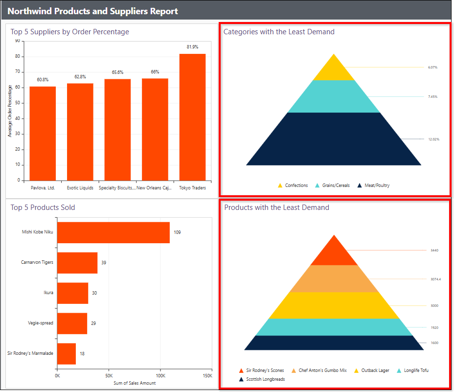
A pyramid chart can be used across industries to visualize ranked or hierarchical data, making it easy to identify which categories or products contribute to the whole the least or most. Following is an example of how a pyramid chart is used in reporting.
Retail industry: Northwind products and suppliers report
Retail teams often need to identify low‑demand products and categories quickly, but large sales tables can slow analysis. A pyramid chart in the Northwind Products and Suppliers Report visually ranks categories and products from smallest at the top to largest at the bottom, making underperforming items easy to spot and enabling faster, more informed decisions on adjustments, promotions, or product evaluation.
Visualize structured data with pyramid charts in reports
Pyramid charts enhance data visualization by clearly communicating hierarchical and ranked information. With Bold Reports®, you can create and use pyramid charts to display proportional layers, such as low‑demand categories or under-performing products and customize their appearance to match your reporting needs. Their simple, structured layout makes it easy to compare segments and turn complex datasets into clear visual summaries.
Ready to turn your segmented data into meaningful visuals? Start a free trial to begin building insightful pyramid charts, or book a personalized demo to see how Bold Reports can streamline your reporting workflow.
Frequently asked questions
- 1.
What is the main purpose of a pyramid chart?
A pyramid chart highlights category proportions and hierarchy by visualizing values in descending or ascending layered segments.
- 2.
Can I invert the pyramid in Bold Reports?
Yes. You can switch between standard and inverted pyramid views.
- 3.
How many categories should I include?
For best readability, keep it between 4–7 segments. Too many layers make the chart harder to interpret.
- 4.
When should I avoid using a pyramid chart?
Avoid it when showing time‑based trends or exact numerical comparisons. Other chart types suit those scenarios better.
- 5.
Can I customize segment spacing and colors?
Absolutely. Bold Reports allows full customization of colors, spacing, borders, and overall chart design.