Visualizing Geographical Data Using Maps in Reports

Visualizing geographical data with maps is crucial for understanding spatial patterns. As organizations of all kinds find ways to integrate geographic information systems (GIS) into their data analysis, the ability to present geographic data visually becomes essential. Bold Reports® offers a powerful solution for turning raw data into actionable insights. In this blog, we’ll explore the benefits, common challenges, use cases, and best practices of using maps in reports, plus how Bold Reports makes using maps easy.
Benefits of using maps for geographic data visualization
- Improved decision-making: Visualizing geographic data helps stakeholders identify trends and patterns that inform strategic decisions.
- Better engagement: Interactive maps can engage users more effectively than traditional data presentations, fostering a deeper understanding of the information presented.
- Effective planning and resource allocation: Maps help organizations allocate resources efficiently by considering the geographic context.
- Easy accessibility: Maps can simplify the communication of intricate datasets, making them accessible to a broader audience, including those without technical expertise.
Key challenges in geographic data visualization
- Data quality and standardization: Ensuring data consistency and accuracy is time-consuming but crucial for reliable analysis.
- Complex data sources: Integrating diverse data sources (e.g., satellite, social media) can complicate visualization due to varying formats and attributes.
- Design challenges: Effective maps require balancing clarity and aesthetics to avoid cluttered or misleading visuals.
- Information overload: Simplifying large volumes of geospatial data is essential for conveying critical insights clearly.
- Ethical considerations: Privacy standards must be preserved to protect personally identifiable information, and biases must be addressed to avoid misleading interpretations.
- Infrastructure costs: High costs of hardware, software, and skilled personnel can limit GIS adoption for smaller organizations.
Bold Reports features for visualizing geographic data
- Customization: Personalize maps to align with your branding and specific reporting needs. Adjust styles, colors, and labels to present data in a way that resonates with your audience.
- Extensive Data Integration: Connect to a wide range of data sources, including cloud services and SQL databases, ensuring you have the necessary data to build informative and detailed maps.
- Collaboration Tools: Share your reports and maps effortlessly with stakeholders. Bold Reports’ sharing and commenting features foster collaboration, helping drive discussions and informed decision-making.
To learn more about maps and their properties in Bold Reports, refer to the documentation.
Best practices for visualizing geographic data with maps
- Ensure data accuracy and quality: Use reliable and up-to-date data sources for accurate and quality maps.
- Use a design that is easy to understand: Use clear and readable fonts and symbols for easier understanding. Ensure sufficient contrast between different map elements to enhance readability. Tailor the map design to the needs and preferences of the target audience. Ensure the map is accessible to all users, including those with visual impairments.
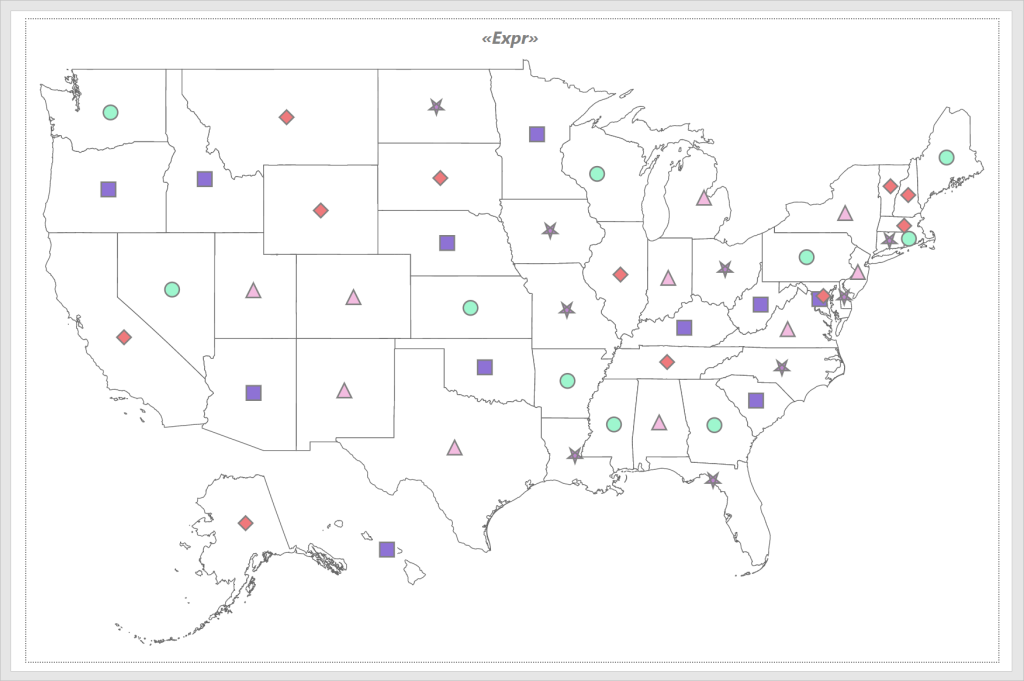
- Choosing the right map type: Selecting the right map type is key to presenting geographic data clearly. Choosing the right one ensures the data is easy to understand and accurately represents the information
- Data visualization techniques: Use consistent color schemes to represent data categories. Include a legend and scale to help users interpret the map correctly
Five use cases for geographical data in maps
Here are five use cases for maps in data analysis that demonstrate their versatility and effectiveness.
1. Election results
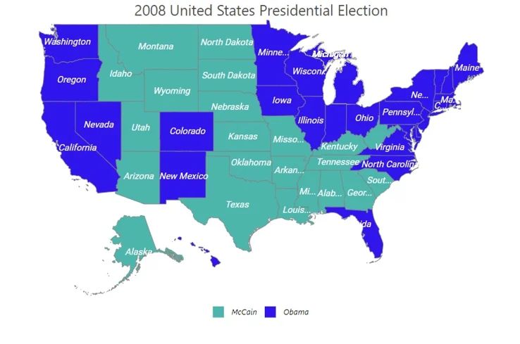
One of the most impactful uses for maps in data analysis is visualizing election results. Maps can display voting patterns, demographic shifts, and electoral outcomes across different regions. By color-coding regions based on vote percentages or candidate wins, analysts can quickly identify trends, strongholds, and areas of concern. This spatial representation helps political analysts, campaign managers, and the public understand the geographical distribution of voter preferences.
For guidance on creating this type of map, refer to this documentation.
2. Population density and urban planning
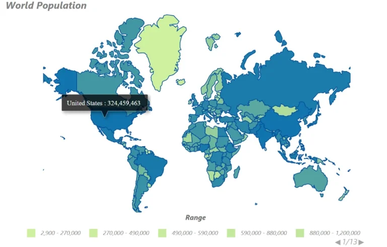
Maps are essential for understanding population density and urban planning. By visualizing population distributions, city planners and researchers can assess infrastructure needs, plan public services, and address infrastructure issues. Maps can reveal areas of high congestion, housing shortages, or potential for development, helping stakeholders make informed decisions about city expansion and resource management.
For guidance on creating this type of map, refer to this documentation.
3. GDP growth rates by region
Analyzing GDP growth rates with maps allows for a clear visualization of economic performance across different regions. This spatial representation helps economists and policymakers identify regions with strong economic growth, areas in need of economic development, and potential factors influencing regional disparities. By combining GDP data with other economic indicators, maps can provide a comprehensive view of economic health and regional dynamics. For guidance on creating this type of map, refer to this documentation.
The following map illustrates the GDP growth rates for different countries, providing a clear view of economic performance on a global scale.

4. Market strategy and sales analysis
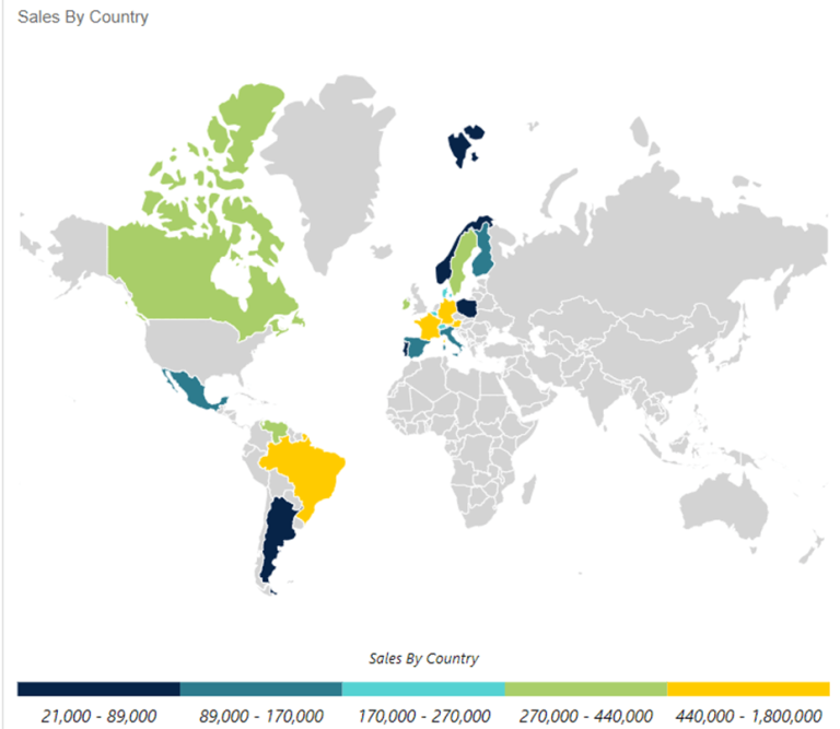
For businesses, maps are invaluable tools for market strategy and sales analysis. By plotting sales data, customer locations, and market potential on maps, companies can identify high-performing regions, uncover underserved areas, and optimize their sales strategies. Heat maps and density maps can show where products are most popular, guiding marketing efforts and resource allocation to maximize growth and profitability.
For guidance on creating this type of map, refer to this documentation.
5. Distribution of mineral resource production plants
Maps are crucial for tracking the distribution of mineral resource production plants. By mapping the locations of mining operations, production facilities, and resource deposits, analysts can monitor resource availability, assess environmental impacts, and plan for future resource management. This geographic perspective helps stakeholders make strategic decisions about resource extraction, transportation, and sustainability.
For guidance on creating this type of map, refer to this documentation.
Conclusion
Visualizing geographic data through maps is an invaluable tool for organizations aiming to communicate complex information clearly and effectively. While challenges such as data quality and integration persist, adhering to best practices in design and utilizing robust reporting tools like Bold Reports® can significantly enhance the impact of geographic visualizations.
Visit the Bold Reports website for more information, or sign up for a 30-day free trial to experience the power of Bold Reports firsthand.
If you have any questions, please post them in the comments section. You can also contact us through our contact page or, if you already have an account, you can log in to submit your support question.