How to Create and Use Doughnut Charts in Reporting

TL;DR: Doughnut charts help you quickly understand how categories contribute to a total. In reporting, they simplify complex data into clear visual summaries. This guide explains when to use them, when to avoid them, and how to create effective doughnut charts in Bold Reports®.
Introduction
Understanding where most of a budget is spent is a common requirement in expense and financial reports. When the data is presented only in tables, it becomes difficult to quickly see which categories consume the largest share or how the total is distributed across categories.
A doughnut chart in reporting addresses this by presenting part‑to‑whole data in a clear, visual format. Instead of scanning rows of numbers, readers can immediately see how each category contributes to the total through proportional slices in a circular ring. This makes doughnut charts especially useful for high‑level insights, helping teams identify dominant categories, smaller contributors, and overall distribution at a glance.
What is a doughnut chart in reporting?
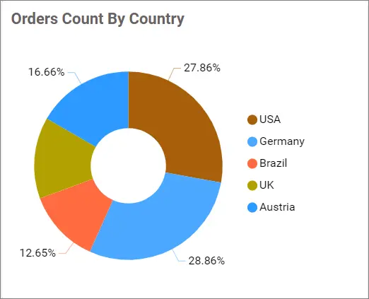
A doughnut chart is a part‑to‑whole chart used in reports to show how individual categories make up a complete total. Values are visualized as proportional segments around a hollow center, making the overall distribution easy to grasp. Doughnut charts are typically used for percentage‑based summaries and are most effective when comparing a small number of categories.
Once you’re clear on what a doughnut chart represents, the next question is: why choose this chart over others?
Benefits of visualizing data using a doughnut chart in reports
A doughnut chart in reports offers several advantages that make it ideal for part‑to‑whole visual analysis:
-
- Instant proportion clarity: Doughnut charts make it easy to see how categories contribute to a total without scanning rows of numbers.
- Quick category comparison: The visual size of slices helps readers identify dominant and minor categories at a glance.
- Clear part‑to‑whole context: Presenting each category as a share of 100% helps readers understand the overall distribution quickly.
- Clean percentage insights: Percentage‑based data is easier to read and interpret without cluttering the report layout.
- Consistent summary reporting: Doughnut charts provide a standardized way to present the distribution of data across reports.
With these benefits in mind, the next step is understanding when a doughnut chart is the right choice.
When is a doughnut chart effective
Doughnut charts work best in a few specific scenarios. Use one when you need to:
-
- Show part‑to‑whole proportions clearly.
- Emphasize top categories and group minor ones.
- Provide high‑level insights rather than precise bar‑by‑bar comparisons.
- Place totals or KPIs in the center for added context.
- Present static snapshots where percentages matter more than trends.
Because the visualization focuses on proportions, it delivers instant clarity for high-level decision-making.
When not to use a doughnut chart
Although doughnut charts are effective, they are not suitable for every dataset. Avoid using a doughnut chart when:
-
- You have many categories, creating thin, unreadable arcs.
- Your data includes negative values that are not meaningful in a proportional ring.
- You’re comparing trends over time, where you should use a line or bar chart instead.
- You need precise comparisons across many categories, where stacked or grouped bar charts are better.
- You need to use 3D effects, since they distort perception and reduce accuracy.
If you want deeper guidance on chart selection and formatting options, see the doughnut chart documentation.
Now that you know when to use a doughnut chart, let’s see how to create one in Bold Reports.
How to create a doughnut chart in reporting
The configuration process is simple, but doing it correctly ensures clarity and export stability. To build a high-quality doughnut chart:
- Add the doughnut chart: From the Chart Items panel, drag a doughnut chart onto the design surface and resize it to fit your layout.
- Assign your dataset: Go to the DATA tab and select the dataset containing the categories and values you want to visualize.
- Map your fields: Define how the doughnut chart should interpret your data.
- Category (Group): Drag the field that represents each slice of the ring, such as Department, Ticket Type, or Expense Category.
- Values: Assign the numeric field that determines each category’s proportion of the whole.
- Customize for clarity and readability: Enhance the chart’s effectiveness by applying key properties:
- TopN grouping: Consolidate small or low‑impact categories into an “other” slice to avoid thin, unreadable arcs.
- Data labels: Configure labels to show percentages, category names, or both, while adjusting placement to avoid overlap.
- Color palette: Choose a consistent set of colors to maintain visual uniformity across reports and exports.
- Review and finalize: Select Export Preview to verify that the doughnut chart renders cleanly in PDF, Word, and Excel. Make adjustments to layout, spacing, or labels to ensure strong readability across formats.
To learn more about preparing your data or refining chart formatting, check the complete doughnut chart documentation.
After creating a basic doughnut chart, you can enhance it further using the built‑in features available in Bold Reports.
Features of doughnut charts in reports
Bold Reports includes formatting and export controls that solve common doughnut chart issues like label clutter, inconsistent styling, and export readability. Some of the settings that matter most include:
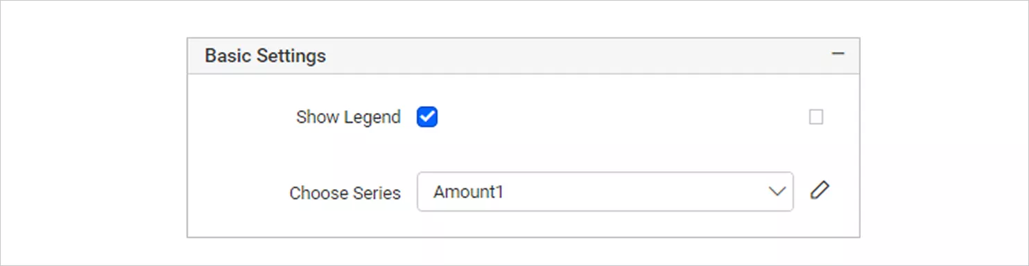
- Basic settings: Control the essentials like toggling the legend, configuring series options, and fine‑tuning display for clarity.
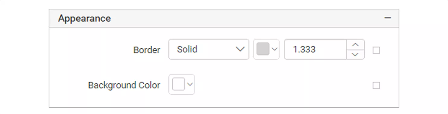
Basic Setting - Appearance: Manage borders, background, and typography to match your brand theme and improve readability.
Appearance 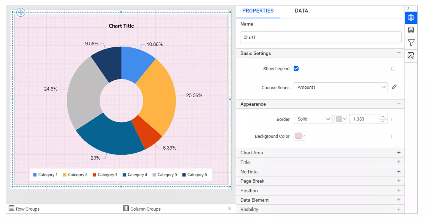
Appearance Category - Chart area: Adjust the drawing region, spacing, and color palette to keep visuals consistent across multiple reports.
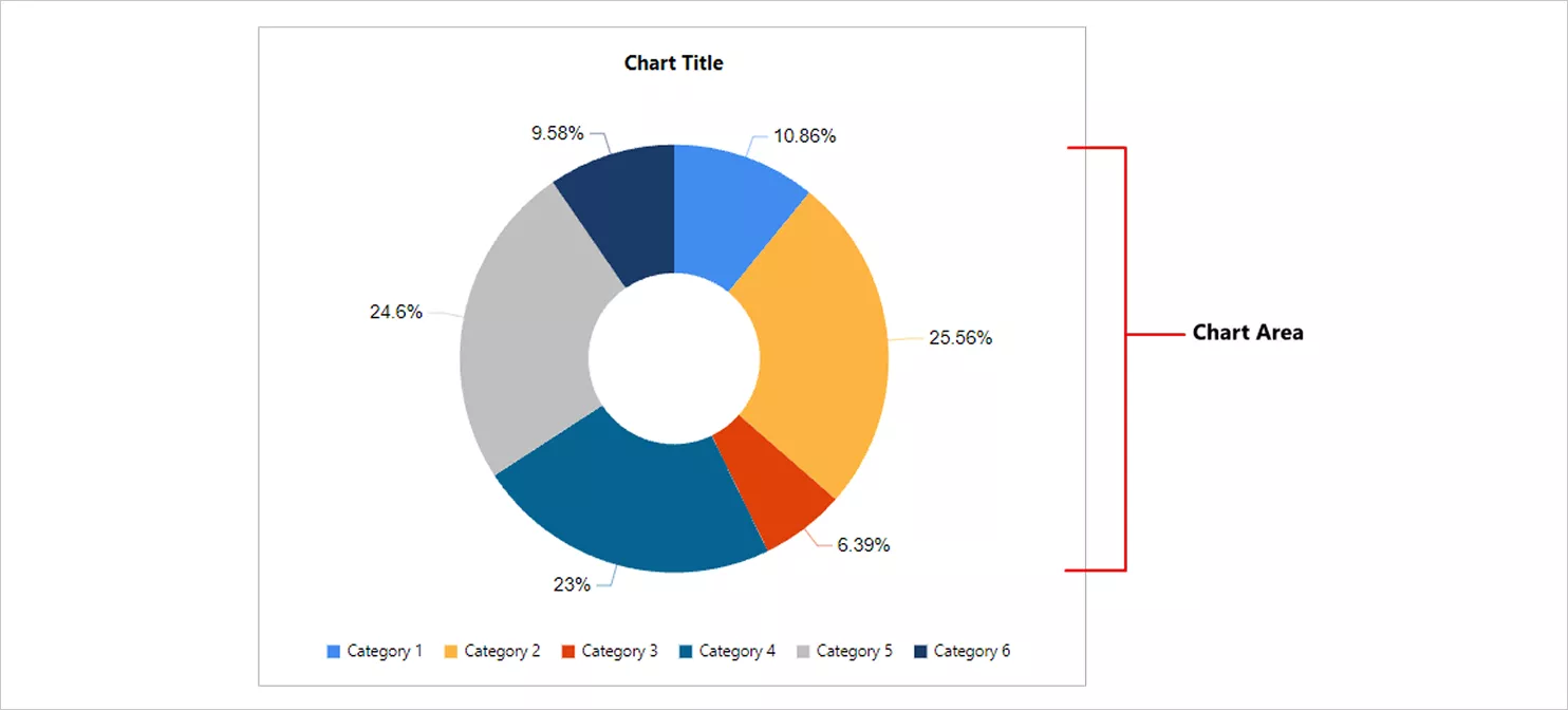
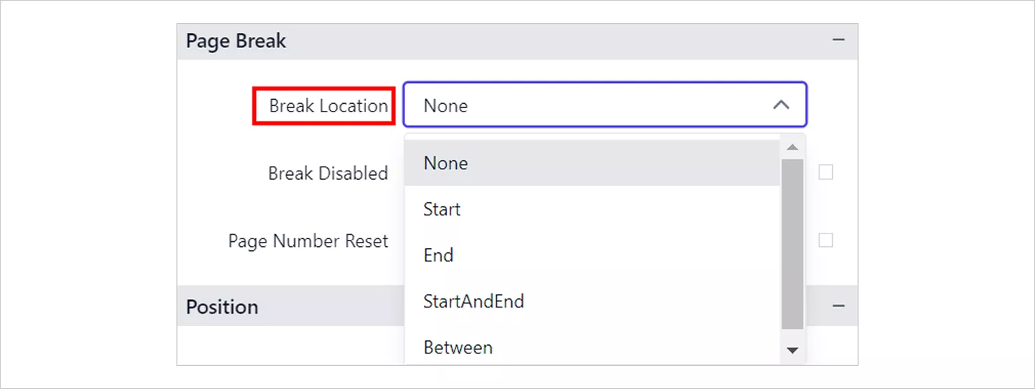
Chart Area - Page break: Handle pagination behavior to ensure clean printed or exported layouts.
Page Break Location 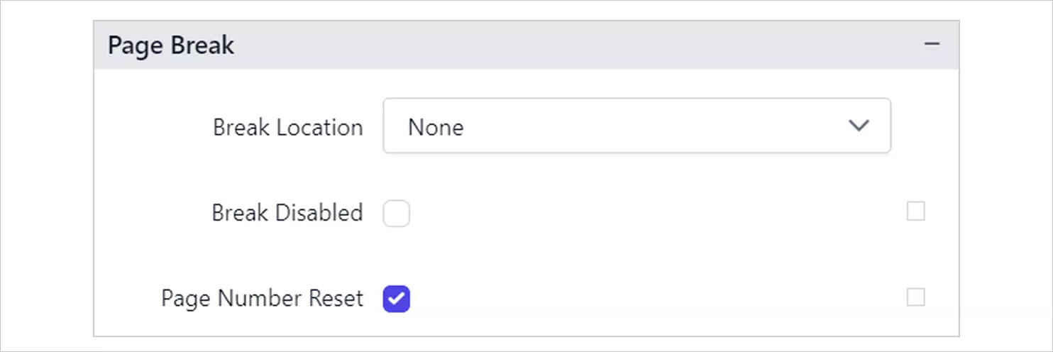
Page Break - Document map: Add the chart to navigation panels in exported PDFs, helping readers locate sections efficiently.
- Bookmark: Create a navigable anchor point so users can jump directly to the doughnut chart within lengthy reports.
- Page name: Define the name shown in page tabs when exporting to Excel or Word, improving navigation and organization.

Page Name - Output: Choose whether the chart appears in specific export formats, which is handy for format‑specific layouts.
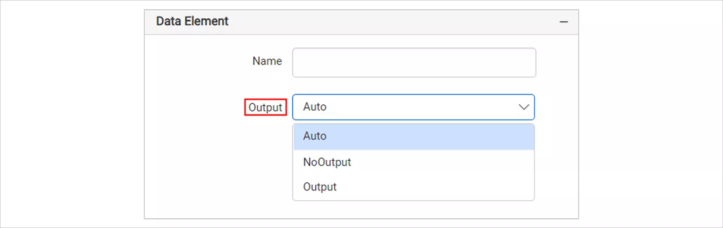
Output - Data element: Define how chart data is represented in data‑driven exports like XML, supporting integration and automation.
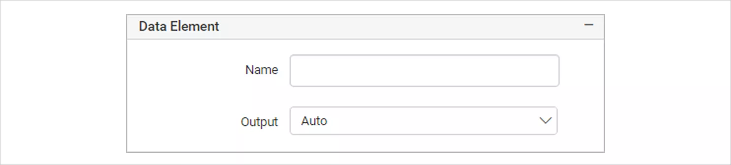
Data Element - Custom style: Apply advanced styling rules when you need formatting beyond the default options.
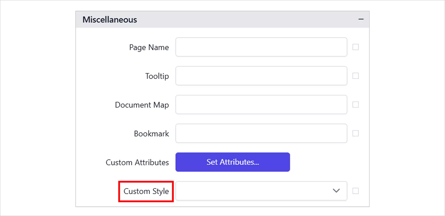
Custom Style
These features create a strong foundation, but effective doughnut charts also rely on following practical best practices. Check out our documentation for more details. Even with the right configuration, following best practices ensures your doughnut charts remain clear and easy to interpret.
Best practices for using doughnut charts in reports
The following best practices will help you design clear, readable, and easy‑to‑interpret doughnut charts in your reports:
-
- Limit the number of categories, aiming for five to eight main slices and grouping smaller ones into an “other” category to maintain clarity.
- Make labels work effectively, showing percentages (and names when helpful) while avoiding clutter. Use leader lines when necessary to keep labels clear and readable.
- Highlight what matters, using contrast or accent colors to draw attention to key categories or important values.
- Avoid overlapping text, adjusting label positions or resizing the chart area to preserve readability.
- Add context where needed, such as a brief subtitle or annotation, to help viewers quickly understand what the visualization represents.
- Stay in 2D, since 3D effects distort slice sizes and reduce accuracy in part‑to‑whole comparisons.
When implemented well, doughnut charts become powerful tools in various industries. Here’s how.
Real-world use cases of doughnut charts in Bold Reports
Real-world reporting scenarios show just how versatile this chart can be. Let’s see:
Sales: Ticket sales analysis
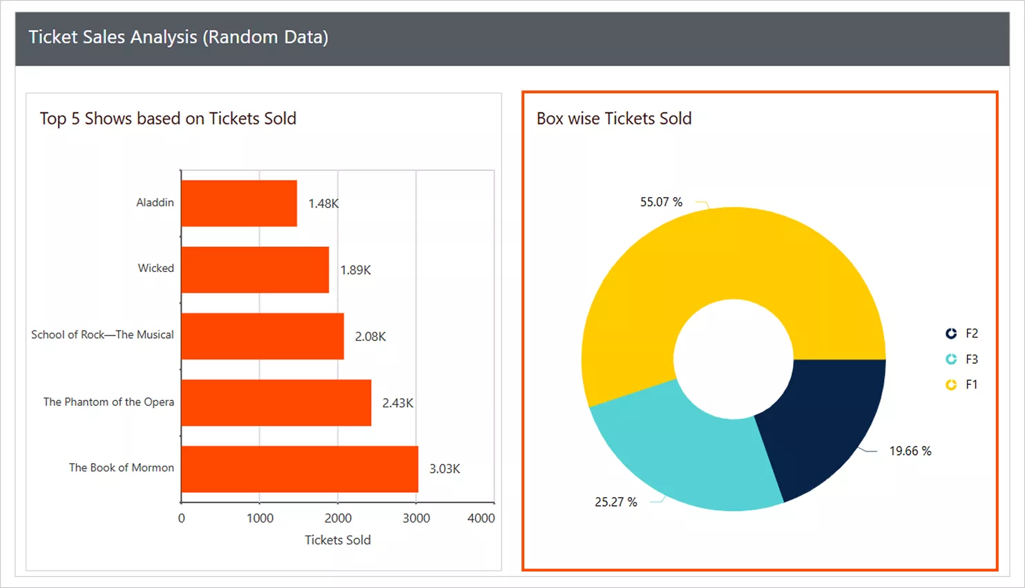
Ticket sales data often vary across seating tiers, making it difficult to identify which ticket types drive the most revenue at a glance. This can lead to misjudging demand or overlooking underperforming categories. In our sample ticket sales analysis, the doughnut chart displays the percentage distribution of tickets sold by ticket type such as VIP, Premium, and Standard. Each slice represents a ticket category’s share of total ticket sales, making it easy to identify dominant ticket types and understand overall sales distribution.
Marketing: Personal expense analysis
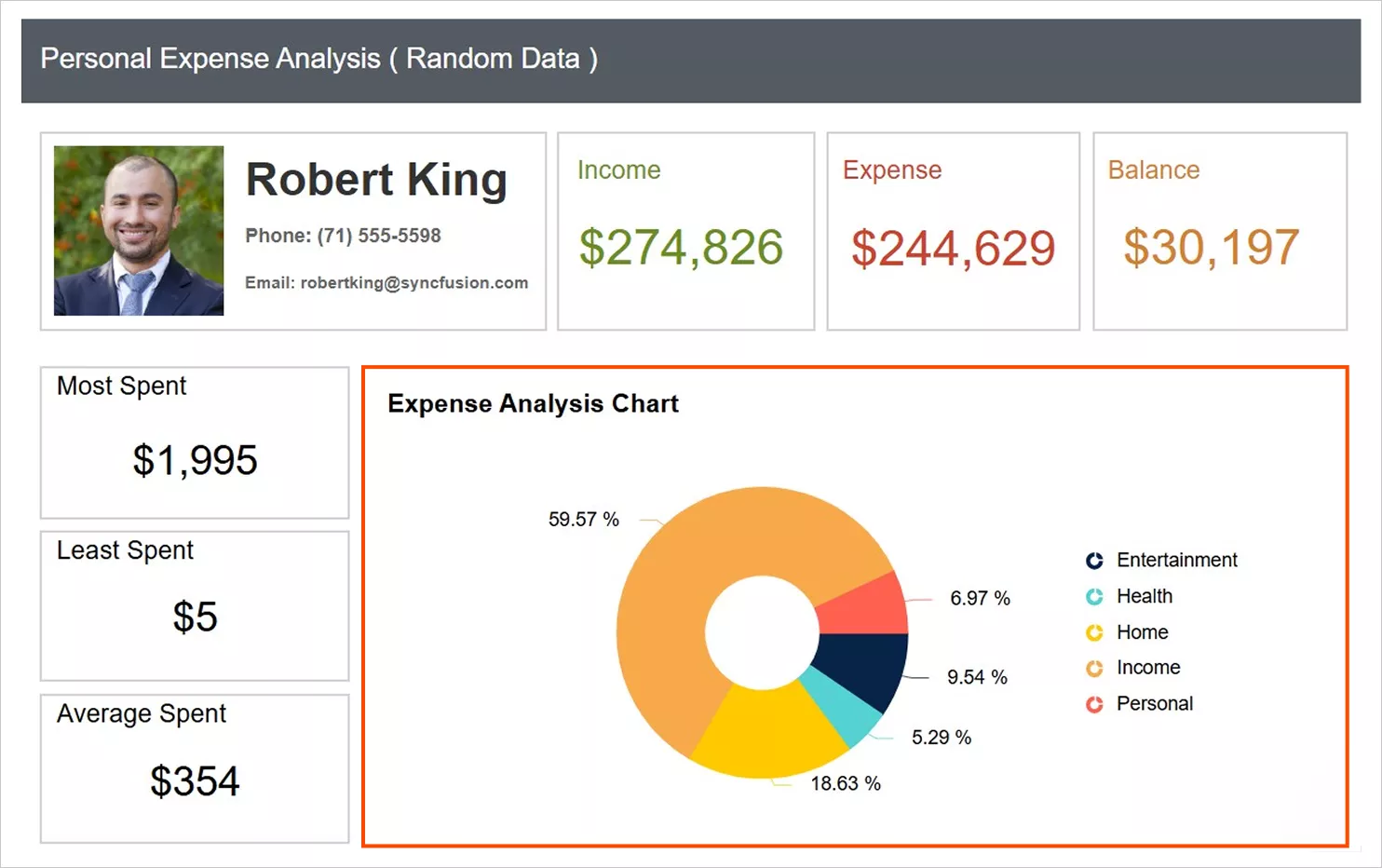
Personal expenses can span multiple categories, making it hard to determine which areas consume the most spending at a glance. This often results in unclear spending patterns and less informed budgeting decisions. A doughnut chart in the personal expense analysis report shows how total expenses are divided across categories such as Entertainment, Health, Home, and Personal. The chart highlights the proportional contribution of each expense type, helping users quickly identify major cost areas and adjust budgets accordingly.
HR: HR payroll report
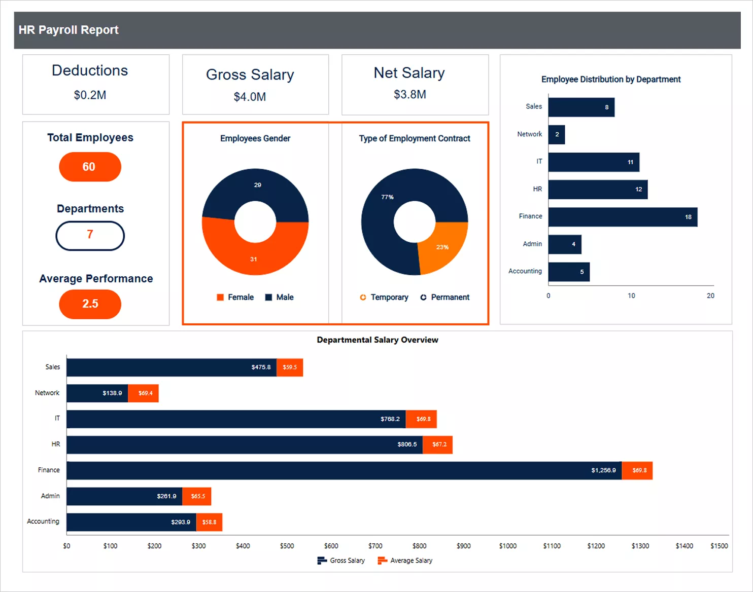
Payroll reports often need to show workforce composition clearly, which can be difficult to interpret using tabular data alone. The doughnut charts used in an HR payroll report show how employees are distributed by gender and type of employment contract. One doughnut chart displays the number of employees by gender, while the other shows the distribution of employees across permanent and temporary contracts. This visual breakdown makes workforce distribution easy to understand and supports payroll and workforce planning discussions.
After seeing how doughnut charts work across industries, let’s wrap it all up into a concise summary.
Visualize proportional data with doughnut charts in Bold Reports
A well‑configured doughnut chart provides a clear, compact view of how parts contribute to a whole, as long as you manage slice count, labels, and color consistency. Bold Reports® gives you the features that matter: Top N or “other” grouping, percentage‑focused labels, palette and appearance controls, plus export and navigation features that keep your chart reliable across PDF, Word, and Excel. Ready to build polished, export‑ready charts? Start your free 30-day trial or request a demo to explore how easy it is to build export-ready visuals.
Frequently asked questions
-
- 1.
What is a doughnut chart?
A doughnut chart is a circular chart with a hollow center that shows how categories contribute to a total. Each slice represents a proportion of 100%, making part‑to‑whole data easy to understand.
- 2.
How many slices should a doughnut chart have?
Ideally, five to seven main slices; group the rest into “other.”
- 3.
Can I show exact values and percentages?
Yes. Use labels for percentages and tooltips for exact values to keep the chart clean.
- 4.
Should I use doughnut charts for time series data?
No. Use line or bar charts for trends over time. Doughnuts are best for static part‑to‑whole views.
- 5.
How do I keep colors consistent across reports?
Lock a palette in Bold Reports and reuse the same style template so categories remain recognizable in every export.
- 1.