Line Chart in Reports: How to Create and Use It Effectively

TL;DR: A line chart helps visualize trends and changes in data, making it easier to track patterns, identify growth or decline, and compare multiple series. This guide explains when to use a line chart, how to create one in Bold Reports®, and practical examples that demonstrate its value in reporting.
Introduction
A line chart is widely used in reporting because it clearly shows how values change over time. By connecting data points with straight lines, it helps stakeholders quickly identify trends, patterns, and fluctuations without needing to examine large datasets in detail.
Because data points are connected in sequence, viewers can quickly see whether performance is improving, declining, or remaining stable.
In this guide, you’ll learn what a line chart is, when to use it, its benefits, and how to create one step-by-step using Bold Reports.
Understanding a line chart in reports
A line chart is a visual chart type that displays trends by connecting data points with straight lines across a continuous axis, typically time. The direction and slope of the line make it easy to see increases, decreases, and patterns in data. In Bold Reports, this chart type works well for tracking performance over time and comparing multiple data series within the same report.
Before you start building or customizing a line chart, it’s helpful to understand the different line chart variations available in Bold Reports.
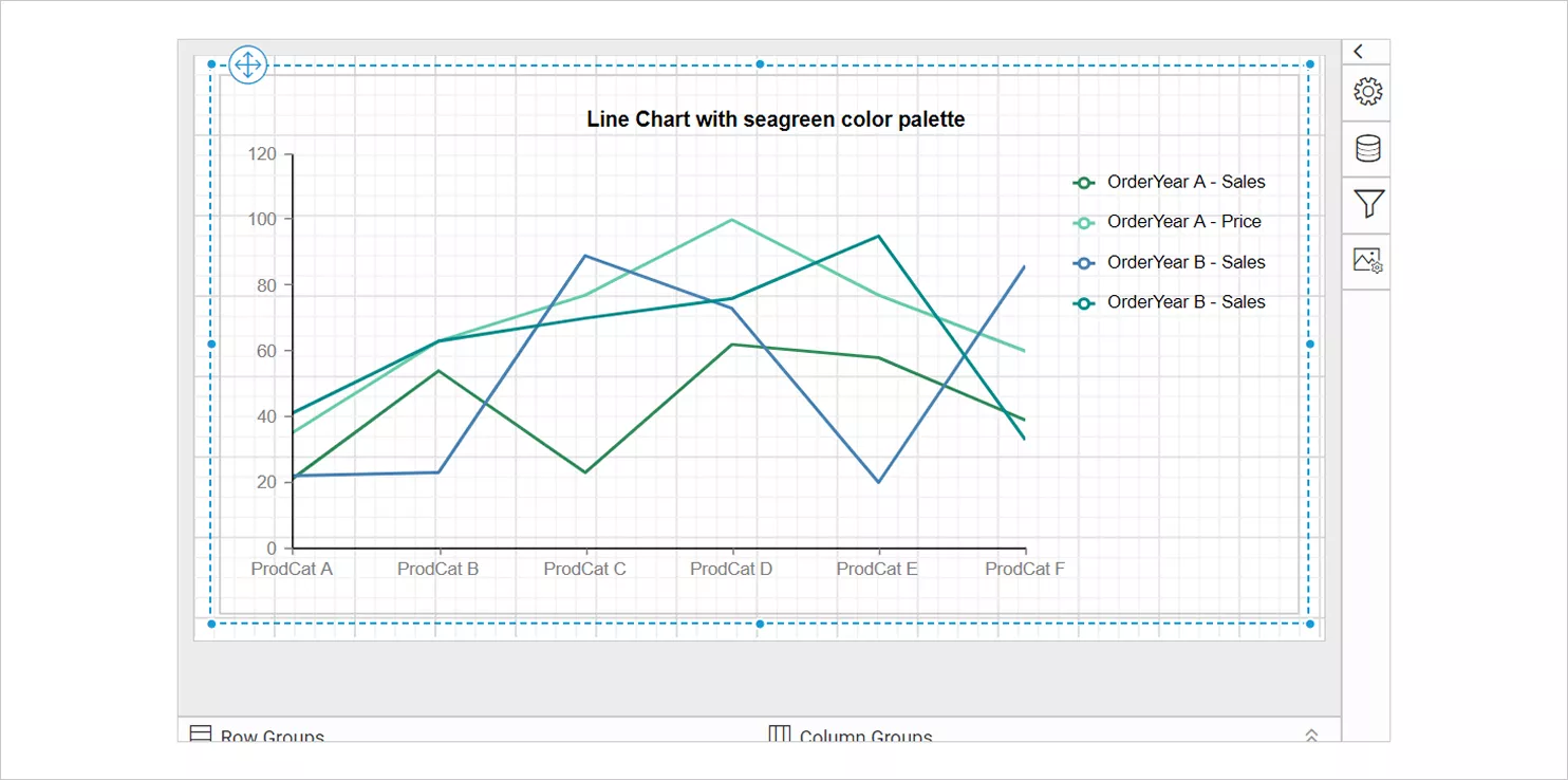
Now that you understand what a line chart communicates, let’s discuss the various types of line charts in Bold Reports.
Types of line charts in Bold Reports
Bold Reports offers two types of line charts, each designed to visualize trends in slightly different ways depending on the detail and clarity required.
Standard line chart
A standard line chart connects data points with straight, continuous lines.
It is best suited for:
-
- Highlighting overall trends.
- Showing direction and rate of change.
- Comparing multiple series over time.
- Keeping the visual clean and focused on movement rather than individual points.
Line with markers
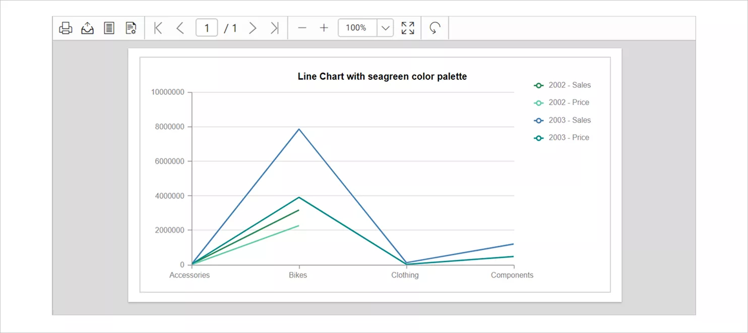
The line with markers chart enhances the standard line visualization by adding markers at every data point. These markers help draw attention to specific positions on the chart.
Use this type when you need to:
-
- Highlight individual values along the trend.
- Show precision at each plotted point.
- Compare data series with clearly visible intersections.
- Make sudden spikes or dips more noticeable.
Markers make this option especially effective for presentations or reports where clarity and point‑by‑point accuracy are important.
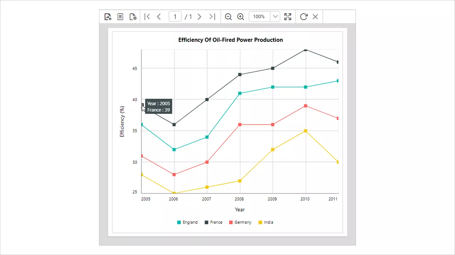
Now, the next step is learning when it’s the right choice, and when it isn’t for your report.
Benefits of using a line chart in reports
Line charts provide several advantages that make them essential for trend-based analysis.
-
- Clear trend visualization: They clearly show whether values are increasing, decreasing, or remaining stable.
- Easy pattern recognition: Patterns such as seasonal changes, growth cycles, or sudden drops become easy to identify.
- Simple comparison: Multiple lines allow users to compare metrics such as sales across regions or product performance over time.
- Clean and professional layout: Line charts present complex data in a simple, visually appealing format, making reports easier to understand.
These advantages make line charts one of the most widely used visualization types in business reporting.
When to use a line chart in Bold Reports
A line chart is most effective when you need to visualize how values change across a continuous sequence. Use a line chart when you are:
-
- Tracking trends over time, such as daily metrics, monthly performance, or yearly growth.
- Monitoring KPIs that change at regular intervals.
- Analyzing patterns or cycles, including seasonal behavior or recurring fluctuations.
- Comparing multiple data series, such as sales across regions or system usage across departments.
- Highlighting spikes, dips, or sudden changes that require quick attention.
- Visualizing continuous or ordered categories, especially dates, numeric sequences, or stages that progress consistently.
- Presenting performance direction, showing whether values are rising, stabilizing, or declining.
If your data follows a logical progression and you need to understand how it moves over time, a line chart is the ideal visualization to use in Bold Reports.
When not to use a line chart in Bold Reports
While the line chart is powerful, it is not suitable for every dataset. Avoid using a line chart when:
-
- The data is not sequential or time-based, such as unordered categories like product names or departments.
- You have many series to compare, as too many overlapping lines can create clutter and reduce clarity.
- The values do not connect meaningfully, such as isolated metrics that don’t follow progression.
- You need to emphasize proportions or part-to-whole relationships, where pie charts or stacked bars work better.
- Data fluctuates randomly without meaningful order, making the trend line confusing or misleading.
- Categories are independent and do not influence one another in sequence.
- You want to compare magnitudes across categories, where bar or column charts provide clearer insights.
In these situations, consider using bar, column, area, or pie charts, which may better represent non‑sequential or comparative data in Bold Reports. Let’s look at some of the types of line chart that we have in Bold Reports.
How to create a line chart in Bold Reports
Bold Reports makes it simple to build a line chart using the Report Designer. To create a line chart in your report:
- Select your data: Choose the tables and fields you want to visualize from your available data sources.
- Add the line chart: From the Report Designer toolbox, drag the Line chart component onto the design surface. Adjust the chart size to fit your report layout.
- Assign data: Open the Chart data panel and click on the Assign fields. To map your data:
-
-
- Groups (Category axis): Drag a dimension field such as Date, Month, Category, or any sequential field.
- Values (Y-axis): Drag the numeric measure you want to plot, such as Sales, Counts, or Revenue.
-
- Customize the appearance: Modify key properties to enhance the chart, including:
-
-
- Line style (solid, dashed, dotted).
- Line thickness.
- Marker shapes (circle, square, diamond).
- Colors and palettes.
- Axis formatting (labels, scales, intervals).
-
- Add labels and legends: Configure data labels to show values on each point if needed. Adjust the legend’s placement and style to make the chart clearer, especially if multiple lines are used.
- Handle empty or missing data: Set up no data properties to show a custom message or placeholder when the dataset is empty or incomplete.
- Preview and save: Click Preview to see how the line chart renders your data. Make final adjustments, then save your report.
For more details on preparing data or customizing formatting, refer to the documentation.
Features of the line chart
Line chart in Bold Reports offer robust customization options to ensure clarity and visual consistency:
- Name: Assign a unique identifier to the line chart item in the report. This makes it easier to manage, reference, and customize the chart, especially when your report includes multiple visual elements or several line-based comparison.
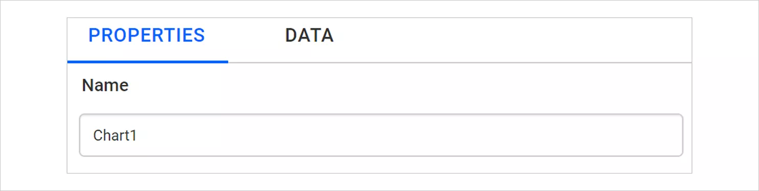
Name - Basic settings: Select the chart type, adjust its behavior, and establish its foundational properties.
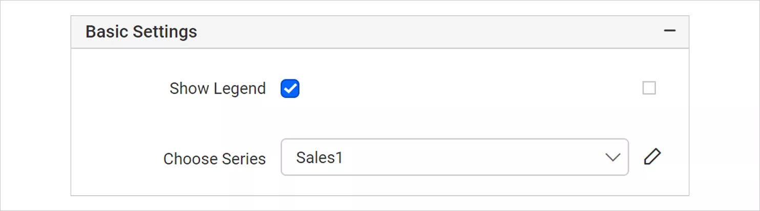
Chart type-basic option - Appearance: Customize borders, backgrounds, and line styles to match your dashboard or organizational theme.
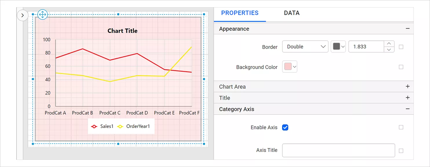
Background color appearance - Chart area: Modify the plot areas: Background, borders, shadows, and color palette.
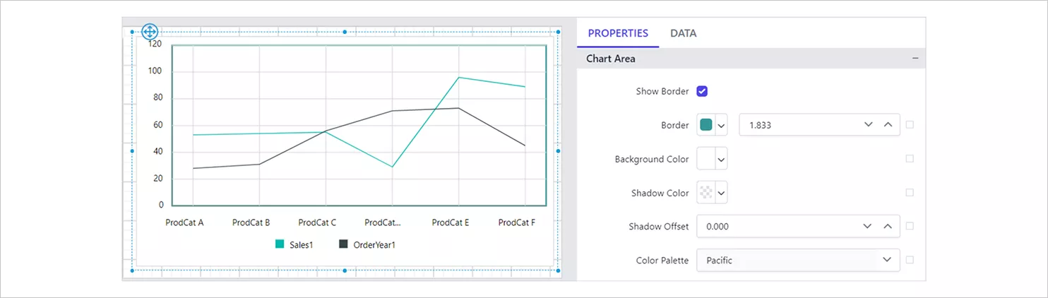
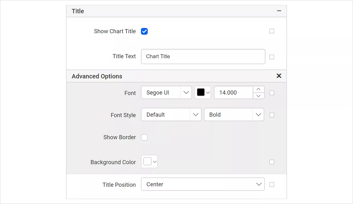
Chart area - Title: The title settings let you show or hide the line chart title and edit the text to match your report’s context. You can also customize the font, background, and alignment to ensure the chart title is clear and visually consistent with the rest of your re
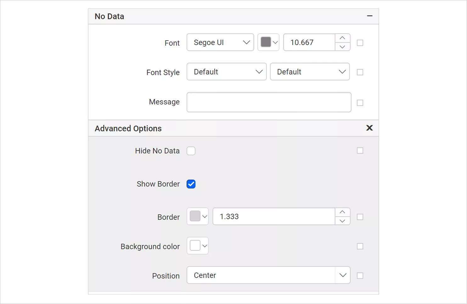
Title - No data: Display a message when the dataset returns empty or zero rows at runtime. This prevents blank charts and clearly communicates why no visual is show
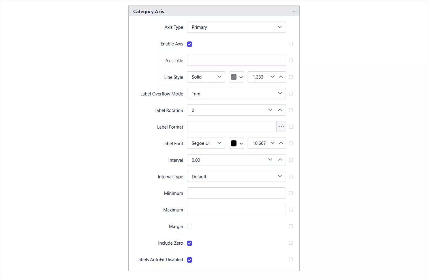
No Data - Category and value axes: Control details such as: Label formatting, interval spacing, number formatting, tick marks and scale and orientation.
Category axis 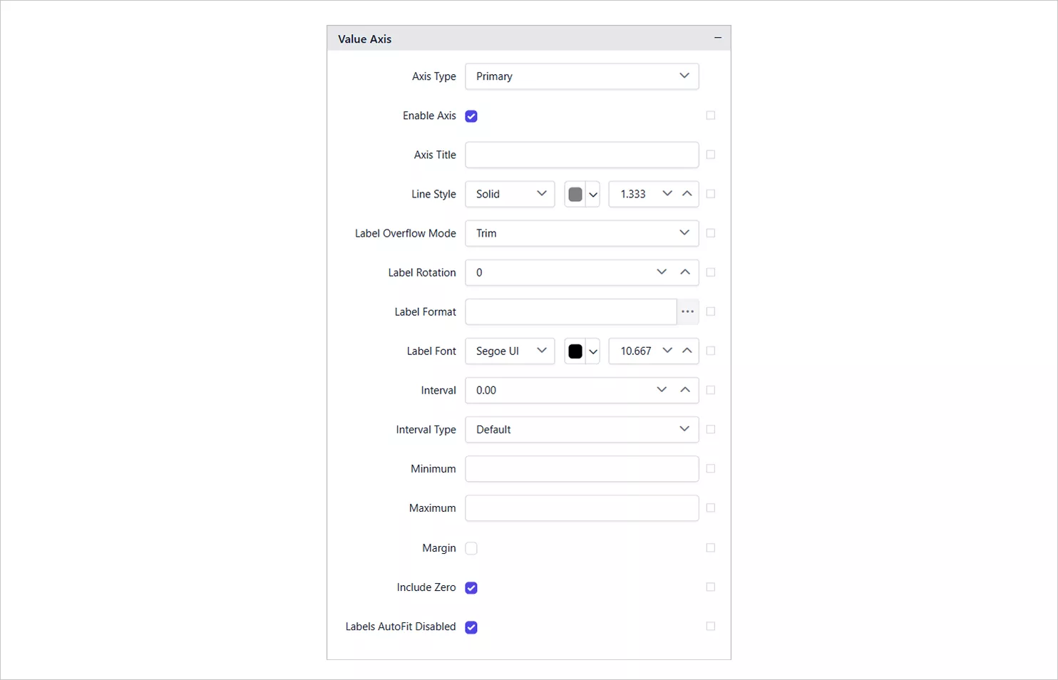
Value axis - Grid lines: Turn major/minor grid lines on or off, or style them for improved readability.
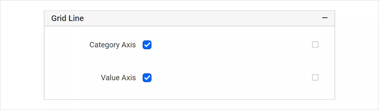
Grid line - Page breaks: Determine how the chart behaves during pagination in printed or exported reports.
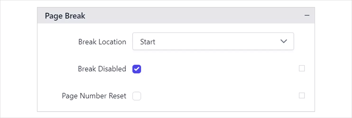
Page Breaks - Data elements: Enable data extraction when exporting XML or CSV for automation workflows.
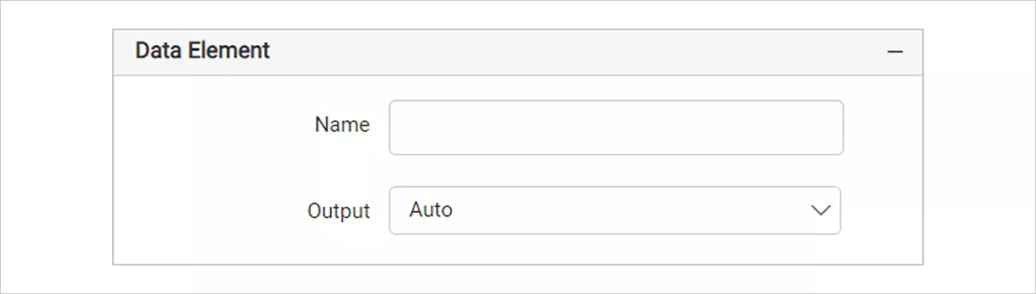
Data element - Output options: Choose whether the chart appears in specific export formats such as PDF, Excel, or Word.
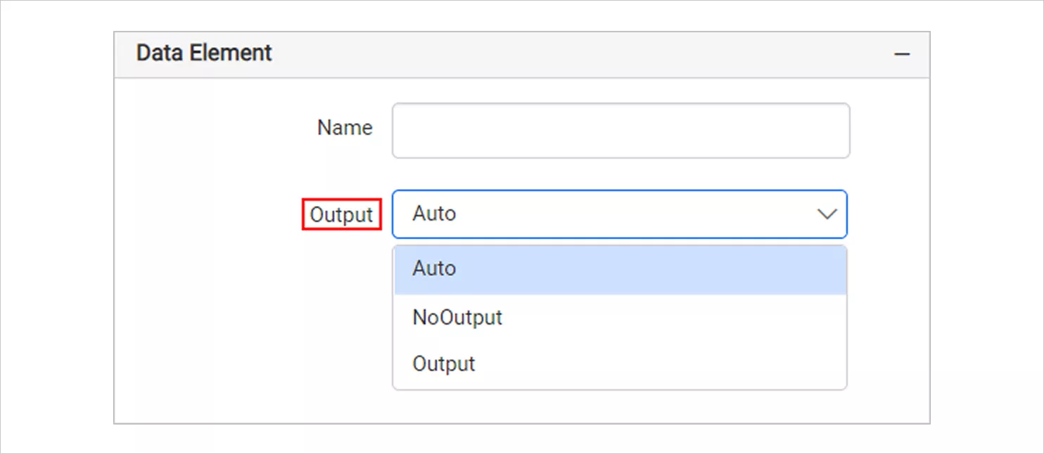
Data element Output Options - Page name: Set custom sheet names to make multi‑page exports easier to navigate.
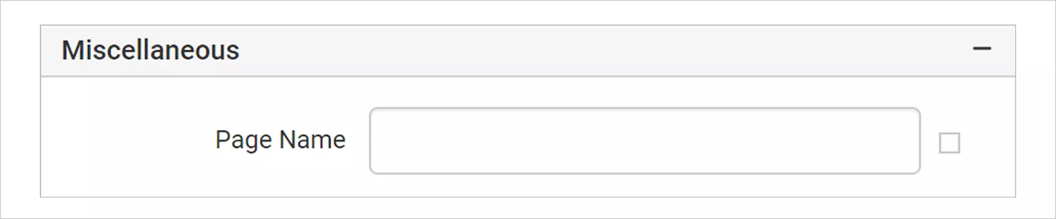
Page Name - Document map & bookmarks: Add navigation shortcuts for larger reports.
- Custom attributes: Attach custom metadata for advanced automation or processing scenarios.
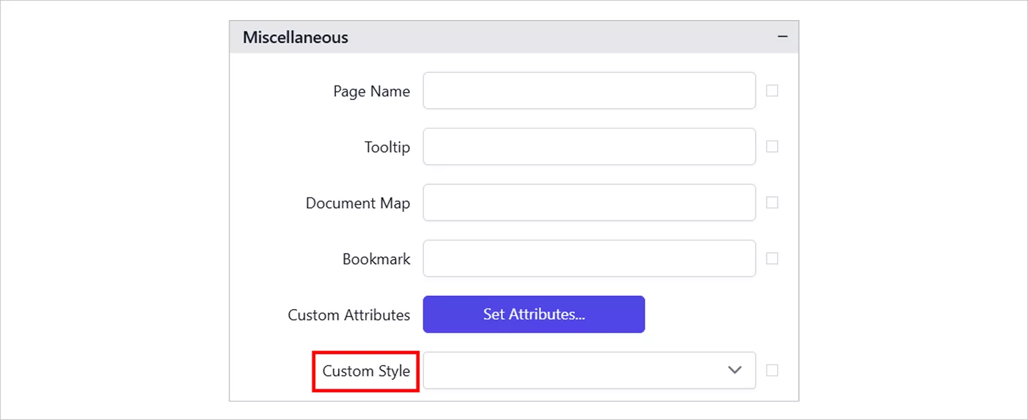
Custom attributes
Explore our help documentation to learn more about these line chart features in Bold Reports.
Real‑world use cases of line chart in Bold Reports
Below are practical, real‑world scenarios showing how line chart support time‑based analysis, trend monitoring, and performance tracking across industries in Bold Reports, using examples from the reference reports.
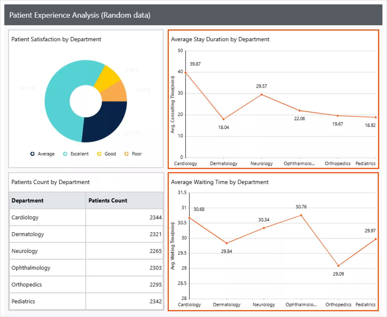
Healthcare: Patient experience trends
In the Patient experience analysis report, line chart helps visualize trends in experience scores, appointment wait times, and service efficiency across months or quarters. This makes it easy for hospitals to identify improvements, spot declines in specific departments, and monitor long‑term patient feedback patterns.
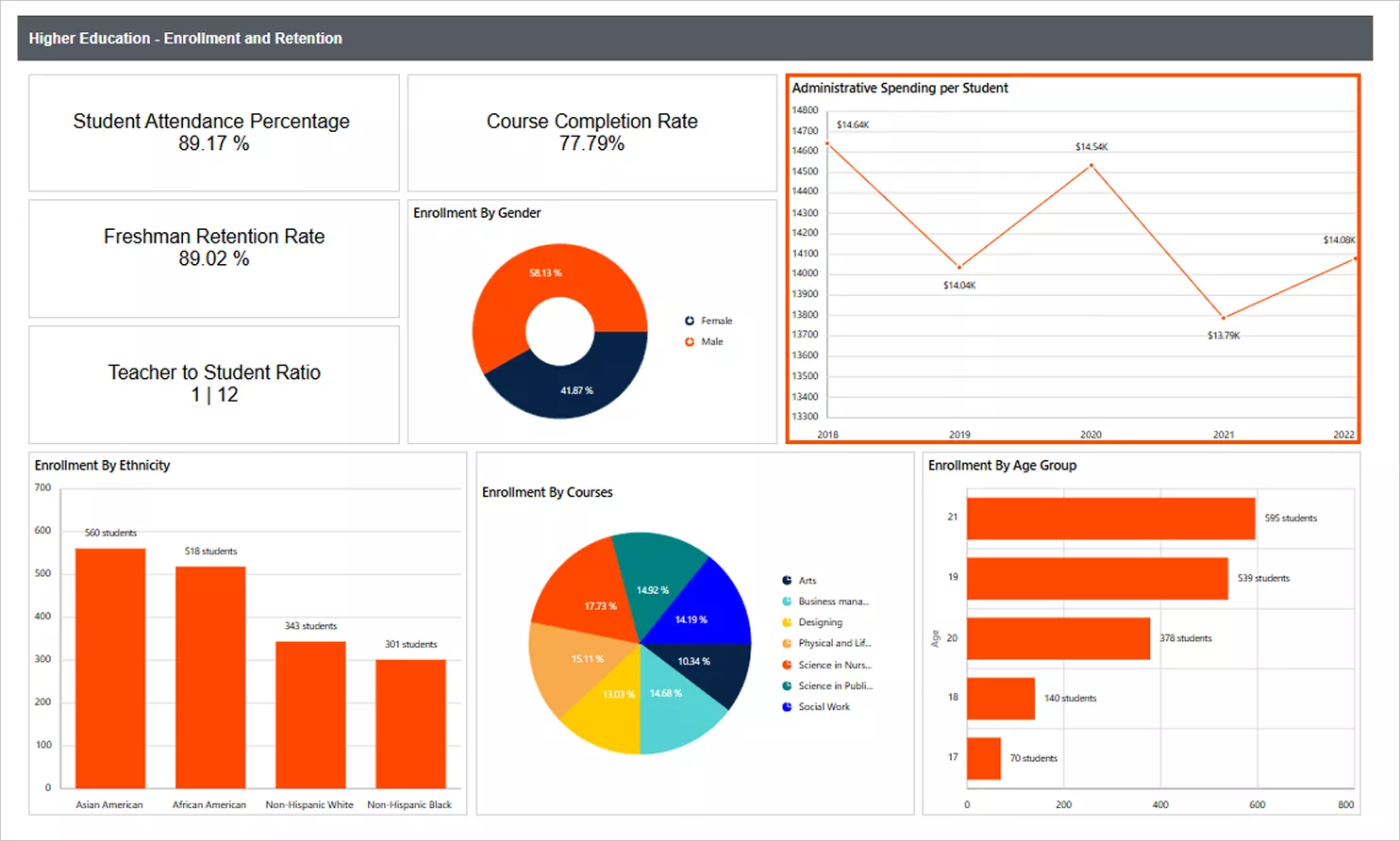
Education: Enrollment and retention over time
Higher education institutions often track how enrollment and retention numbers shift across semesters or academic years. In this report, line chart illustrates changes in student enrollment, continuing student percentages, and retention trends. These visuals help administrators quickly identify cycles and evaluate the impact of recruitment strategies or academic support pro
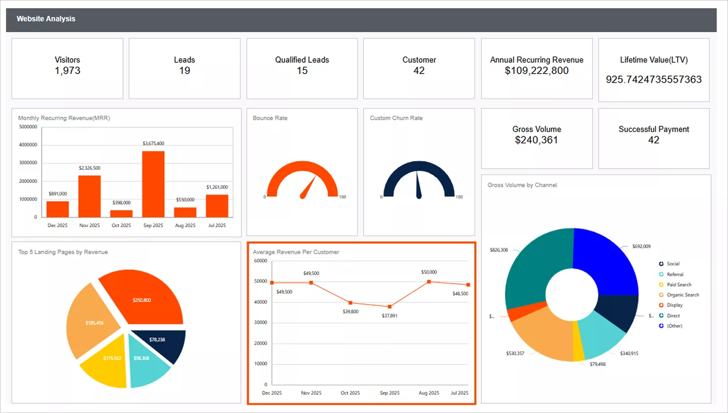
Marketing: Website performance trends
Marketing teams rely on timely insights to understand user engagement. The website analysis report uses line charts track metrics such as daily or monthly page views, bounce rates, average session duration, and visitor trends. These visuals reveal meaningful patterns, traffic surges, content performance cycles, and seasonal declines, helping teams refine marketing strategies and optimize digital campaign
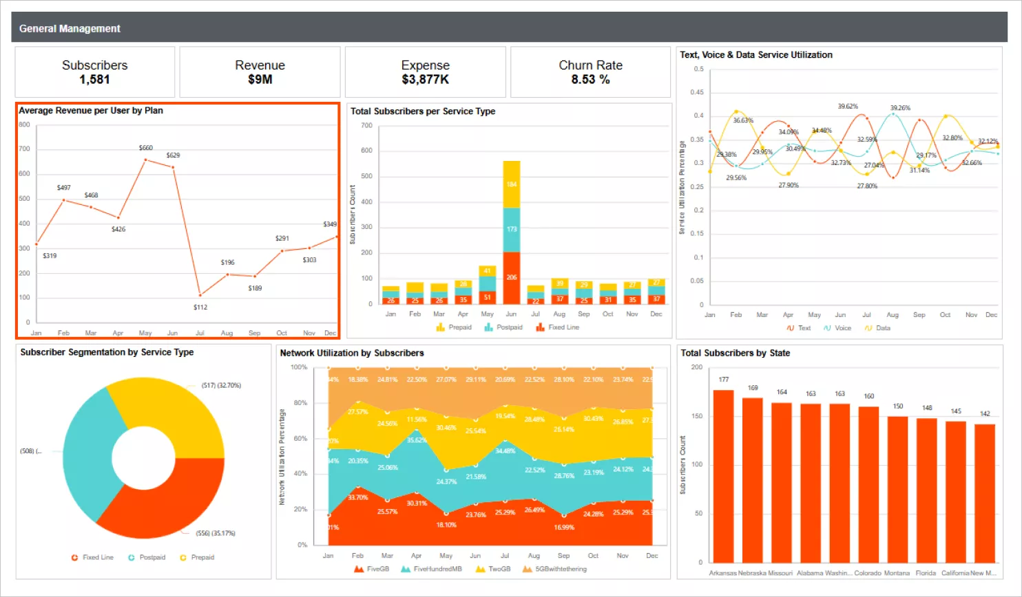
Telecommunications: General management and operational trends
This general management report uses line chart to track call volume fluctuations, service usage trends, network performance metrics, and subscriber growth patterns. By observing these time-based variations, management teams can detect peak usage periods, identify service bottlenecks and make data‑driven operational decisions.
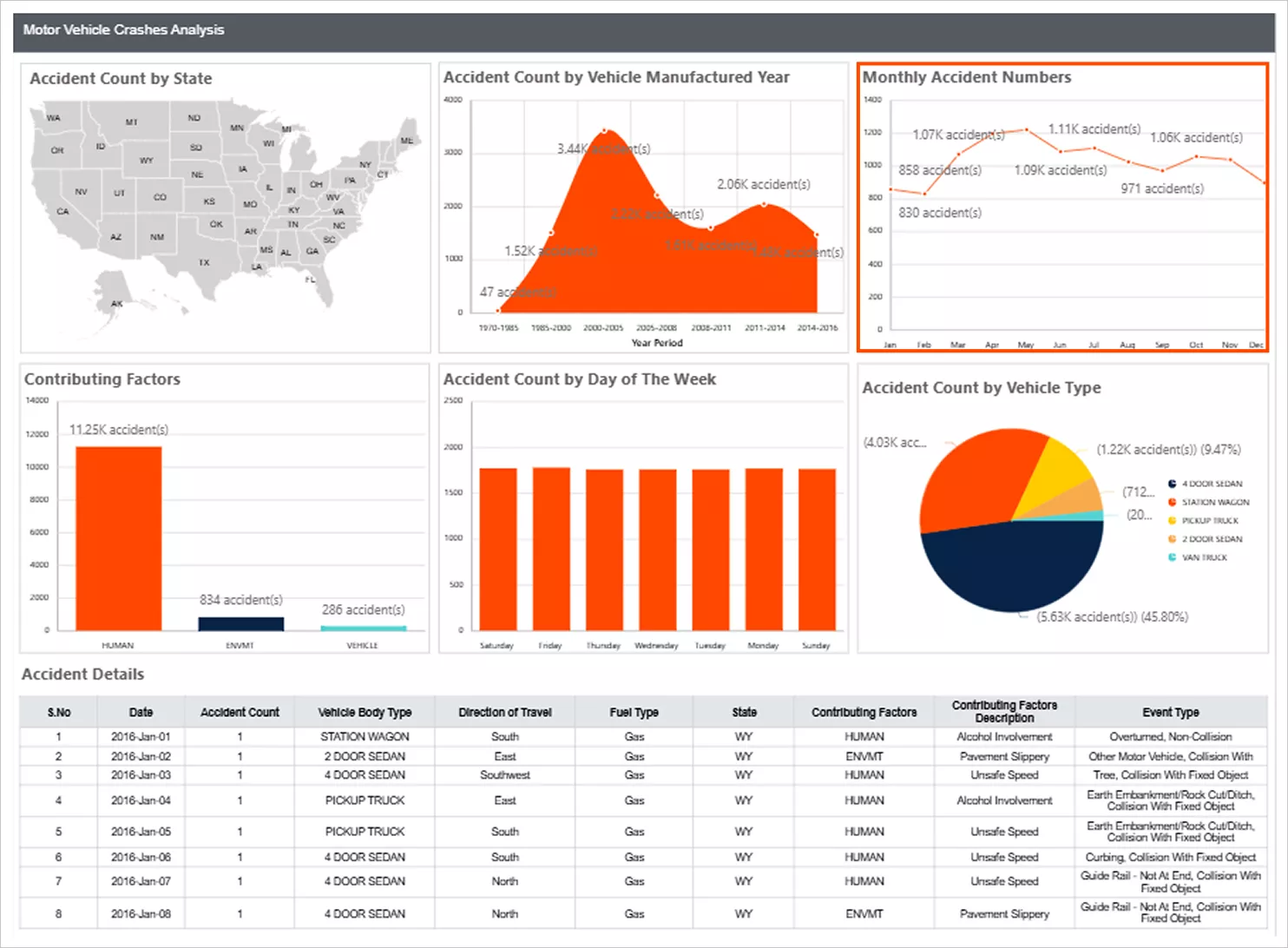
Government: Motor vehicle crash trend analysis
In the motor vehicle crash analysis report, line chart help track accident counts by year or month, visualize peak crash periods, and identify long‑term safety trends. This makes it easier for policymakers to pinpoint high‑risk seasons, evaluate the effectiveness of safety interventions, and allocate resources appropriately.
Best practices for designing a line chart
To make your line chart clear and effective, follow these best practices.
- Use time-based data: A line chart work best when the data follows a logical sequence such as days, months, or years.
- Limit the number of lines: Too many lines can make the chart difficult to read.
- Use markers carefully: Markers should highlight important points without overcrowding the chart.
- Keep the design simple: Avoid unnecessary colors or decorative elements that distract from the trend.
- Use proper axis scaling: Ensure that axis intervals accurately represent the data.
Following these practices improves the readability and impact of your reports.
Why teams use Bold Reports for data visualization
Organizations choose Bold Reports to create powerful data visualizations because it provides:
-
- A drag-and-drop Report Designer.
- Pixel-perfect reporting layouts.
- Built-in chart visualizations.
- Export to PDF, Excel, Word, and PowerPoint.
- Easy embedding inside applications.
- Scalable enterprise reporting.
These capabilities help teams build professional reports while maintaining flexibility and performance.
Final thoughts
A line chart in reports is one of the most effective ways to visualize trends and performance changes over time. By connecting data points sequentially, it helps teams quickly identify patterns, detect anomalies, and make better decisions. With tools like Bold Reports®, creating a line chart becomes simple through a drag-and-drop designer and customizable chart options.
Whether you are tracking sales growth, monitoring system performance, or analyzing user engagement, a line chart provides clear insights that transform raw data into meaningful visual information. Ready to elevate your reporting? Start your 30-day free trial of Bold Reports and build an interactive line chart directly from your application or data sources.
Frequently asked questions
- 1.
Can I control page breaks and print layout?
Absolutely. Bold Reports gives you full control over page breaks, margins, and layout settings, making it easy to create clean, structured, and print-ready reports.
- 2.
Will the reports look the same across different export formats (PDF, Excel, Word)?
Yes. Bold Reports delivers pixel-perfect output, maintaining layout and formatting across all export formats, what you design is what you get.
- 3.
Can I control the exact positioning of text, tables, and images?
Yes. Bold Reports uses a grid-based layout that lets you precisely place every element, ensuring consistent alignment across pages.
- 4.
Can I create multi-page reports with repeating headers and footers?
Absolutely. You can design repeating elements like headers, footers, and page numbers for a consistent, professional look across pages.
- 5.
Does Bold Reports support complex formatting like nested tables, conditional formatting, or subreports?
Yes. You can build rich layouts with nested tables, conditional styles, subreports, and dynamic visualizations all with pixel-level precision.
- 6.
Is it possible to preview print layout before exporting?
Yes. You can preview your report’s print or PDF layout directly in the designer, making it easy to fine-tune before exporting or sharing.