How to Visualize Data Using a Pie Chart in Reports

TL;DR: A pie chart quickly communicates how each category contributes to a whole, making it easier for stakeholders to interpret proportional data at a glance. This guide explains when to use it, how to build one in Bold Reports®, and practical examples that show its value.
Introduction
A pie chart is widely used in reporting because it makes part-to-total relationships easy to understand. With a simple visual layout, stakeholders can immediately grasp distribution patterns without analyzing complex datasets.
In this guide, you’ll learn what a pie chart is, when to use it, its benefits, and how to create one step-by-step using Bold Reports®.
Who this guide is for
This blog is written for:
-
- Business analysts who need to visualize category distribution.
- Operations managers tracking inventory or resource allocation.
- Sales teams analyzing order distribution across channels.
- Report designers and BI developers building interactive reports.
If your goal is to show how a total is divided across categories, a pie chart in reports is a dependable option that most viewers immediately understand.
Understanding a pie chart in reports
A pie chart is a visual chart type that summarizes part-to-whole relationships by showing each category as a slice of a circle. The larger the slice, the larger the contribution. In Bold Reports, this chart type works well for presenting percentage breakdowns and making dominant segments instantly obvious.
Before you start building or customizing a pie chart, it’s helpful to know the specific pie chart variations available in Bold Reports.
Types of a pie chart in Bold Reports
Below are the different variations of a pie chart in Bold Reports, each designed for a slightly different storytelling need.
- Simple pie chart: This is the standard pie chart that illustrates how each category contributes to the total by displaying values as slices of a circle.
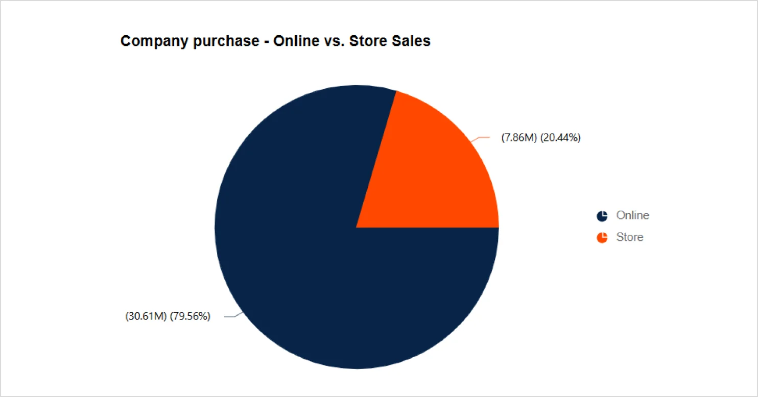
Simple pie chart in Bold Reports - Exploded pie chart: Separates selected slices from the rest of the circle, helping highlight important categories or small proportions.
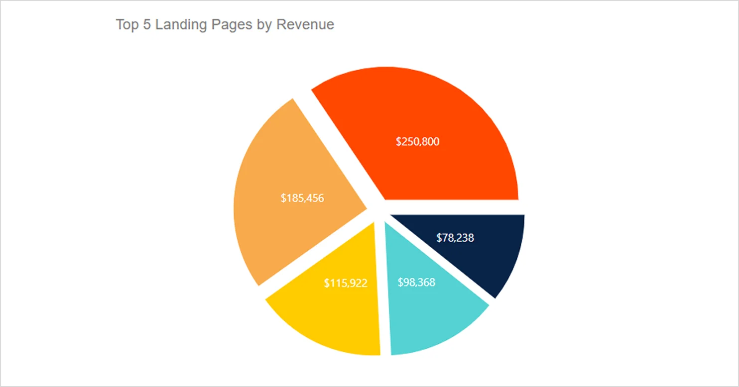
Exploded pie chart in Bold Reports
Now that you’ve seen the available chart types, let’s explore the advantages that make a pie chart an effective choice for summarizing proportional data.
Benefits of visualizing data with a pie chart
A pie chart helps communicate a clear story by presenting category breakdowns in a familiar, easy-to-follow visual. It improves stakeholder engagement by making key metrics quicker to scan and understand than raw tables. Pie charts are well-suited for showing percentage-based “parts of a whole” data, such as market share, budget allocation, or survey response splits. They also make proportional differences easy to grasp at a glance because each slice visually represents its share of the total.
These advantages make a pie chart effective, but only in the right situations. Here’s when they add the most clarity to your reports.
When to use a pie chart
Use a pie chart when you want to:
-
- Highlight the largest contributors so viewers can quickly see which categories dominate.
- Communicate a clear part-to-whole relationship.
- Focus on proportions rather than precise numeric differences.
- Present a small set of categories that can be compared easily.
When not to use a pie chart
Avoid pie charts when you need to:
-
- Compare precise category values, since overlapping fills make exact comparisons difficult.
- Display many categories, because too many slices or layers become visually crowded.
- Work with hierarchical categories that require multi-level breakdowns.
- Show overlapping or non-mutually exclusive categories where areas blend and cause confusion.
- Present long-term trends that are clearer in a simple line chart.
To ensure your visuals remain easy to understand, it’s important to follow a few design guidelines.
Best practices for designing a pie chart
To make pie charts easy to understand, follow these best practices:
-
- Limit the chart to five or six slices.
- Display percentage labels clearly.
- Use distinct colors for each category.
- Avoid cluttered legends.
Next, let’s explore how to create a pie chart in Bold Reports.
How to create a pie chart in Bold Reports
Here’s how to create a clean, accurate pie chart in Bold Reports.
- Drag the pie chart from the proportion category into the Design Area to add it to your report.
- Select the chart to open the Properties Panel, go to Assign Data, and pick your dataset from the dropdown.
- Drag a Dimension to the column field and add a Measure to the values field.
- Set aggregation if needed by selecting the Settings Icon next to the value and choose the aggregation type.
- Customize the pie chart by adjusting settings such as colors, styles, and formatting to match your report theme.
- Turn on data Labels and Legend so categories and values are easy to interpret.
- Select Preview to validate the chart with real data, then Save the report.
Refer to the documentation for more information on how to create a pie chart. Next, let’s explore the features that give a pie chart flexibility and visual impact.
Features of a pie chart in Bold Reports
These features help enhance the clarity of the pie chart and user experience. Let’s explore them.
Series
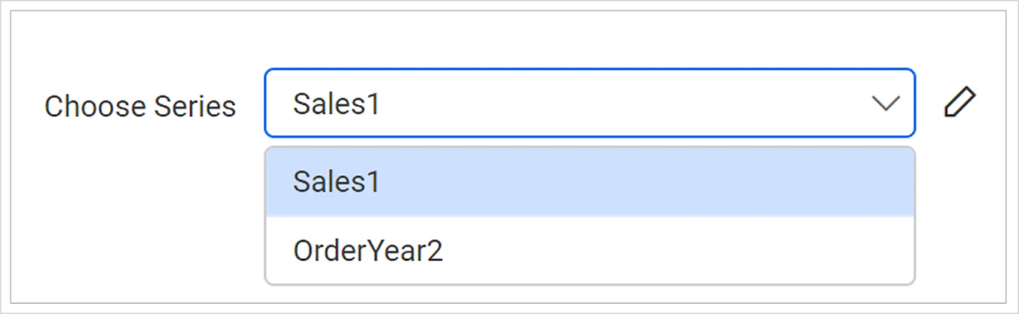
You can add multiple series and switch between them using the choose series dropdown to style each series independently.
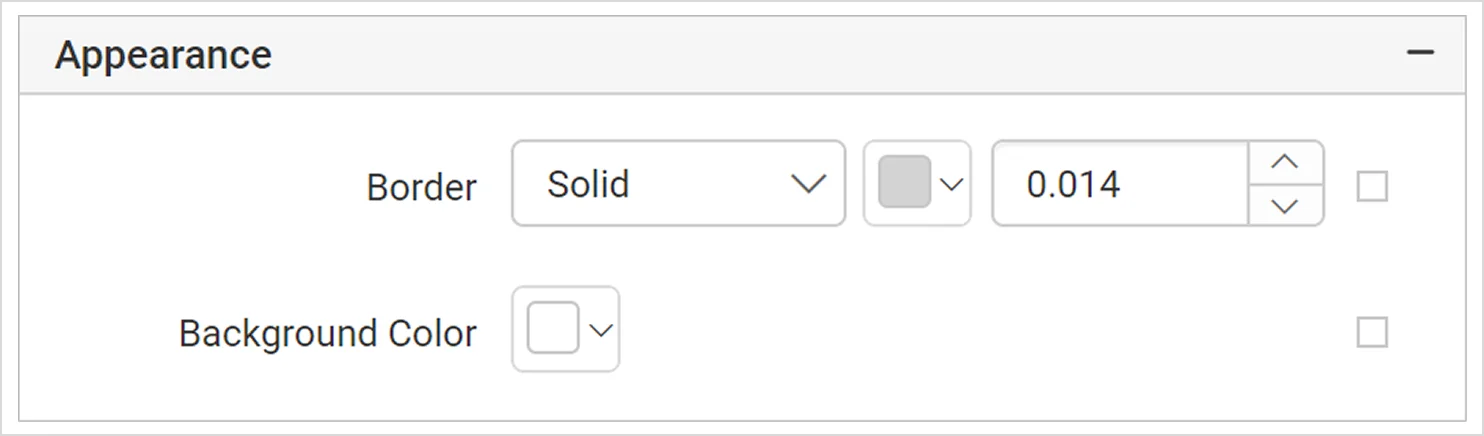
Appearance
You can enhance the chart’s look in the report designer by adjusting its border style, color, width, and background color. These options are available in the appearance category in the properties panel.
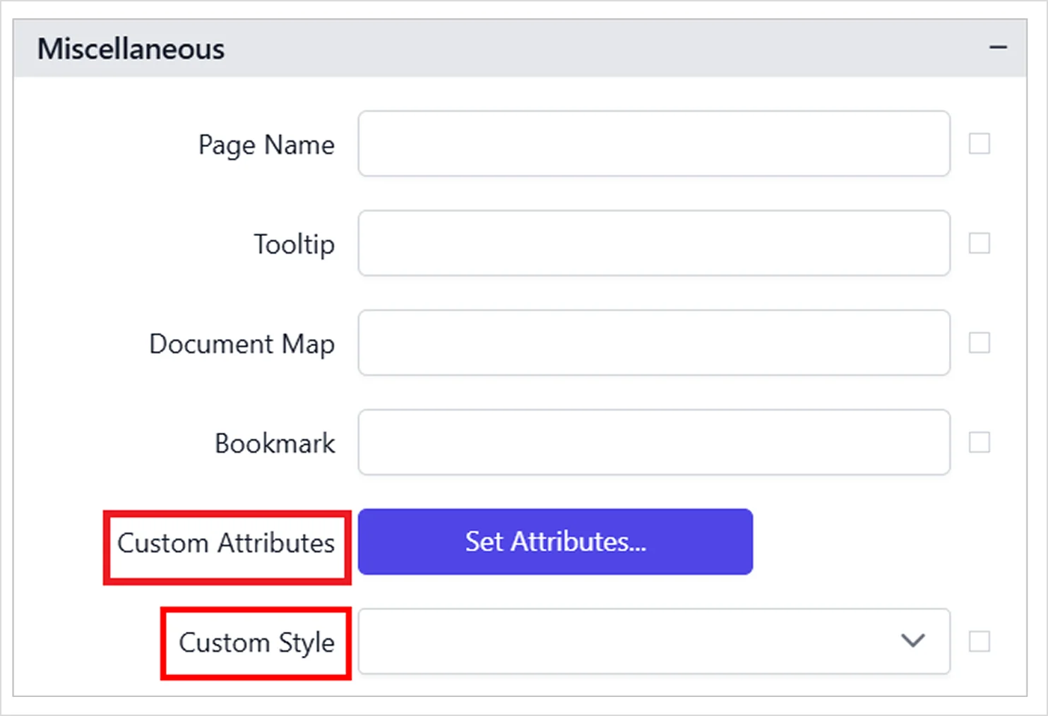
Custom style
You can apply external CSS using custom style for greater styling flexibility and consistent design across reports.
Custom attributes
This setting lets you define values for the chart’s custom properties. To configure these values through the properties panel, refer to the custom properties section.
Many chart-wide features such as legends, titles, tooltips, export options, and data binding are shared across all chart types. Refer to our documentation for general chart properties.
With the chart features in place, it’s helpful to see how a pie chart functions in real‑world reports across different industries.
Real-world use cases of a pie chart in reports
Below are real‑world use cases of a pie chart in different industries.
Retail: Retail inventory management
Inventory levels shift with seasons, promotions, and customer demand, making it hard to see which categories are driving stock imbalances. A pie chart in the inventory report shows each category as a share of total stock, helping teams spot overstock, low quantity risks, and which products dominate the mix.

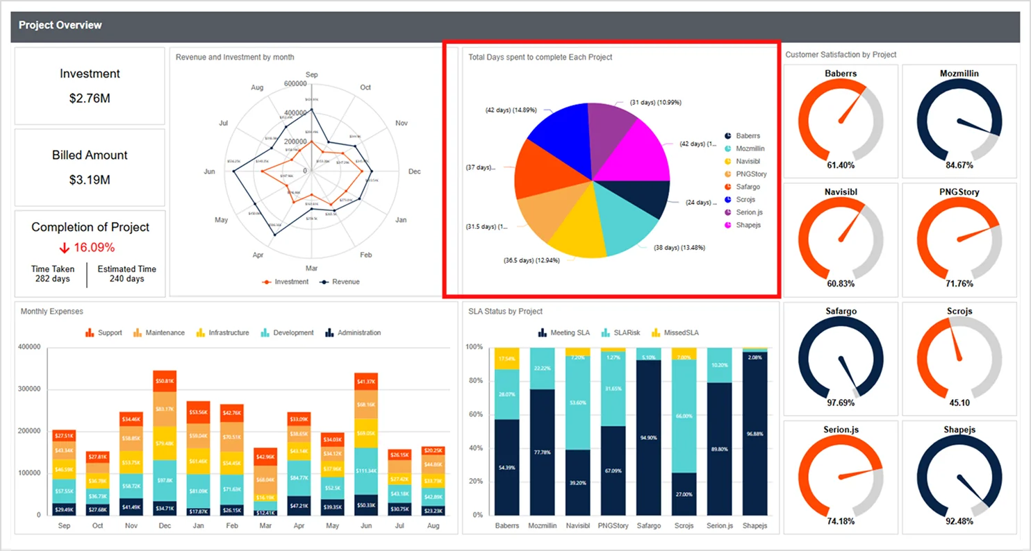
Information technology: Project management
Project priorities often shift, making it difficult to see which initiatives consume the most time. A pie chart in the project report highlights total days spent per project, helping teams spot workload imbalances and redirect resources to stay on schedule.
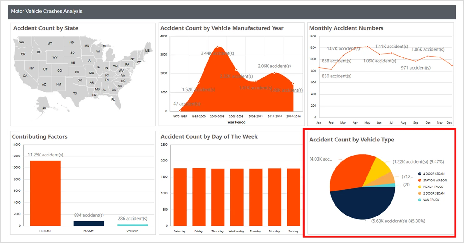
Government: Motor vehicle crashes analysis
Transportation officials often need a quick view of which vehicle types are most involved in crashes. A pie chart highlights accident counts by vehicle type, making it easy to compare categories fast. This helps teams spot high‑risk groups and focus on safety measures where they’ll have the greatest impact.
Sales: Sales performance
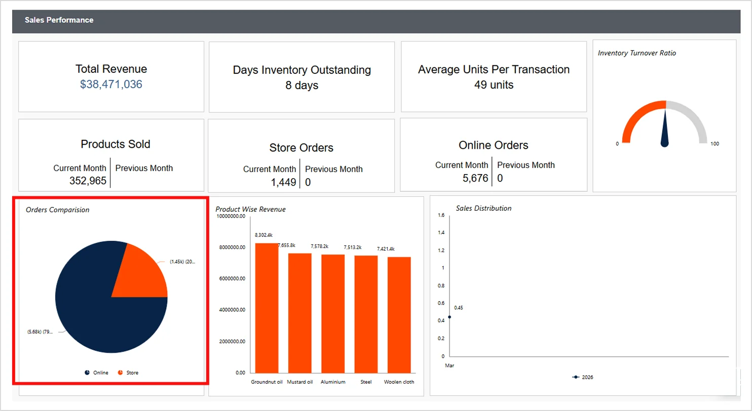
Sales teams often need a quick way to identify where most orders come from to guide staffing and marketing decisions. A pie chart comparing online and in‑store orders highlights each channel’s share, making trends easy to spot. This clear breakdown helps teams refine sales strategies, adjust inventory placement, and focus on the channels driving the most demand.
As demonstrated across these scenarios, a pie chart simplifies how stakeholders absorb proportional data. Here’s a quick wrap‑up before you start building your own.
Create a pie chart in Bold Reports to visualize proportional data
A pie chart in reports is a simple yet powerful way to highlight how categories contribute to a whole. When used with a small number of categories and clear labels, it delivers fast, high‑impact insights for stakeholders. Bold Reports® makes it easy to build, customize, and export a pie chart that fits your reporting needs
Ready to start creating intuitive reports? Start your free trial to explore Bold Reports hands-on. Also, you can book a free personalized demo to see a pie chart and other visualizations in action with guidance from a product expert.
Frequently asked questions
- 1.
Is it possible to embed a pie chart into my application or website?
Yes. You can embed a pie chart created in Bold Reports directly into your applications or websites using the platform’s embedding options.
- 2.
Can I apply conditional formatting to a pie chart?
Yes. Bold Reports allows you to use color rules, thresholds, and logic‑based formatting to highlight important slices within the pie chart.
- 3.
Can users interact with a pie chart?
Yes. Users can hover to view tooltips, drill down, filter, and sort data depending on configuration or data model qualifiers.
- 4.
Can I customize the appearance of a pie chart to match my brand?
Yes. Bold Reports includes flexible design tools that let you apply custom themes, colors, fonts, borders, and layout styles.