Funnel Chart in Reports: Benefits, Uses & How to Create It
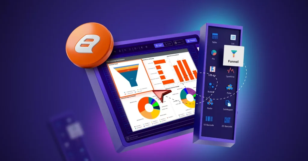
TL;DR: A funnel chart visualizes how data decreases across sequential stages in a process. It helps teams identify drop off points, measure conversion efficiency, and understand where improvements are needed. Use it when analyzing stage-based pipelines, such as sales, lead qualifications, or workflow completion, where each step narrows down to the next.
Introduction
Processes like sales pipelines, application workflows, or customer journeys often involve multiple stages where not everyone progresses to the end. When teams rely only on tables filled with stage‑by‑stage counts, it becomes difficult to immediately see where major drop‑offs are happening or how efficiently the process is performing overall. A funnel chart solves this by transforming those numbers into a simple, tapered visual that clearly shows how values change at each step. Instead of manually comparing rows of data, teams can instantly identify where the largest losses occur and which stages may require attention.
This makes funnel chart especially useful in reports designed for monitoring conversions, tracking workflow performance, or diagnosing bottlenecks. In this blog, you’ll learn when a funnel chart is the right choice, when it isn’t, and how to build a decision-ready funnel chart in Bold Reports®.
Understanding a funnel chart in reports
A funnel chart is a chart type that displays values across sequential stages, where the values typically decrease at each step. Each stage is drawn as a section of the funnel, and the change in width or area from stage to stage visually represents conversion and drop‑off. A funnel chart is commonly used to highlight pipeline progression, conversion efficiency, and bottlenecks in multistep processes.
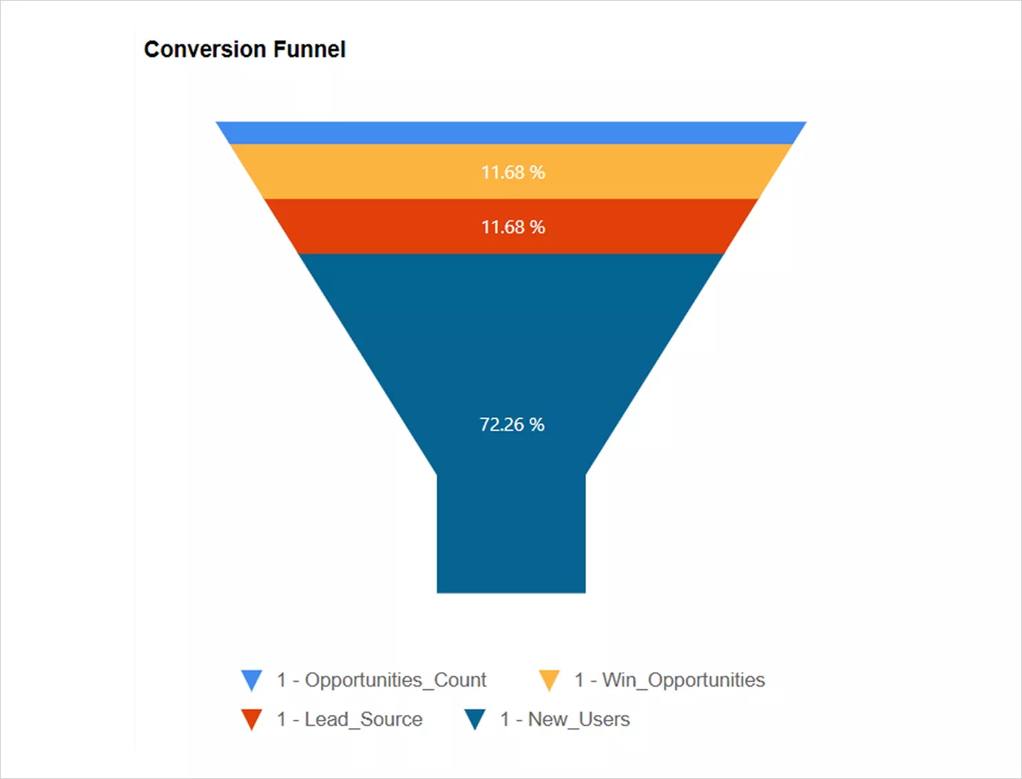
Now that you know what a funnel chart communicates, the next step is learning when it’s the right choice and when it is not.
When to use a funnel chart in Bold Reports
The funnel chart shines when you need to visualize stage-based processes that narrow over time. Use them when you are:
-
- Showcasing sequential steps in a workflow.
- Analyzing sales and marketing conversion rates.
- Tracking customer journey progression.
- Visualizing recruitment or hiring funnels.
- Monitoring lead qualification stages.
- Highlighting drop-offs in processes or campaigns.
- Displaying task or project completion stages.
If your values naturally decrease as they move through a sequence, a funnel chart is the ideal data visualization in Bold Reports.
When not to use a funnel chart in Bold Reports
While funnel chart is powerful, they are not the right fit for every dataset. Avoid using a funnel chart when:
-
- The data does not follow a sequential order.
- Stages do not trend downward or narrow naturally.
- The dataset has no process flow to visualize.
- Values are not measurable or quantifiable.
- Stages are unrelated or do not influence one another.
- You need to compare values that fluctuate instead of decrease.
- The goal is to analyze independent or unrelated data points.
In these scenarios, consider using bar, line, or stacked chart, which may better represent your data.
Benefits of using a funnel chart in reporting workflows
A funnel chart offers practical advantages when your report needs to explain sequential performance. Some benefits include:
- Instant conversion visibility: Funnel chart makes stage‑to‑stage loss obvious, so readers can identify where performance drops without scanning rows of numbers.
- Bottleneck identification: The funnel chart clearly highlights where the largest drop-offs occur, helping teams identify process bottlenecks.
- Simplified complex stage reporting: Multistage workflows become easy to understand even for non‑technical viewers, especially in executive or cross‑team reports.
- Designed for process storytelling: Funnel charts communicate flow, not just magnitude, which is useful when you want to explain “how far things progress.”
- Easy formatting and standardization: In Bold Reports, you can tune labels, colors, and layout to match report style guides and improve readability across exports and dashboards.
These benefits matter most when your data follows a clear stage sequence. Next, let’s see how you can build a funnel chart quickly in the Bold Reports Report Designer.
How to create a funnel chart in Bold Reports
Bold Reports makes it easy to build a funnel chart using the Report Designer. To create a funnel chart in your report:
- Select your data: Choose the tables and fields you want to visualize from the data sources.
- Add the funnel chart: In the widget panel, locate the Funnel chart and drag it onto the design surface. Adjust the size to fit your layout.
- Assign data: Open the properties panel and go to assign data. To assign data:
-
-
- Drag a dimension field, such as category or stage, into the groups.
- Drag a measure, such as count or amount, into the values.
-
- Customize the appearance: Modify properties like colors, styles, neck width, gap ratio, and other formatting options to achieve the desired look.
- Add labels and legends: Adjust the data label and legend settings as needed to make each stage of the funnel easy to interpret.
- Handle empty or missing data: Configure the no data settings to show a custom message or placeholder when the dataset is empty.
- Preview and save: Select preview to see how the funnel chart renders your data. Make any final adjustments, then save your report.
For more details on preparing data or customizing formatting, refer to the documentation.
With your funnel chart created, the next step is understanding the feature groups that help you refine it for clarity and usability.
Key funnel chart properties in Bold Reports
These options are available after selecting the funnel chart in the designer.
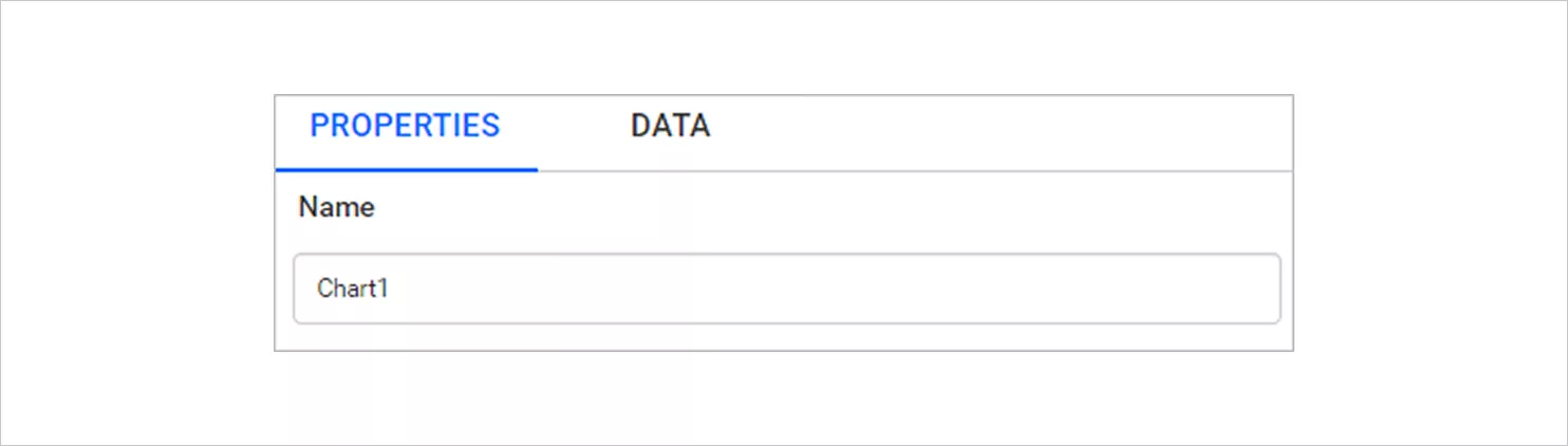
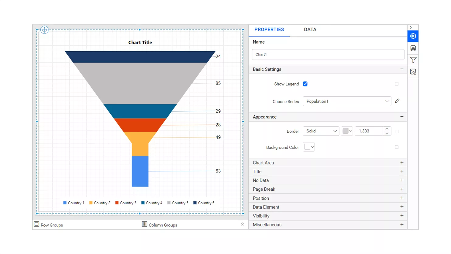
- Name: Assign a unique identifier to the funnel chart item in the report. This helps you manage and reference the chart easily when the report contains multiple visuals.

Name - Basic settings: This section contains the core funnel chart configuration options and default values. Use it to confirm the selected chart type and adjust basic behavior before styling.
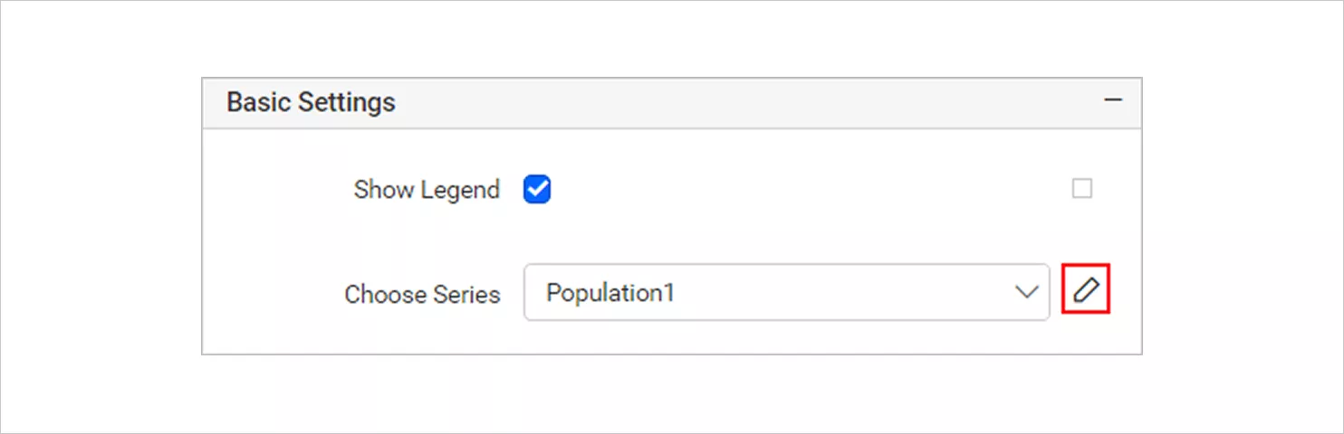
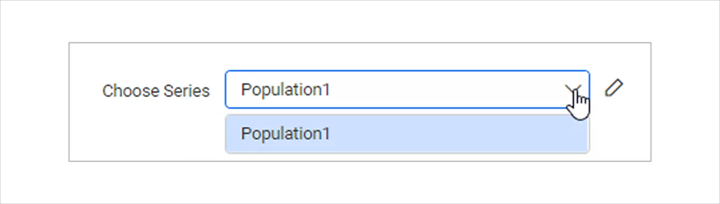
Chart type- Basic option - Choose series: This dropdown menu lists the available series when the funnel chart contains multiple series. Select a series to edit its appearance and behavior independently from the others.
Choose series - Appearance: Control the outer styling of the chart, such as border and background. Use it to match the funnel chart with your report theme and improve visual insight.
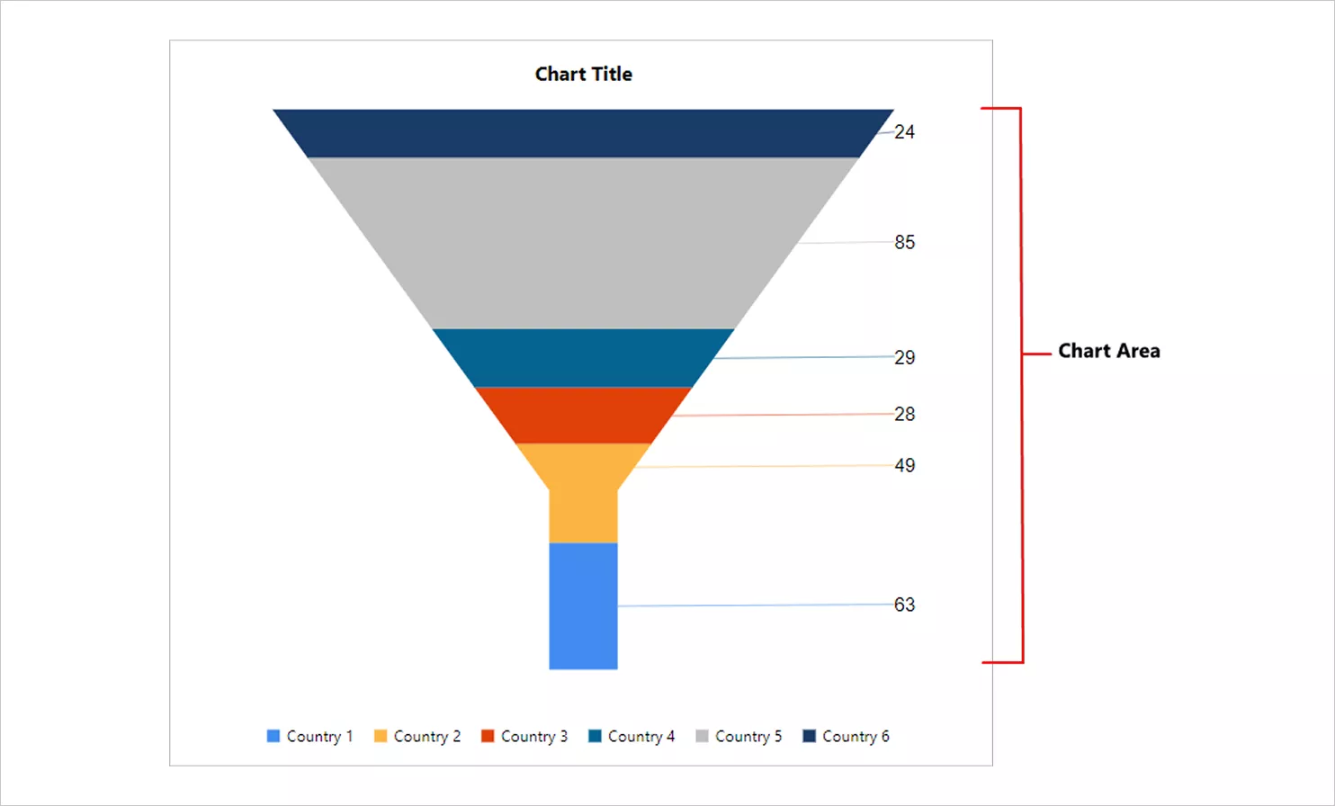
Background color appearance - Chart area: Customize the main region where the funnel is drawn. It helps you refine the chart’s visual insight without changing the underlying data.
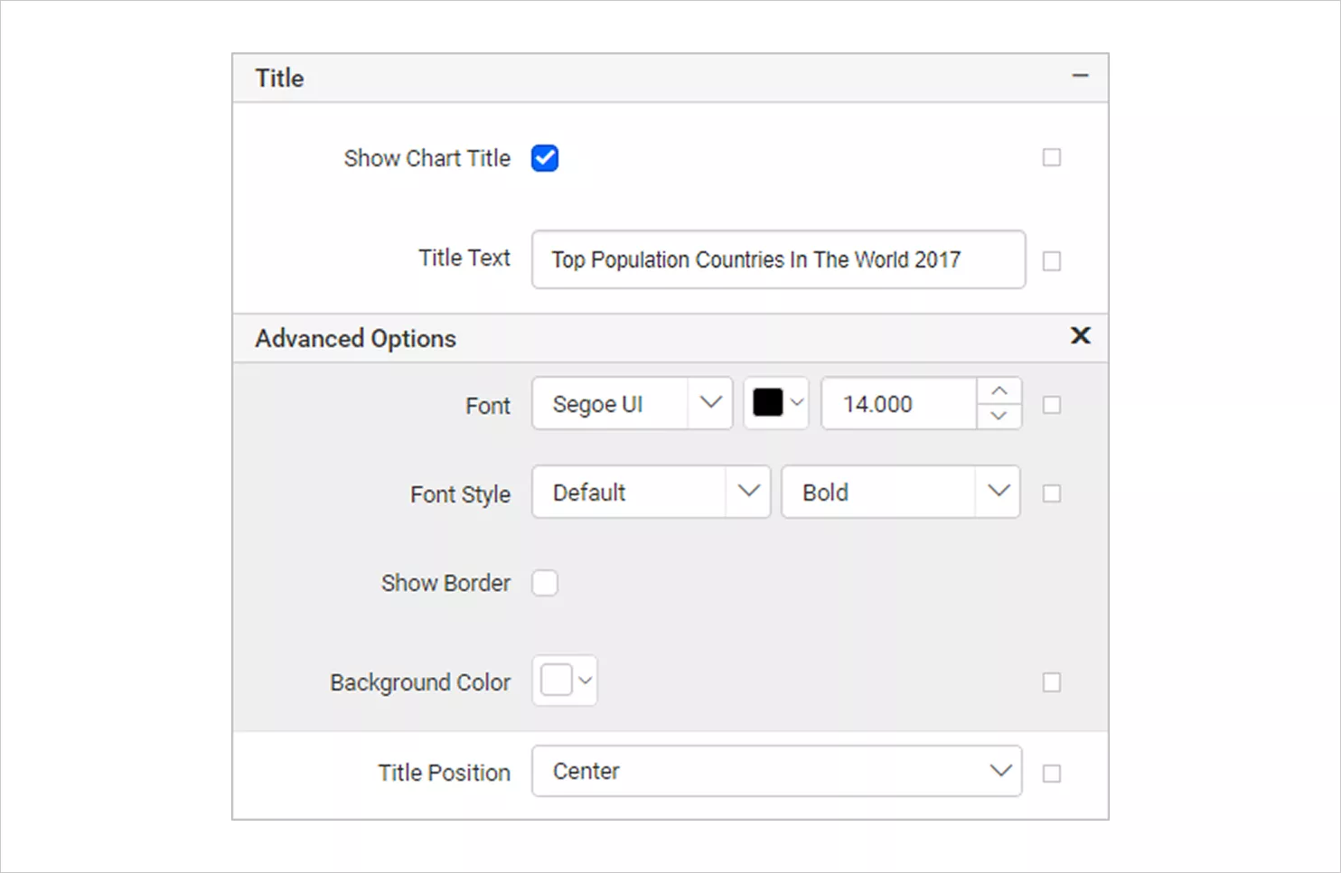
Chart area - Title: The title settings let you show or hide the chart title and edit the title text. You can also style the font, background, border, and position for clearer visuals.
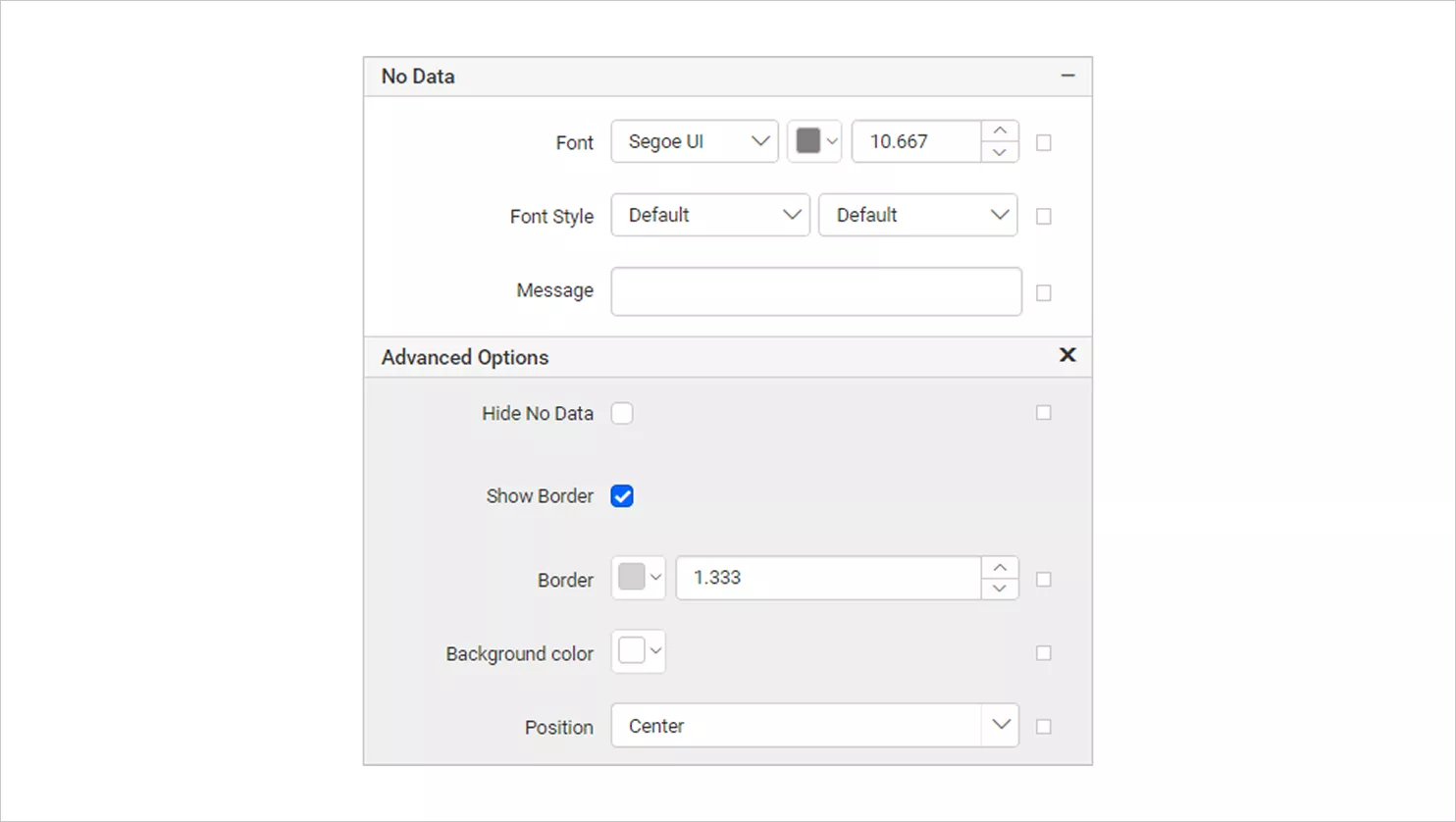
Show chart title - No data: Display a message when the dataset returns empty or zero rows at runtime. This prevents blank charts and clearly communicates why no visual is shown.
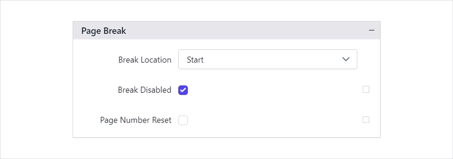
No data - Page break: These settings control how the chart behaves across pages during preview and export. They help ensure multipage reports remain clear and properly segmented.
-
-
- Break location: Specify exactly where the page break occurs, ensuring cleaner pagination by controlling how the chart is split across pages.
- Break disabled: Prevent predefined page breaks during preview. This can be dynamically controlled using expressions when needed.
- Page number reset: Restart page numbering after a page break, which is ideal for sections that require independent numbering.
Page break setting
-
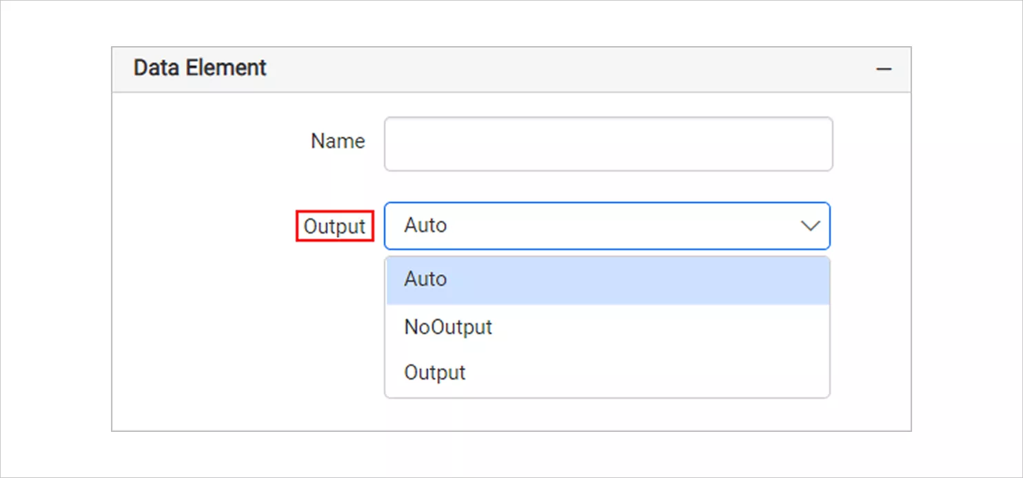
- Data element: These controls determine how the chart appears in XML exports. You can assign a custom data element name, which must begin with a letter and use only letters, numbers, or underscores. Select NoOutput in the Output dropdown menu to exclude a chart from an exported file or select Auto or Output to include it.
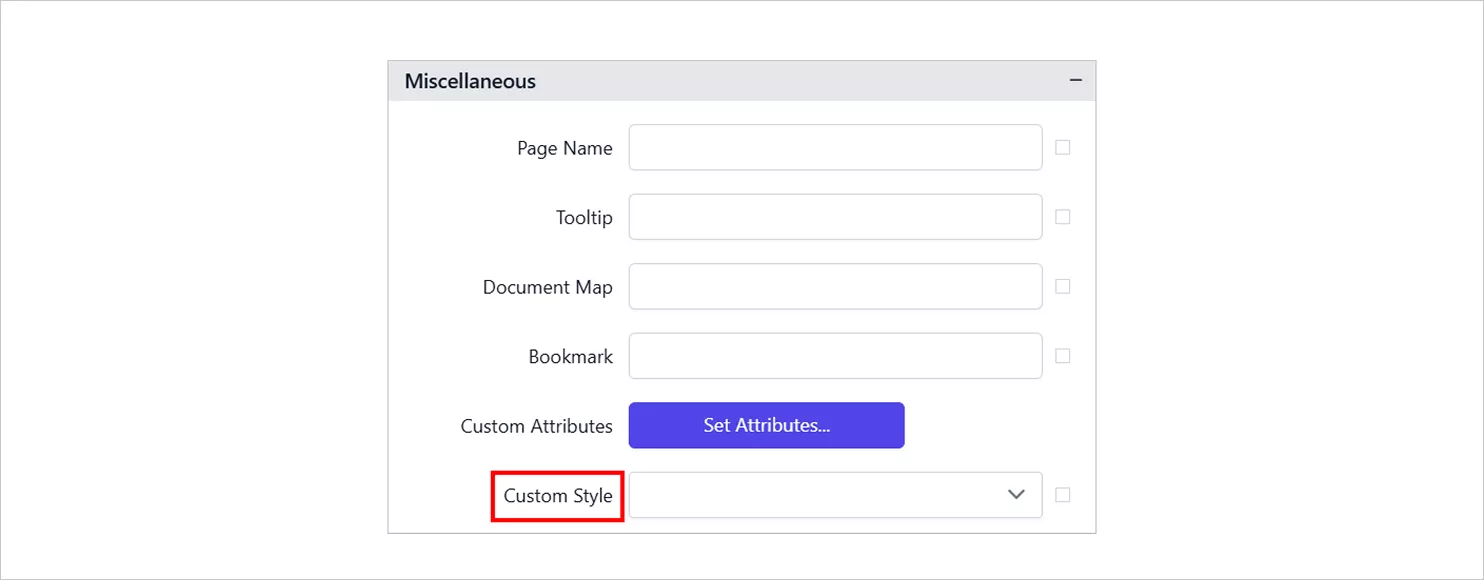
Data element-output - Miscellaneous: The page name setting defines the name of the first worksheet when exporting to Excel, using either static text or expressions. Custom styles allow you to apply external CSS to customize the appearance of the chart when required.
Custom style
Now that you’ve seen what you can control through chart properties, let’s look at where a funnel chart delivers the most value in real reporting scenarios.
Real‑world use cases of a funnel chart in Bold Reports
Below are some practical, real-world scenarios, demonstrating how funnel chart support clear, stage‑based analysis in Bold Reports.
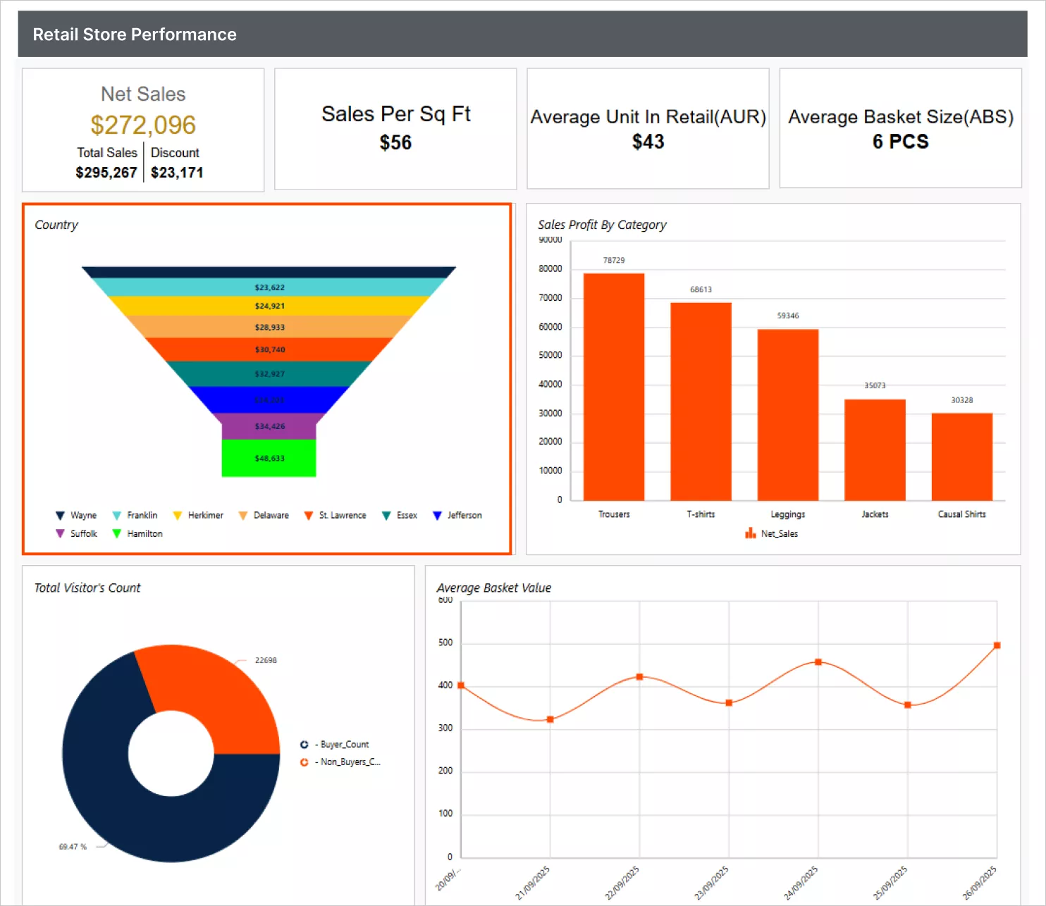
Retail: Country funnel analysis
In the retail industry, understanding customer drop‑offs across the buying journey can be challenging, especially when viewing data from multiple countries in table form. Using a funnel chart in reports such as the retail store performance report allows retailers to visualize how customers progress from initial interest to completed purchase across different regions. This helps highlight regional strengths, bottlenecks, and overall funnel health at a glance.
Marketing: Lead conversion funnel
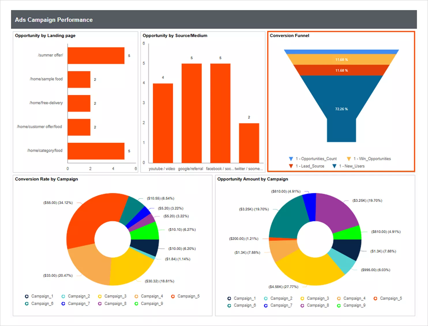
In marketing workflows, tracking how leads progress through qualification and engagement stages can be difficult. Using a funnel chart in a ads campaign performance report provides a clear data visualization of each stage, from initial inquiry to follow‑up and final conversion. This makes it easier for marketing teams to pinpoint weak stages, understand engagement gaps, and refine their conversion strategy.
Key takeaways
By following the steps provided in this blog, you can design a clear and insightful funnel chart in your report, whether you’re on an HR team tracking recruitment stages, a finance team analyzing approval cycles, or an operations team monitoring process completion rate.
Bold Reports® empowers you to turn these funnel visualizations into actionable insights by offering flexible customization, rich data‑binding options, and intuitive controls that help teams understand where progress slows and where improvements can be made.
Ready to elevate your reporting? Start a 30-day free trial of Bold Reports and build your first funnel chart in minutes using the drag-and-drop report designer.
Frequently asked questions
- 1.
Do I need coding knowledge to create a funnel chart in Bold Reports?
No. You can create a funnel chart using the drag-and-drop Report Designer by assigning category and value fields.
- 2.
Can funnel charts be exported from Bold Reports?
Funnel charts can be exported with reports to formats like PDF, Excel, and Word.
- 3.
Can I customize the appearance of a funnel chart?
Yes. You can customize colors, labels, gap ratio, neck width, and other formatting options.
- 4.
Does Bold Reports support multiple series in a funnel chart?
Yes, depending on the version. When multiple series are available, you can select and format them individually using the Choose Series panel.