How to Visualize Data Using a Column Chart in Reports

TL;DR: Comparing data across categories doesn’t have to mean digging through long tables of numbers. Column charts turn raw data into clear visual comparisons, making patterns, trends, and differences easy to spot. This guide explains what column chart reporting is and how to use it effectively in Bold Reports®.
Introduction
Comparing values across categories or tracking performance over time shouldn’t require scanning dense tables or flipping through multiple reports. Yet when data is presented only as raw numbers, patterns and differences are easy to miss, slowing analysis and decision-making.
Column chart in reports solves this by transforming numerical data into clear, visual comparisons. By representing data along a vertical axis, it makes trends, category-level differences, and performance changes immediately obvious. In this blog, we explore what column chart reporting is, its benefits, different types of column charts, and how to create one using Bold Reports.
Let’s get started.
What is a column chart in reports
A column chart is a vertical bar chart used to compare values across different categories. Each column represents a category, while the height of the column reflects the corresponding value, making it easy to visually compare data points. Column charts are especially effective for showing differences and changes between discrete categories.
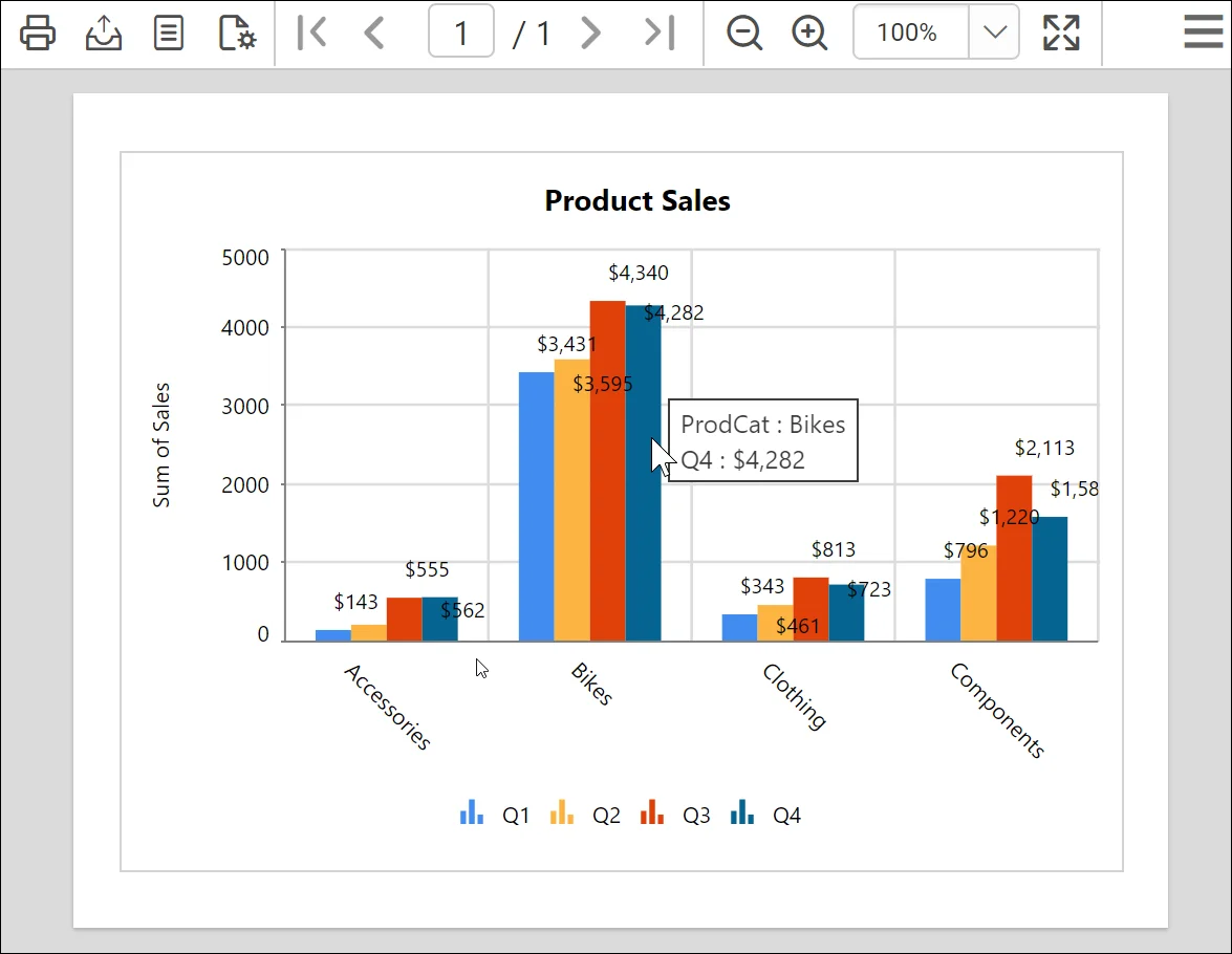
Column chart types in Bold Reports
Bold Reports supports multiple column chart types, each designed to address different comparison and analysis scenarios.
- Stacked column chart: Enables comparison of multiple categories’ contributions to a total by stacking them on top of each other within individual.
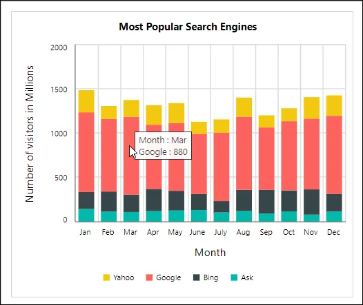
Stacked column chart - 100% stacked column chart: Compares multiple measures’ contributions to a whole by stacking them on top of each other. The cumulative value of each stacked column is always 100%.
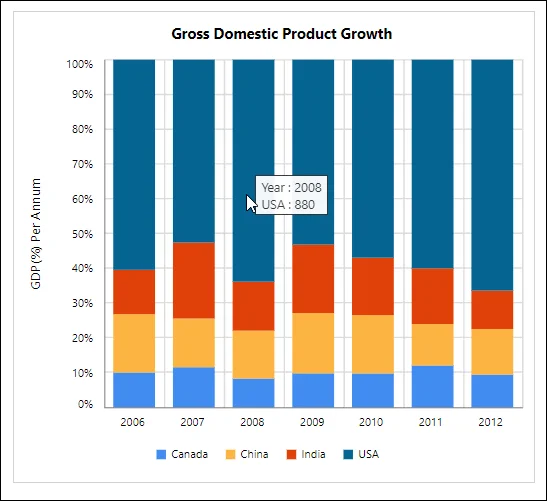
100% stacked column chart - Range column chart: Represents data as a range by plotting two y‑values (low and high) for each data point, making it ideal for visualizing variations within categories.
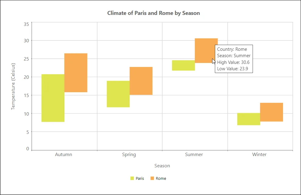
Refer to our supported chart types guide to learn more about charts in Bold Reports.
Each column chart type answers a slightly different question. Before choosing a chart type, it helps to understand what column charts do best in reports.
5 benefits of visualizing data in a column chart in reports
Column charts make trends, patterns, and performance variations easy to understand and act upon. Key benefits include:
-
- Simple comparison: Column charts make it easy to compare different values side by side, especially when working with larger sets of data.
- Strong visual clarity: Their straightforward design helps viewers quickly notice patterns in the data.
- Helpful for spotting issues: Column charts can reveal unusual values, inconsistencies, or gaps in the data, making problem areas easier to identify.
- Easy for broad audiences: Because they present information in a clear visual format, column charts help even non-technical readers understand complex findings more quickly.
When to use a column chart in reports
Use a column chart in the following situations:
-
- When you want to compare changes across discrete time periods (for example, monthly revenue or quarterly sales performance).
- When you need to compare values across categories to clearly show how values differ (for example, survey response sentiments).
- When you want to rank categories by value so viewers can quickly identify the highest and lowest categories.
- When your data is naturally grouped into discrete, non-continuous categories (for example, regions, departments, or product types).
- When you need to show both positive and negative values relative to a baseline, such as profit versus loss or variance from a target.
When not to use a column chart in reports
A column chart may not be the best choice in the following situations:
-
- When you want to display continuous data.
- When you are representing proportions or percentages.
- When you are showing relationships involving many distinct variables.
- When you need to make precise quantitative comparisons between data points.
How to create a column chart in Bold Reports
Bold Reports makes it simple to design a column chart within its Report Designer. To create a column chart in reports:
- Add the column chart: From the Chart Items panel, drag a Column Chart (under the Comparison category) onto the design surface and resize it to fit your layout.
- Assign your dataset: Go to the DATA tab and select the dataset that contains the categories and numeric values you want to visualize.
- Map your fields: Define how the column chart should interpret your data.
- Columns (Category): Drag the field used to group data along the horizontal axis, such as
Month, Product, or Region. - Y Values: Assign one or more numeric fields that determine the height of each column, such as Sales, Revenue, or Count.
- Columns (Category): Drag the field used to group data along the horizontal axis, such as
- Series (Optional): Add a field to the Rows section to compare multiple data series within the same column chart.
- Customize for clarity and readability: Improve the chart’s effectiveness by applying key properties.
- Axes and titles: Clearly label axes and provide meaningful titles.
- Data labels: Display values on columns where quick interpretation is needed.
- Legend: Enable legends to distinguish multiple series.
- Color palette: Apply consistent colors to maintain visual clarity across reports
and exports.
- Review and finalize: Select Export Preview to verify that the column chart renders clearly in PDF, Word, and Excel. Adjust spacing, labels, or styling as needed to ensure strong readability before saving.
Refer to the documentation for detailed information on creating a column chart.
Real-world use cases of column chart in reports
The following are common use cases that demonstrate how column charts support effective data analysis across industries and scenarios.
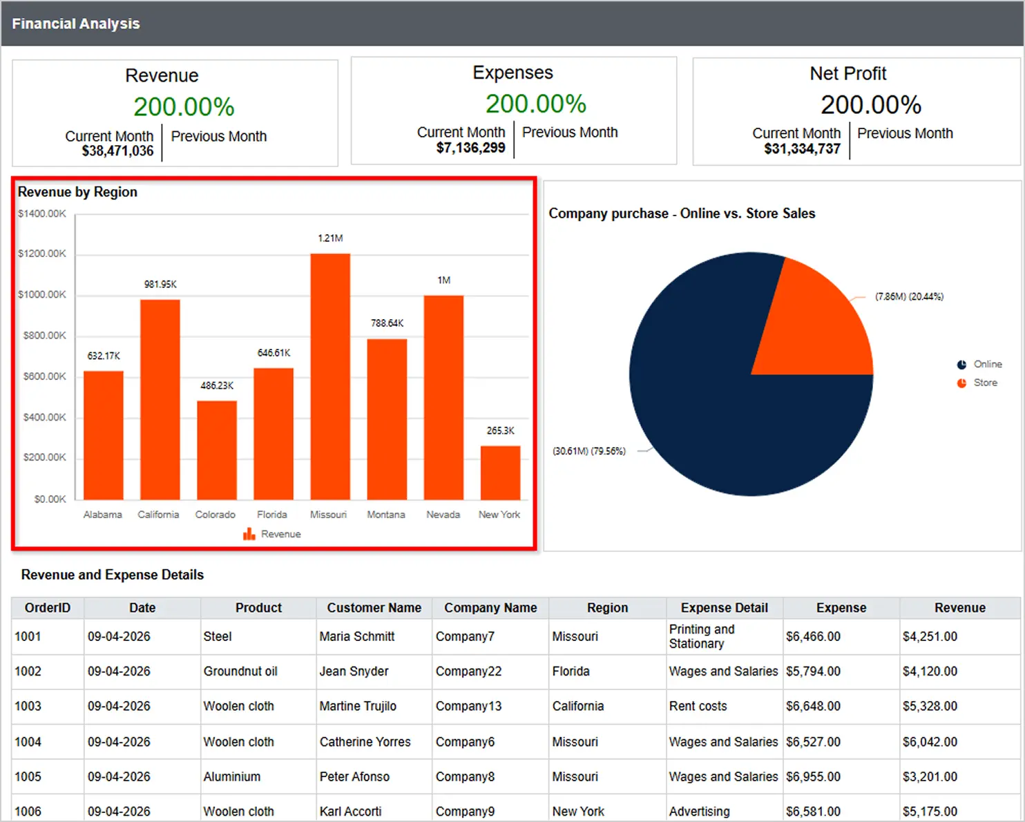
Finance: Revenue by region
Finance teams can quickly compare revenue and expenses with column charts. The column chart in this Financial Analysis report showcases revenue by region, helping stakeholders visualize performance effectively and make more informed, data‑driven decision.
Digital marketing: Monthly recurring revenue
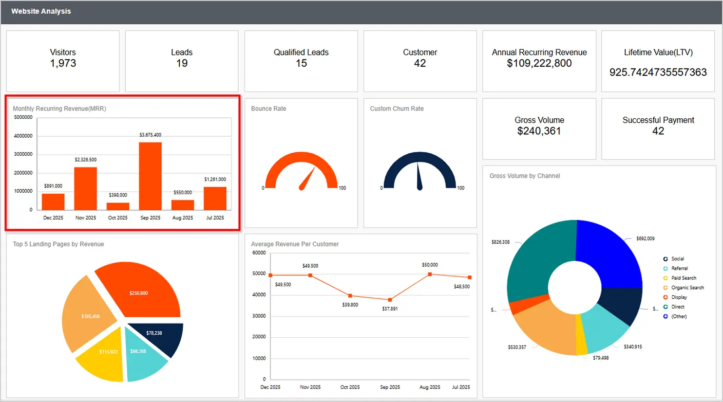
Marketing teams need to know whether their campaigns generate revenue. The column chart in this Website Analysis report highlights monthly recurring revenue, allowing marketing teams to see which month’s campaign likely had the most impact.
Retail: Top-selling items
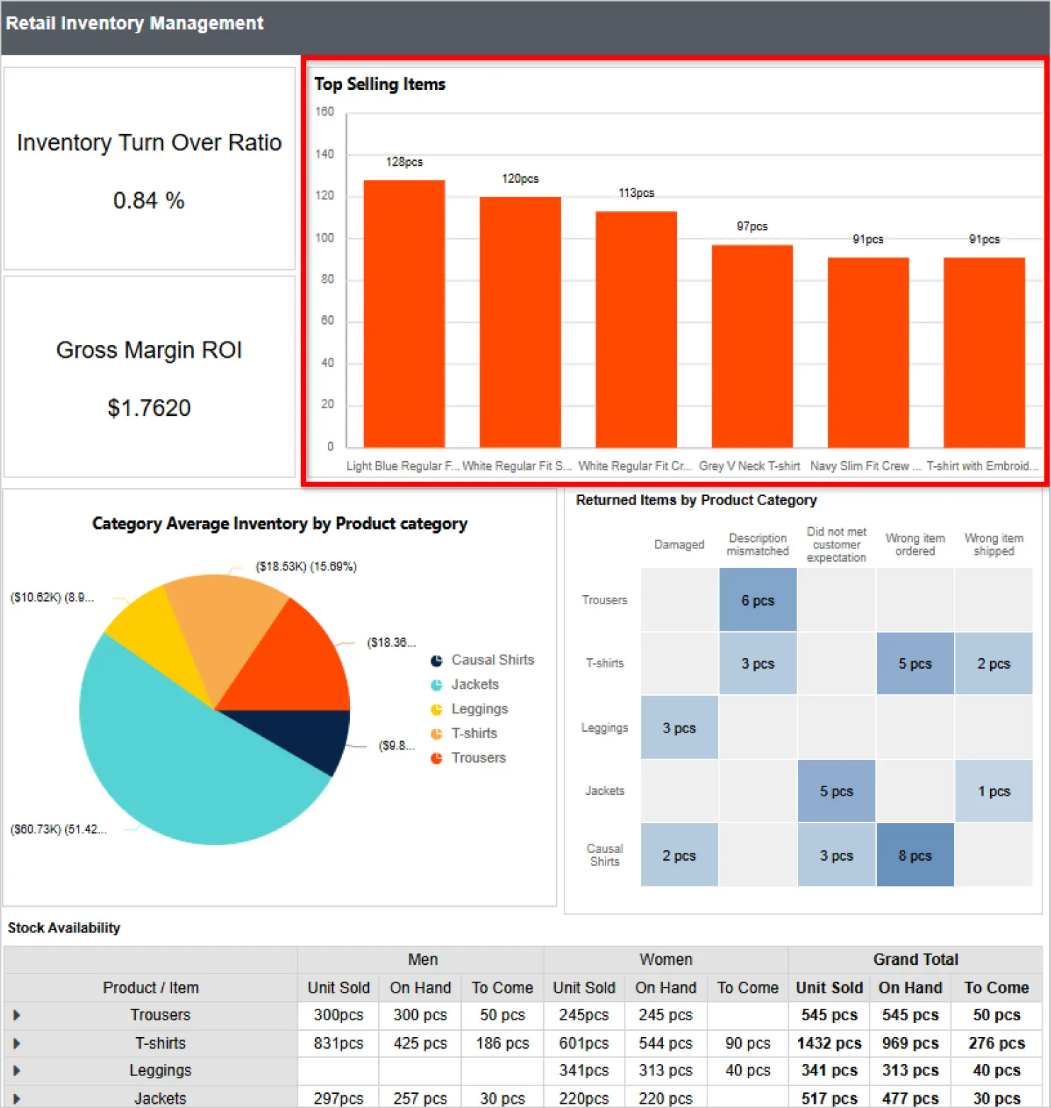
Retailers need to balance stock availability across products and locations. This Retail Inventory Management report uses a column chart to compare top-selling items, helping retailers make timely, data‑driven stocking decisions.
Best practices for column chart in reports
Designing a column chart for effective data analysis requires clarity, comparability, and visual balance.
-
- Keep only essential categories, so the chart remains uncluttered and easy to read at a glance.
- Use a consistent value scale to ensure comparisons between columns are accurate and meaningful.
- Arrange data in a logical order, such as chronological or by value, to clearly highlight trends and differences.
- Limit the number of data series to avoid visual clutter and maintain focus on key comparisons.
- Use clear titles, labels, and legends to provide context and make the chart easy to understand.
Key takeaways
Column charts make category‑based comparisons easy to scan, interpret, and act on, especially in reports where readers need to identify differences and trends quickly. Creating effective column charts in Bold Reports is easy, just choose the right column chart type, map categories and values, format labels, and stakeholders will be able to compare data quickly and confidently.
Ready to elevate your reporting? Try Bold Reports® through a 30-day-free trial or book a 30-minute personalized demo to see how it can transform your reporting.
Frequently asked questions
- 1.
What is a column chart used for?
A column chart is used to compare values across categories or time periods, helping report viewers easily identify patterns, trends, and differences.
- 2.
What types of column charts does Bold Reports support?
Bold Reports supports standard, stacked, 100% stacked, and range column charts to meet different reporting needs.
- 3.
How do I choose the right column chart type?
Choose the column chart type based on your reporting goal, such as comparing totals, showing proportions, or visualizing value ranges over time.
- 4.
Which use cases benefit from column chart reporting?
Column charts are widely used in financial analysis, sales performance, marketing analytics, inventory management, and operational reporting.
- 5.
How can I keep a column chart clear and readable?
To maintain readability, limit the number of categories charted, use clear axis labels, apply consistent colors, and avoid overcrowding the chart with data.